Role: Product designer
Year: 2022
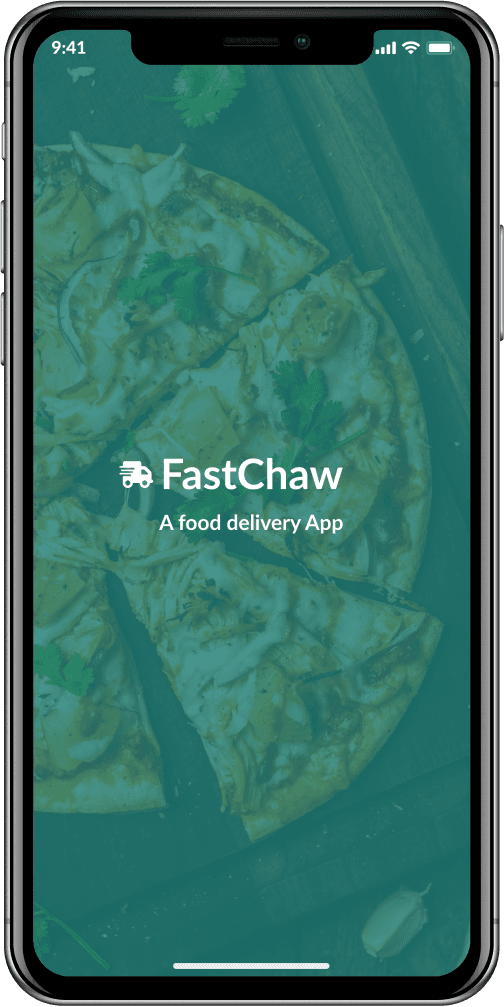
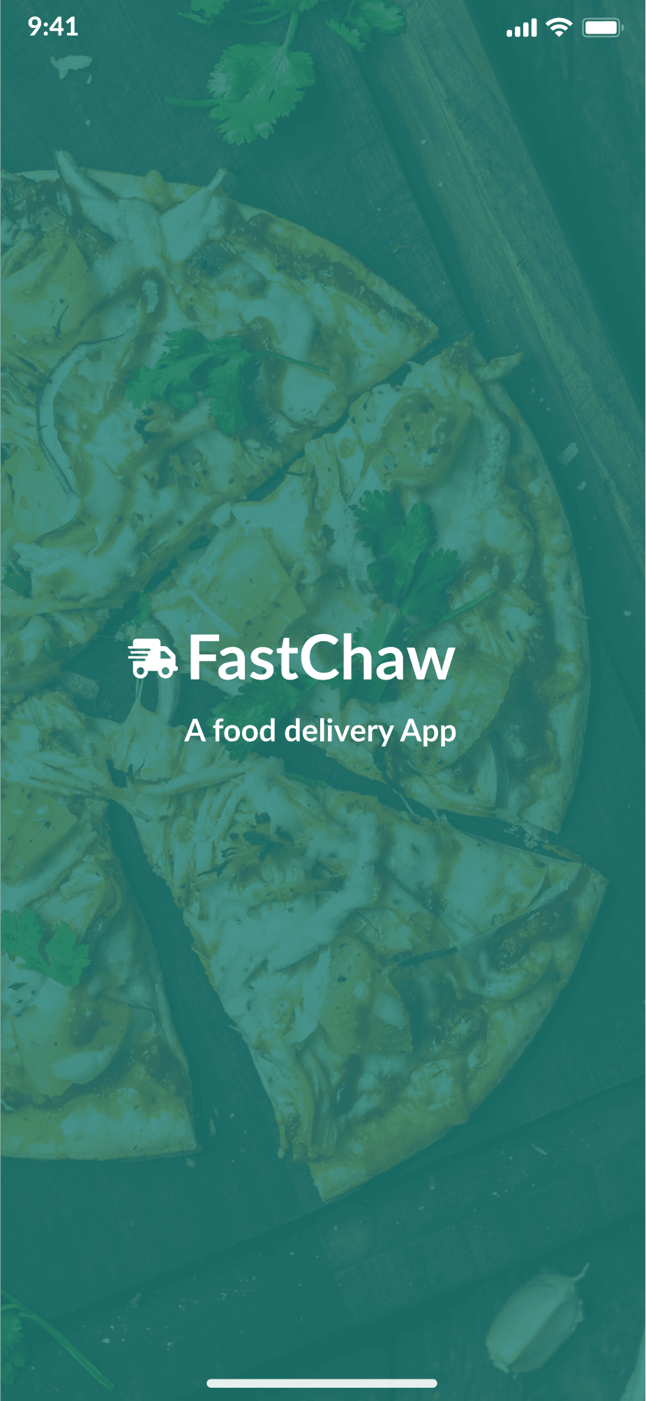
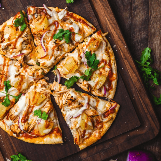
FastChaw
Project: A food delivery app
MY DESIGN PROCESS
MY DESIGN PROCESS
Brainstorm
Empathize
Ideate
Prototype
Test
Define
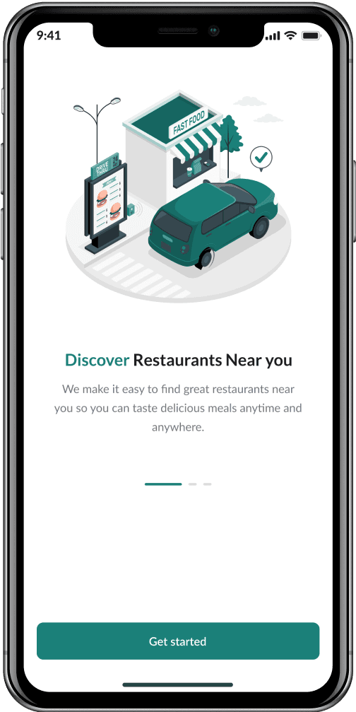
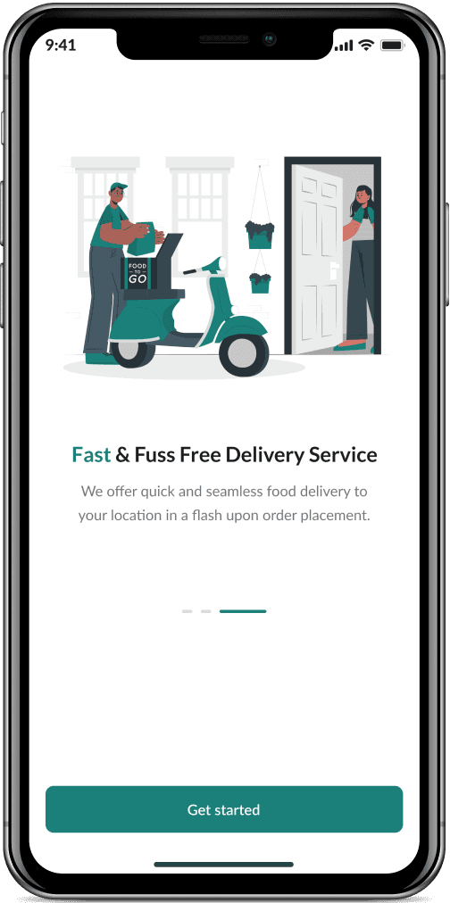
A new look at how you order food
Creating an amazing experience when ordering food
Define the audience
The audience
The food delivery app is aimed at people that don’t have time or like to cook, busy workers, and people that just want to order in food.
Empathize
Empathize
To fully empathize with users and understand user needs and pain points, I conducted user interviews of 5 adults between the ages of 20 - 60 that order food online at least three times a month. I created one-user empathy map for each user I interviewed to understand the users I am designing for, then I created an aggregated empathy map, took down user pain points, created personas, created user story, and finally user journey map. A user group identified through research was working adults who prefer ordering food than cooking for themselves.
Research revealed that interest wasn’t the only factor limiting users from cooking at home. Other user problems includes nature of job, time, and challenges that make it difficult to get groceries for cooking or go to restaurant in-person.
Pain points
Two (2) major pain points were identified in the research phase which are::
Time
Feature
Aggregated empathy map


Sharon
Working adults don’t like waiting on their ordered food more than the specified time of delivery.
Platforms for ordering food don’t have real-time delivery maps.
Platforms for ordering food don’t have 24 hours food delivery service options.
Some platforms for ordering food don’t allow users pay for their ordered items on delivery.
Time
1
Features
2

Sharon James
Age: 26
Education: B.sc Computer Science
Hometown: Lagos, Nigeria
Family: Single, lives alone
Occupation: Data Analyst
Sharon is a data analyst that resides in Lagos. She currently works at a start up company in the USA, but works remotely which affects her timezone. She doesn’t have time to cook due to her work schedule, so she prefers ordering food from food vendors. Although, she gets frustrated by different food vendors because of their inability to deliver on-time. She would like to have a more accurate time of delivery, track her ordered food real-time and pay for her order on delivery, so she can plan her work and eating time properly.
I work from home and I prefer ordering food because I don’t have time to cook.
Goals
Wants to get her food within the specified time.
Wants to be able to track ordered food real-time.
Wants to be able to order food round the clock.
Wants to be able to pay for ordered food upon delivery.
Frustrations
“It’s annoying waiting on my ordered food more than the specified delivery time”.
“I really wish I could track my delivery real-time”.
“I would like to have a 24hr food delivery service”.
“I would like to pay for my orders on delivery”.
User persona
After creating an aggregated empathy map and identifying painpoints, I created a persona whose goals and characteristics represented the needs of the larger group of users.
User story
After creating a persona, I decided to give the persona a story told from the persona point of view to inspire and inform design decisions and to connect the persona to the goal they’d like to accomplish.
As a Data analyst, I want to have access to good food delivery options, So that I don’t have to bother about cooking.
User journey map
After creating a user story, I decided to create a user journey map to show the series of experiences a user has as they acheive a specific goal. After all, if you can’t put yourself in the users shoes, you can’t be sure your design will really help them!
Goal: Place an order on a food delivery app and enjoy your meal.
Go to app
Put in your address details
Place an order
Proceed to checkout and make payment
Pick up order
A. Confirm if orders are correct.
B. Input debit cards details and make payment.
A. Wait on delivery agent.
B. Pick up food from delivery agent upon arrival.
C. Inspect food.
D. Eat meal.
A. Select a restaurant of your choice.
B. See available food options.
C. Decide on food to order.
A. Specify delivery location.
A. Go to designated app.
B. Input login details or sign up if you are a new user.
Provide a simple checkout flow.
Create alternative payment options like pay-on-delivery.
Create a mobile app that has good readable typeface, good luminosity ratio (backround color to text color ratio), and Icons to make navigations clear.
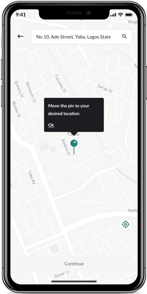
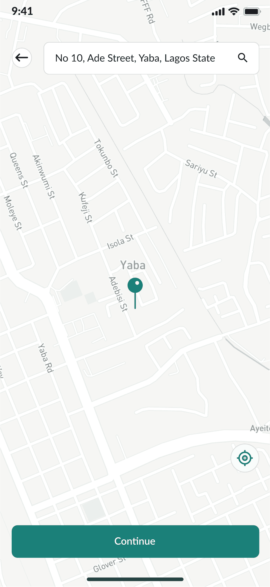
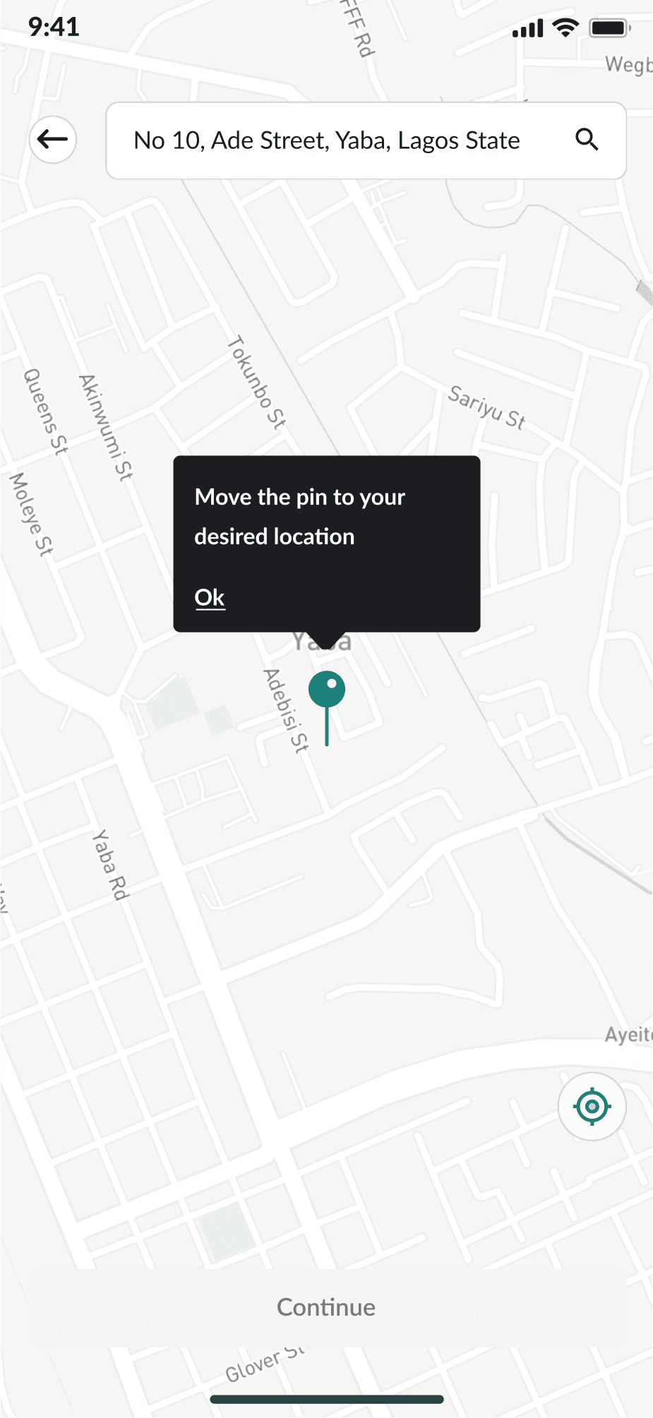
Include a more detailed map option for user to easily select their location.
Include clear images and add Alt text for accessibility.
Create a delivery option that includes a map that displays realtime feed of delivery agent location upon order placement.
Create an option to rate and give feedback.
Upset that there was no option to pay-on-delivery.
Not comfortable with inputting card details.
Upset that there was no map to show the delivery agent reatime location.
Excited about the inspected meal.
Satisfied with the meal.
Happy.
Felt excluded (no accessibility option).
Satisfied.
Satisfied and happy.
Action
Task list
Feelings adjective
Improvement opportunities
Mapping Sharon’s user journey revealed how helpful it would be for users to have access to a dedicated food delivery app Fastchaw.
Define
Define
In the define stage, I created a problem statement which is a clear description of the users needs that should be addressed.
Problem statement
Sharon is a Data Analyst who needs access to good food delivery options that keep to delivery time, allow her track her orders in realtime, and has the pay-on-delivery payment option because she doesn’t have time to cook for herself.
Ideate
Ideate
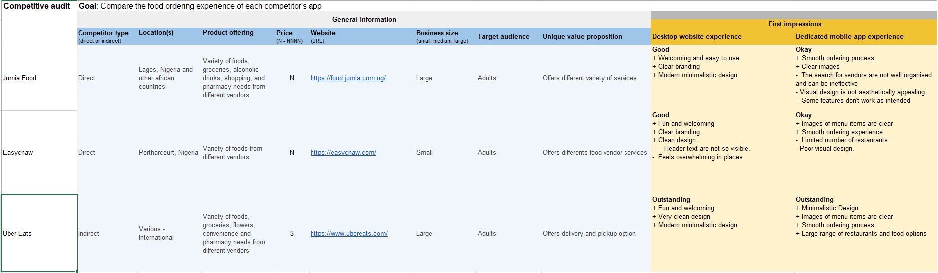
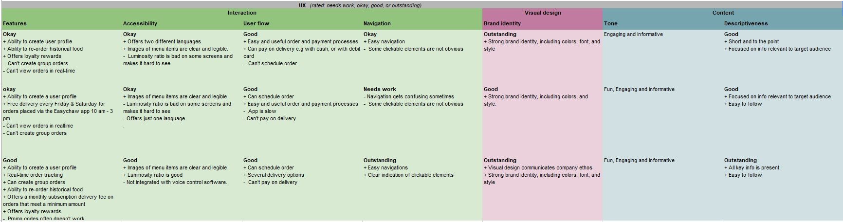
In the ideation stage, I compared the Fastchaw app that I am going to design with existing apps from similar organizations. I carried out a competitive audit and created a competitive audit report which gave an overview of my competitors strengths, weaknesses, gaps, and opportunities. This research was key because I wanted to deliver effective and unique designs that offer new solutions to user problems, and also understand products in the market that are similar to mine to help guide my design decisions.
I compared two direct competitors (Jumia Food and Easy Chaw) and one indirect competitor(Uber Eats).
Competitive audit
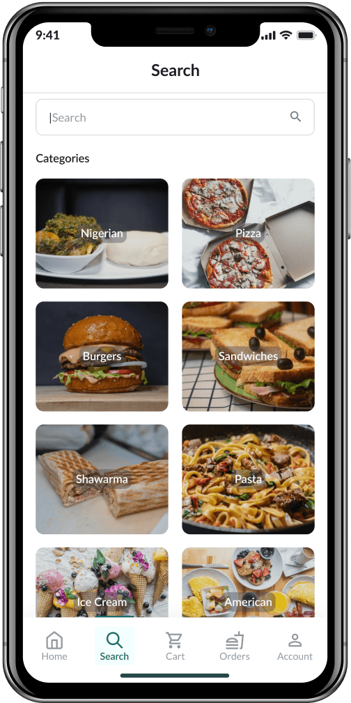
Information architecture
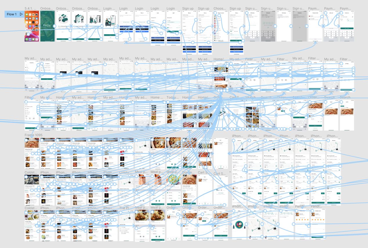
I decided to figure out how to organize the content in the app to help users understand where they are in the product and where the information they want is so they can have an excellent user experience. In other to do that, I created a sitemap and userflow.
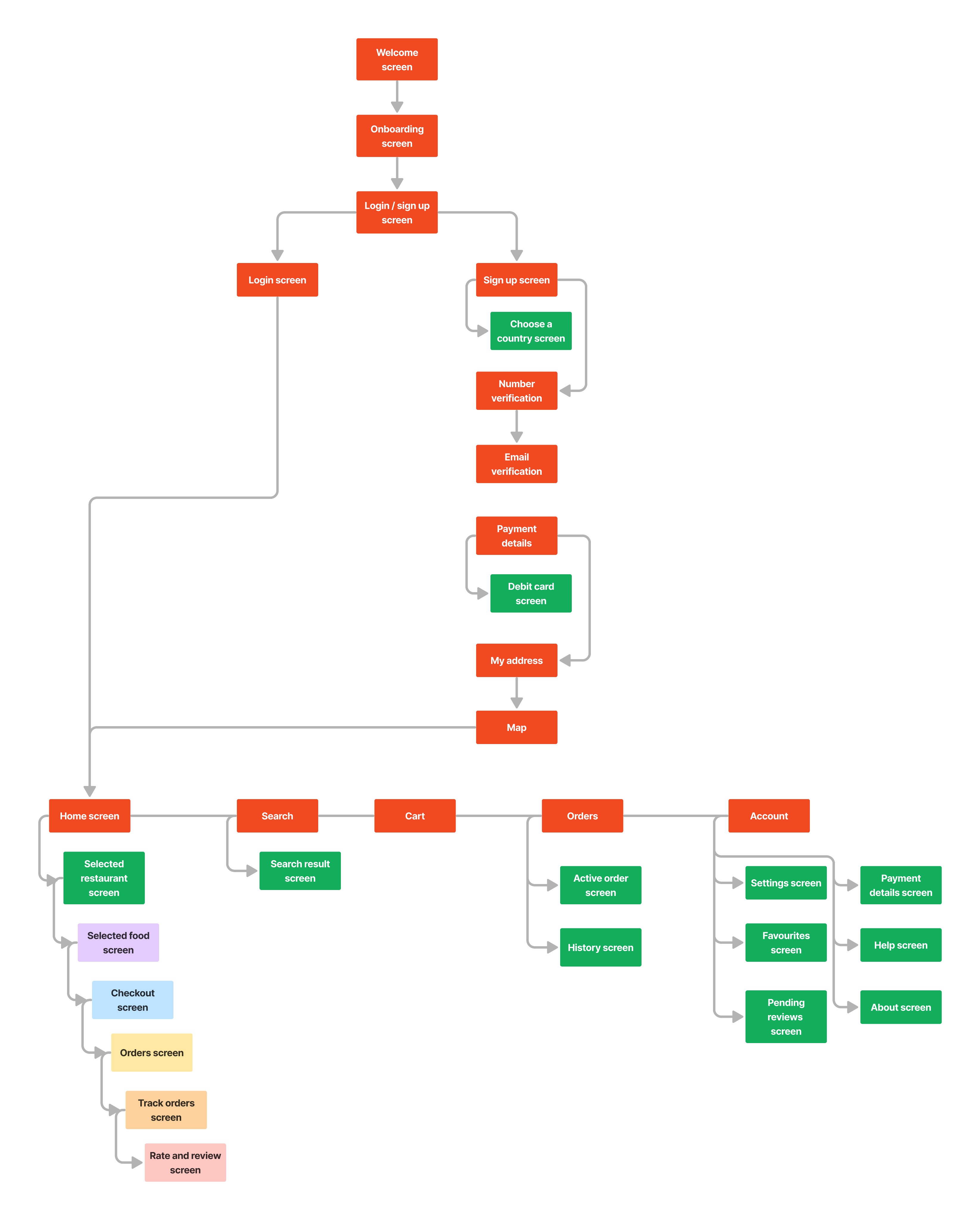
Sitemap
I created sitemaps to show how pages or screens are prioritized, linked and labeled together.
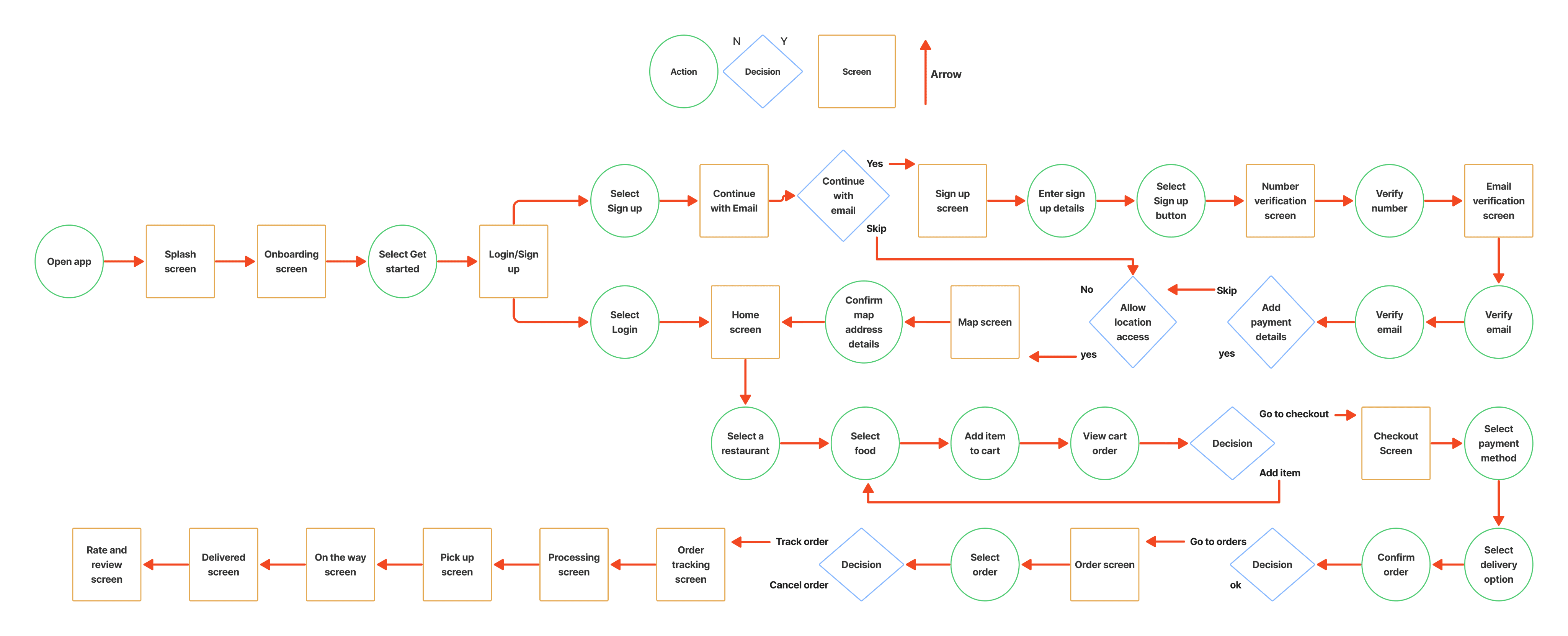
Userflow
The userflow represented users path through the app and the process a user will take to perform a task from start to finish.
User Task: Use the Fastchaw app to order food from a restaurant and track your order real-time.
Wireframes
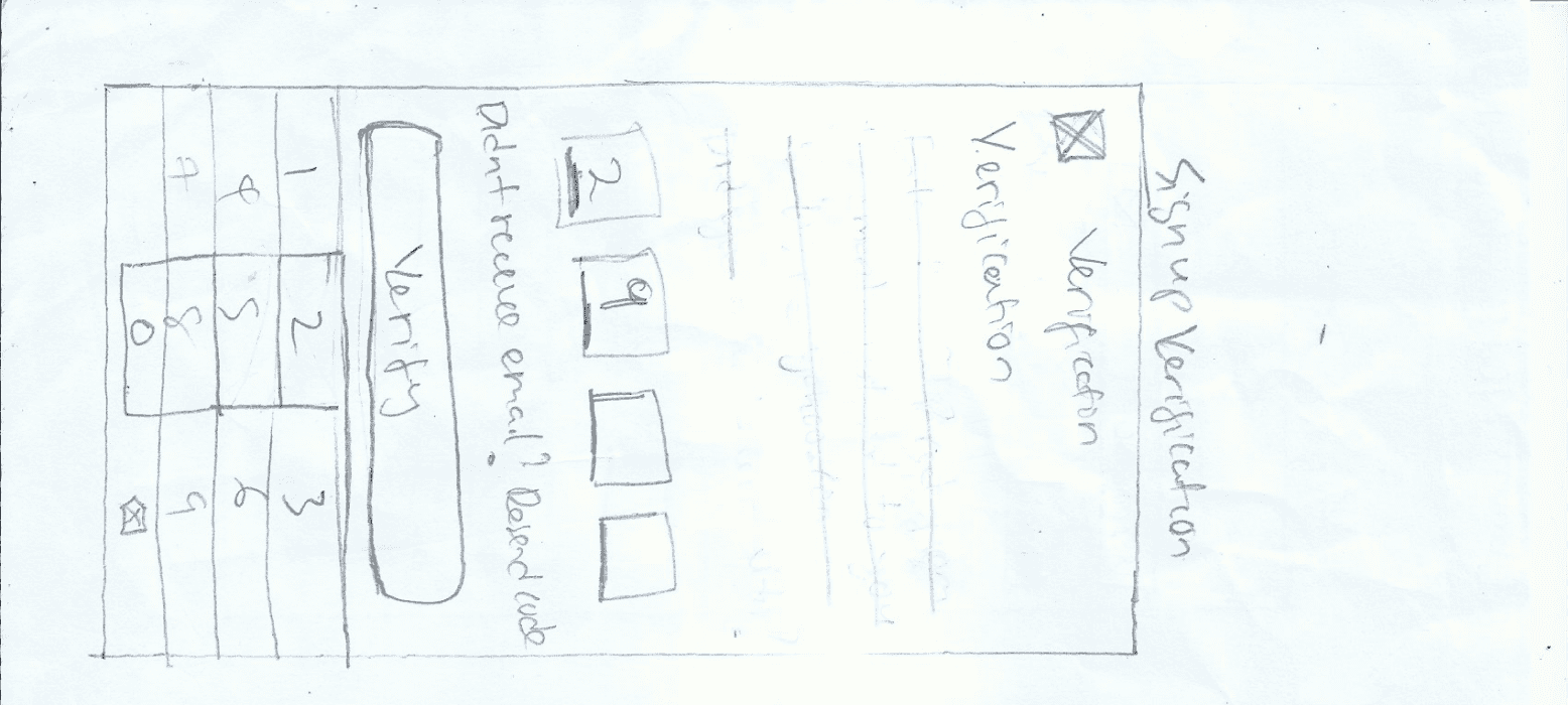
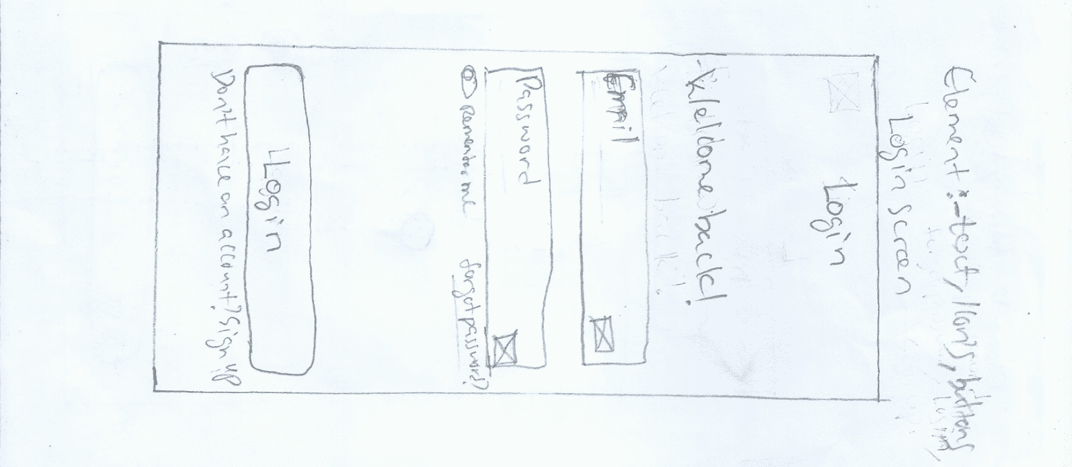
At this time i started to bring all my design to life by starting with paper wireframes, then digital wireframes. The paper wireframes represented a rough sketch of my design idea and what i intend to solve based on my user research findings.
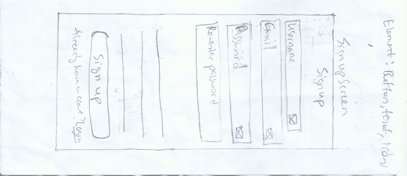
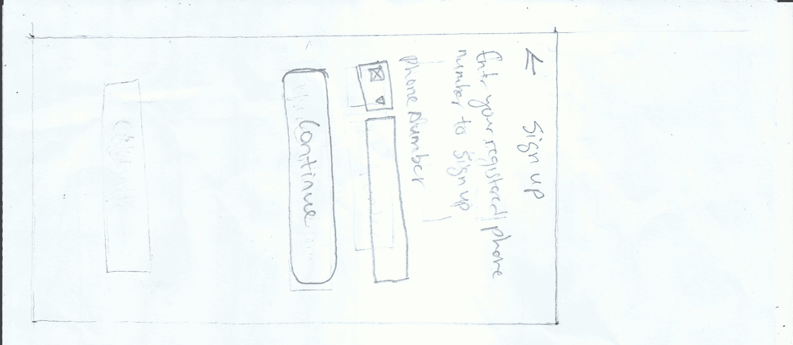
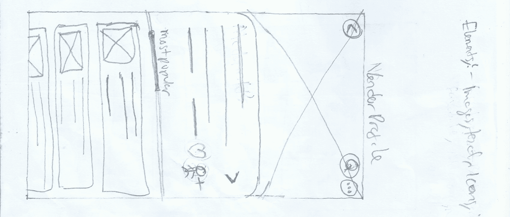
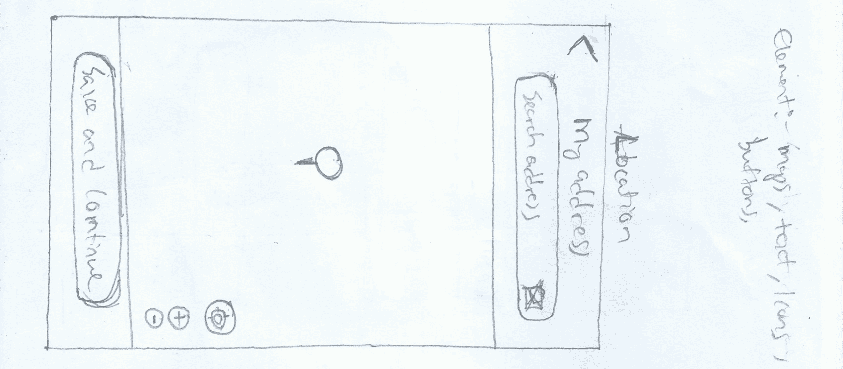
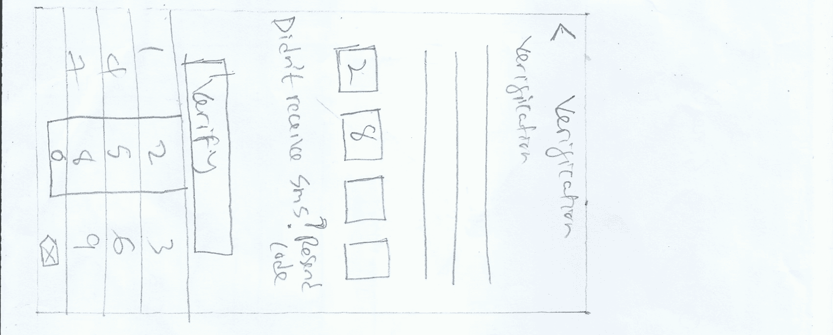
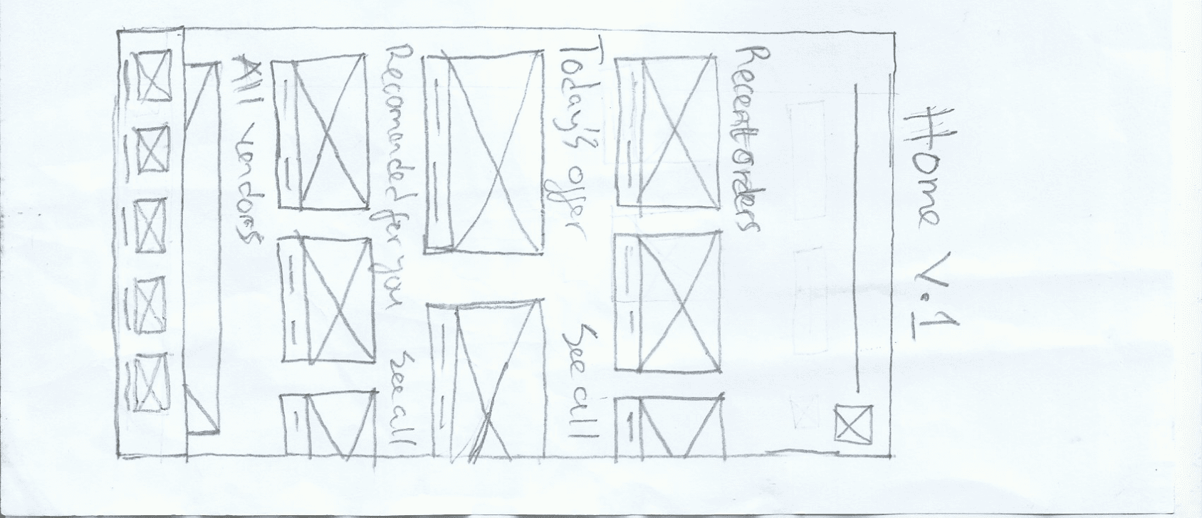
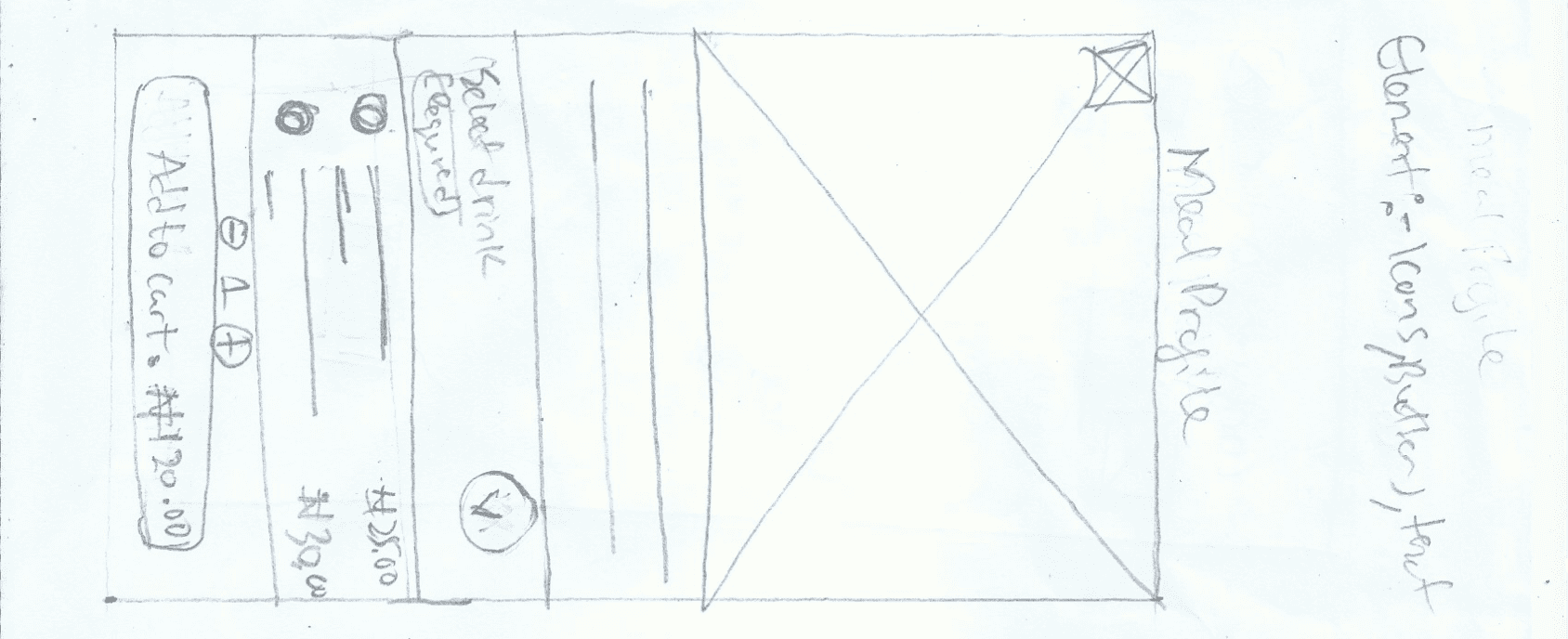
Paper wireframes
The sketches below are some of the paper wireframes screens I sketched for the food delivery app design.

Digital wireframes
This is a low fidelity representation of the intended design solution. This design also addresses users painpoints i identified.
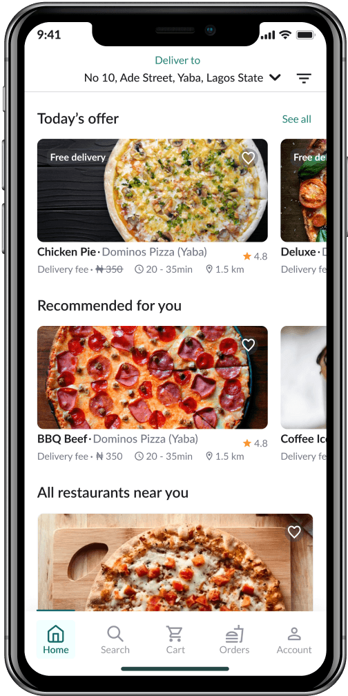
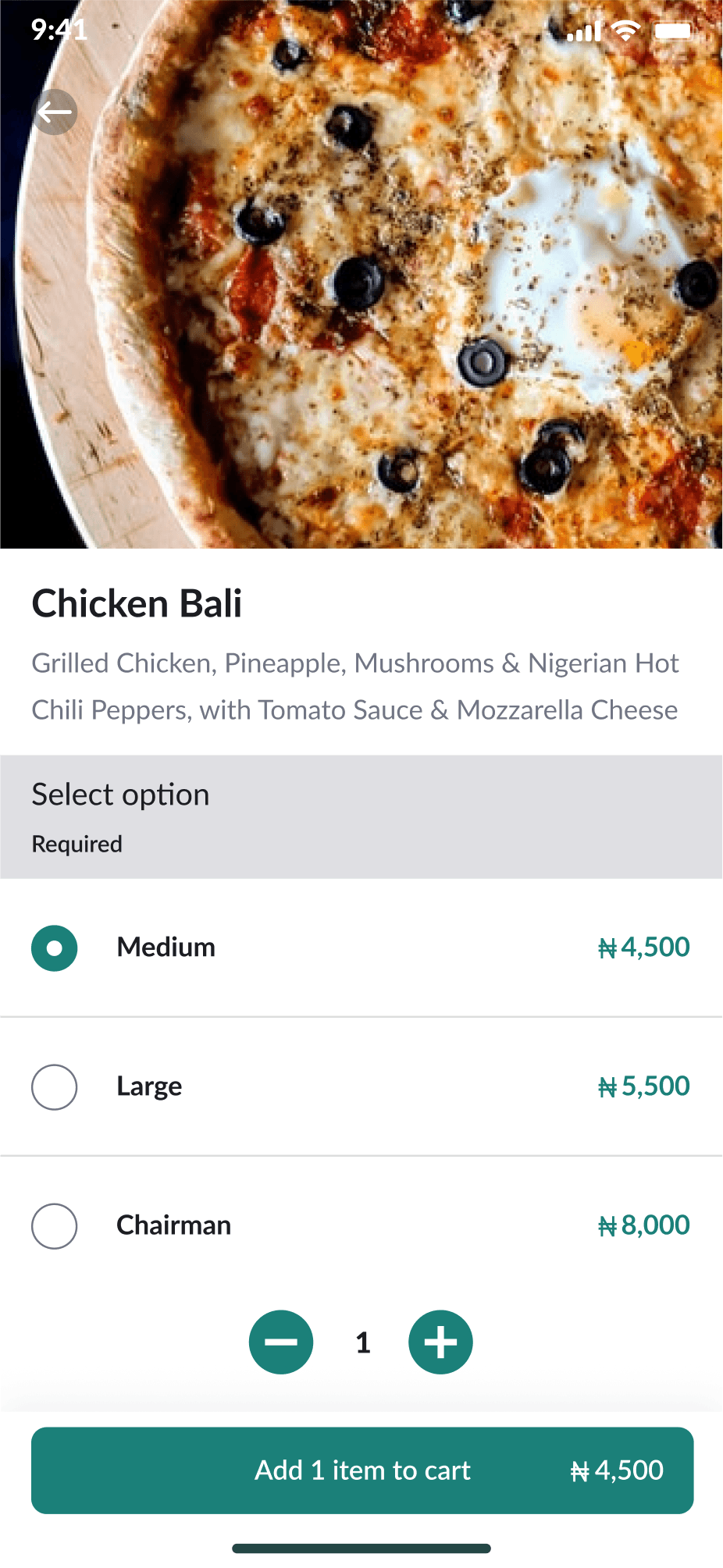
I made sure to base screen designs on feedback and findings from the user research. For the home screen I prioritized giving users different food options and vendors to choose from.
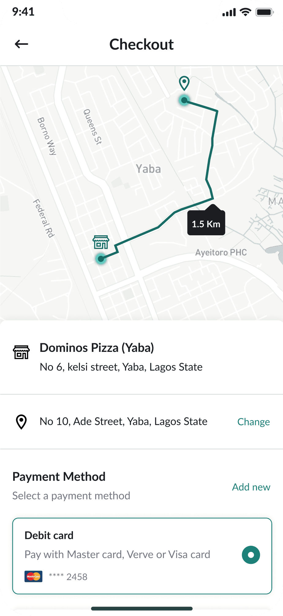
The pay-on-delivery payment option was also a key user need to be addressed in this design.
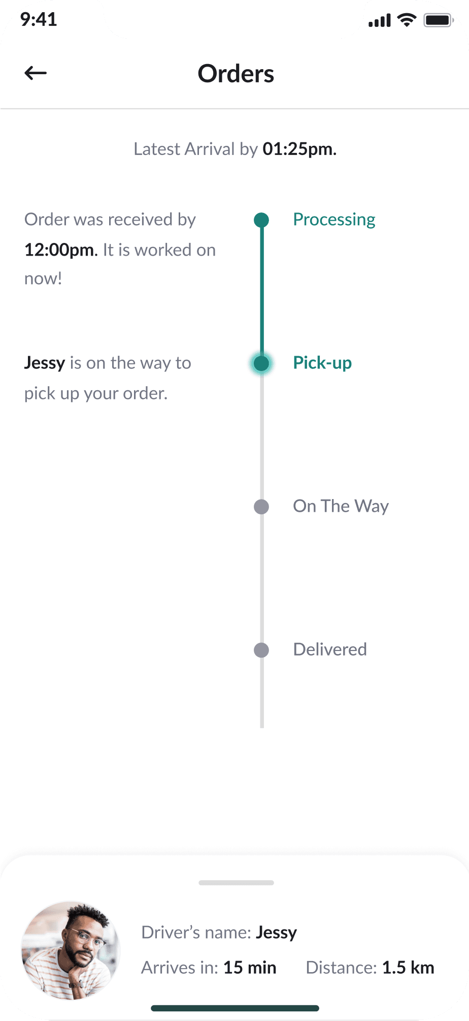
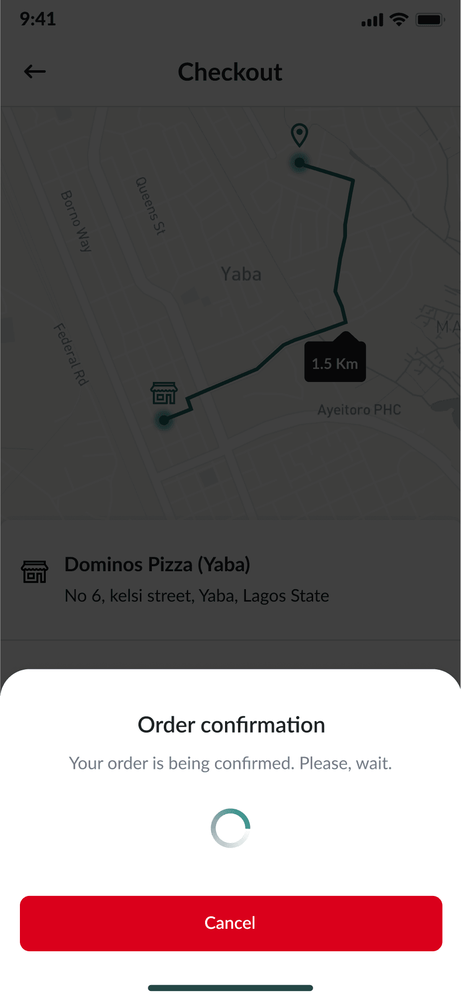
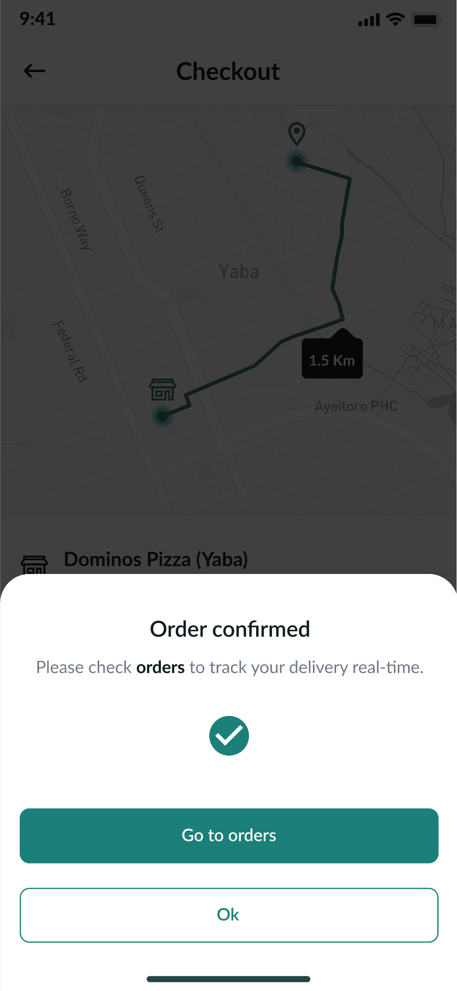
Real-time feed on the delivery process was also a key user need to be addressed in this design in addition to details of the time of delivery.
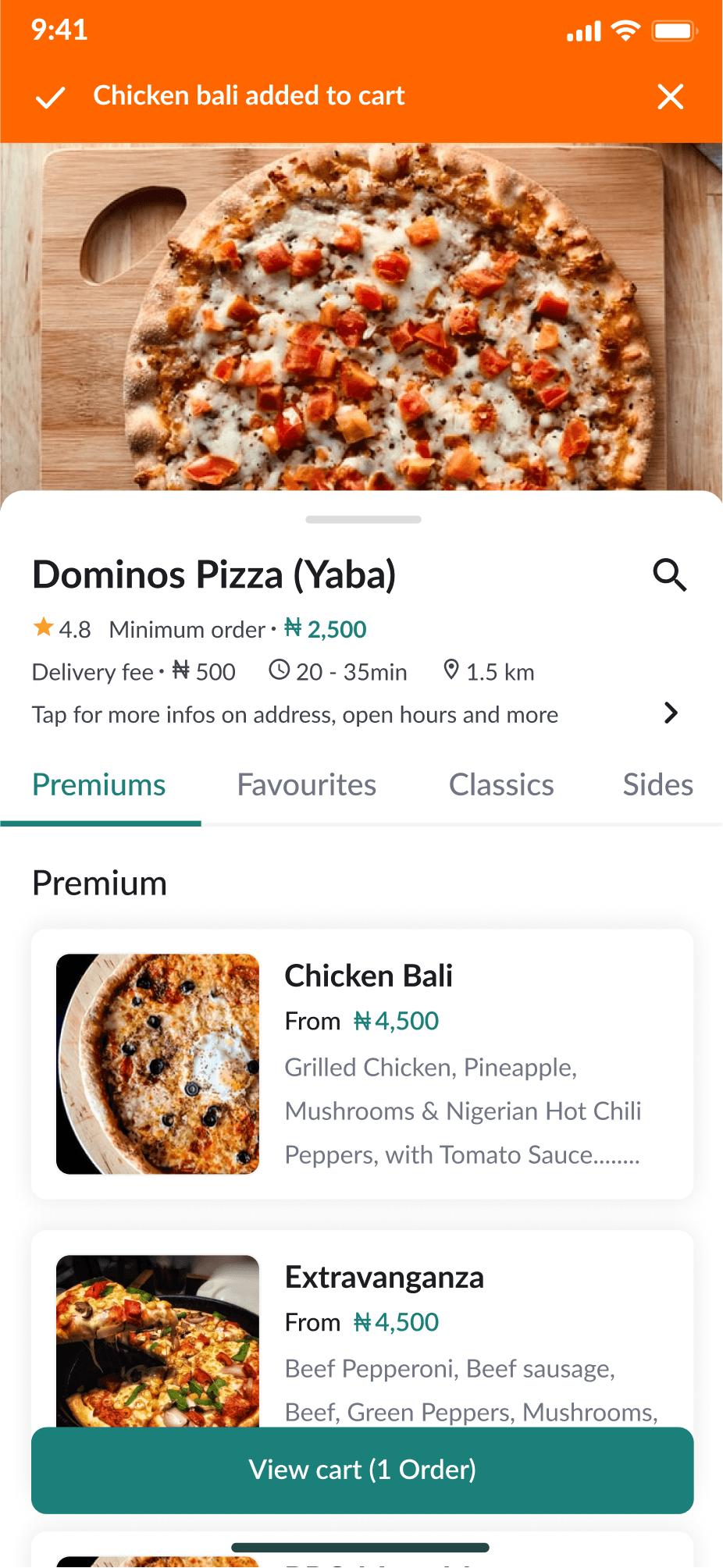
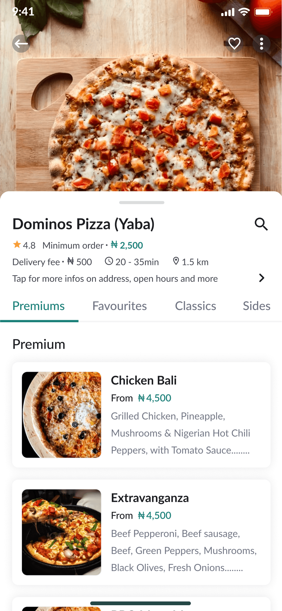
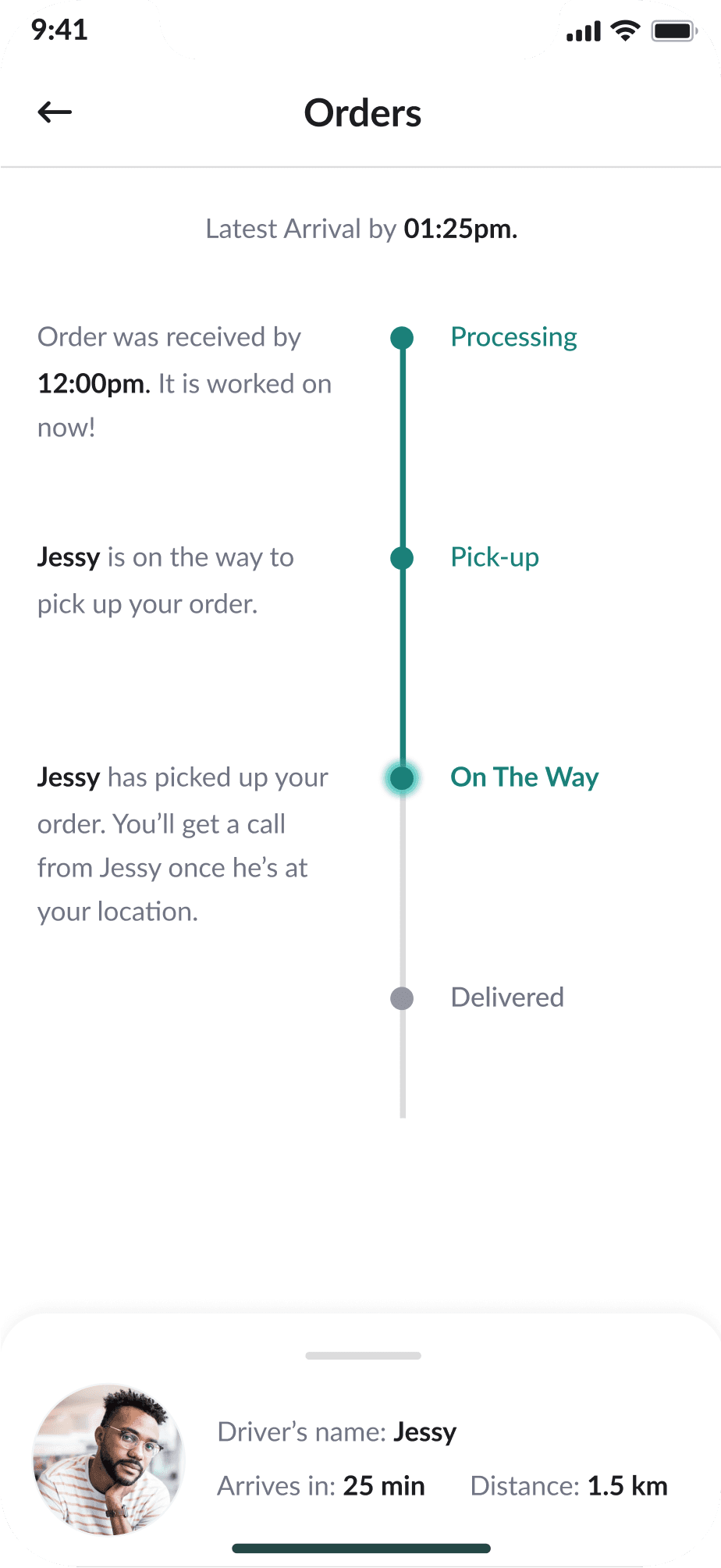
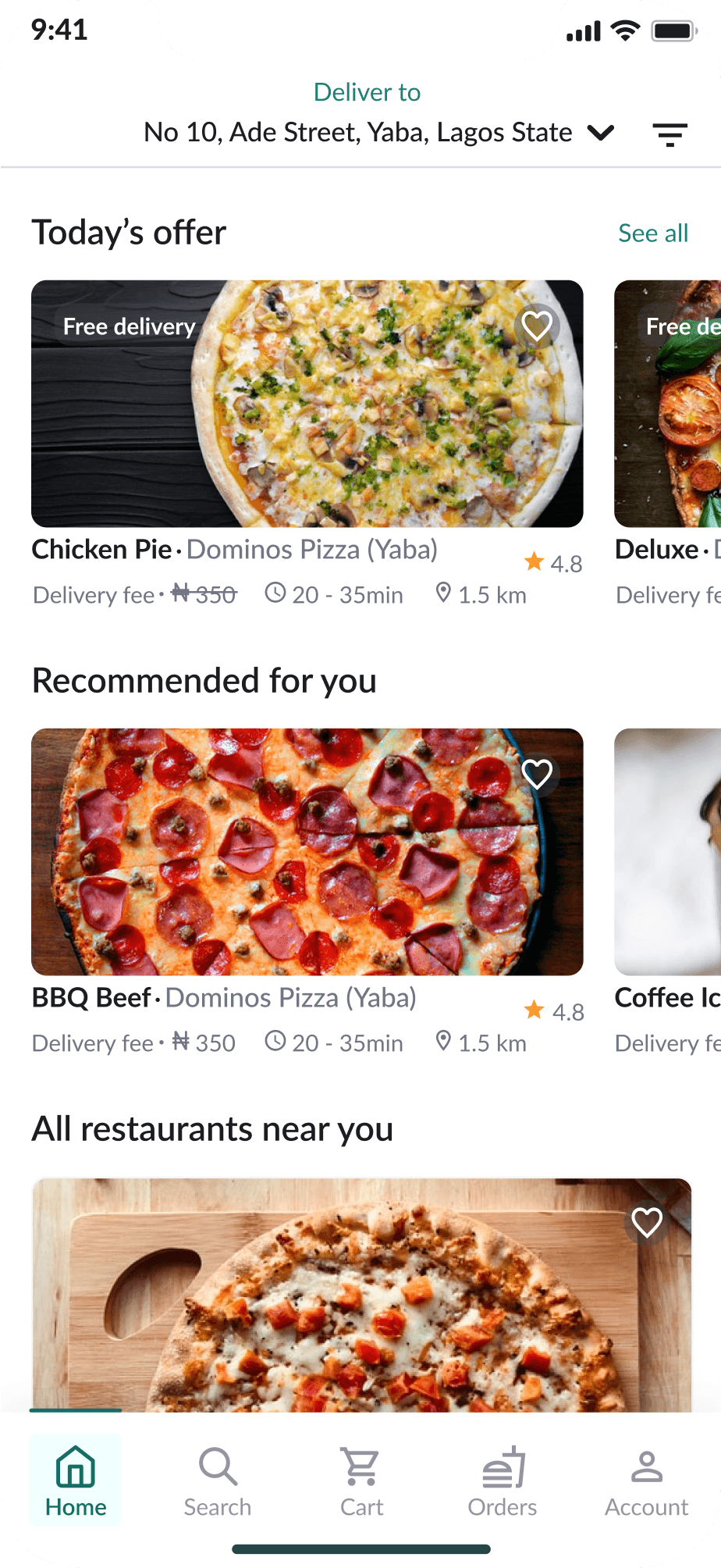
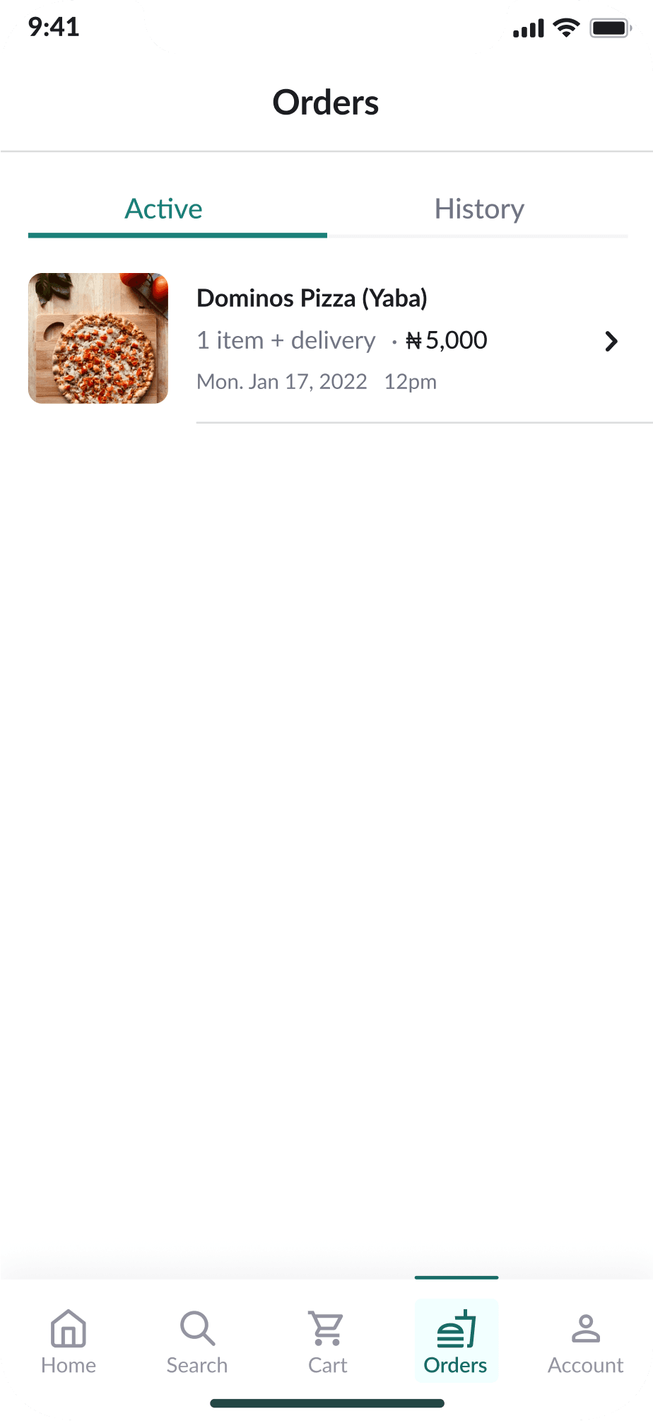
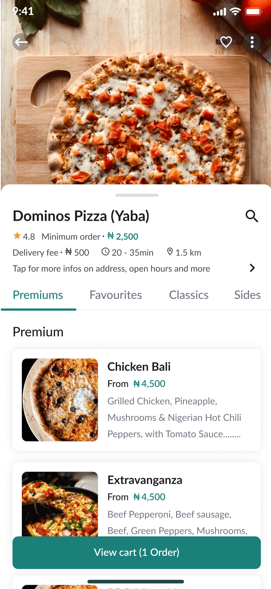
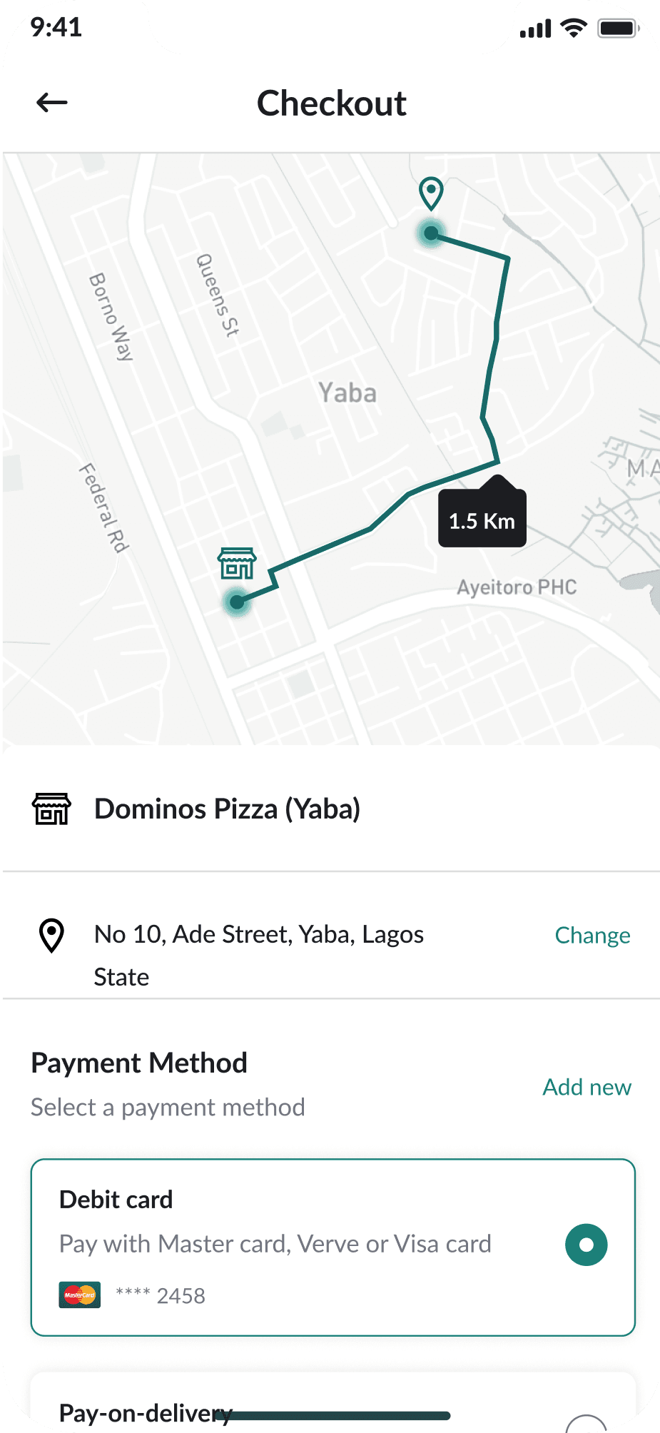
This is the home screen that offers user easy access to different vendors within their environment and also access to recent orders, interesting offers of the day, and orders recommended for users..


This shows the item you ordered.
Access to different payment method such as pay-on-delivery.
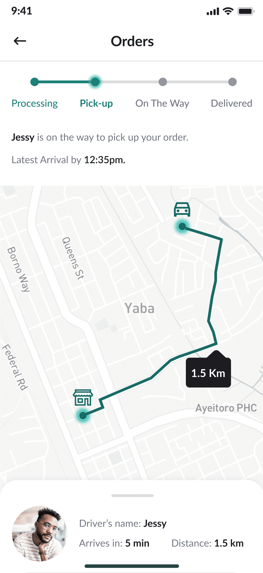
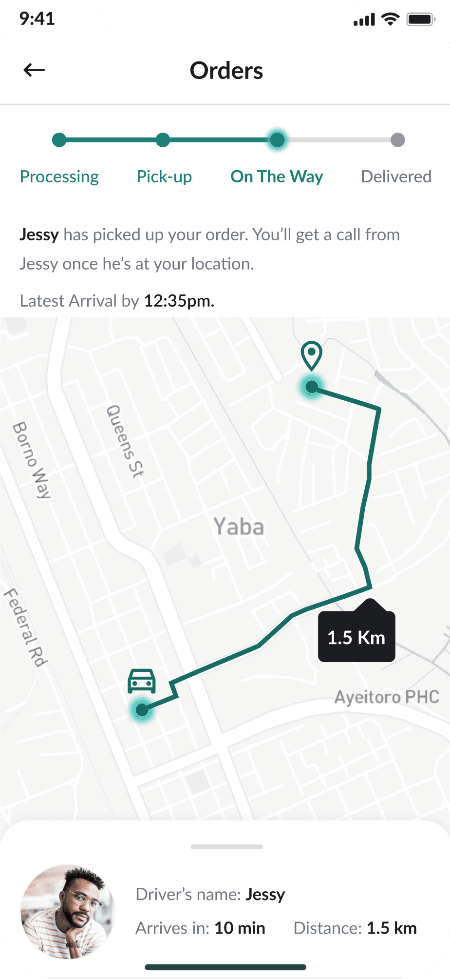
This shows what stage your delivery is.
This tells you the expected time and latest time of your delivery.
This shows realtime feed of where your order is.
This tells who your delivery personel is.
Low fidelity prototype
After creating my low fidelity wireframes, I prototyped the frames. The low fidelity prototype is a simple, interactive model that provides a basic idea of what the app would look like.
Low fidelity test
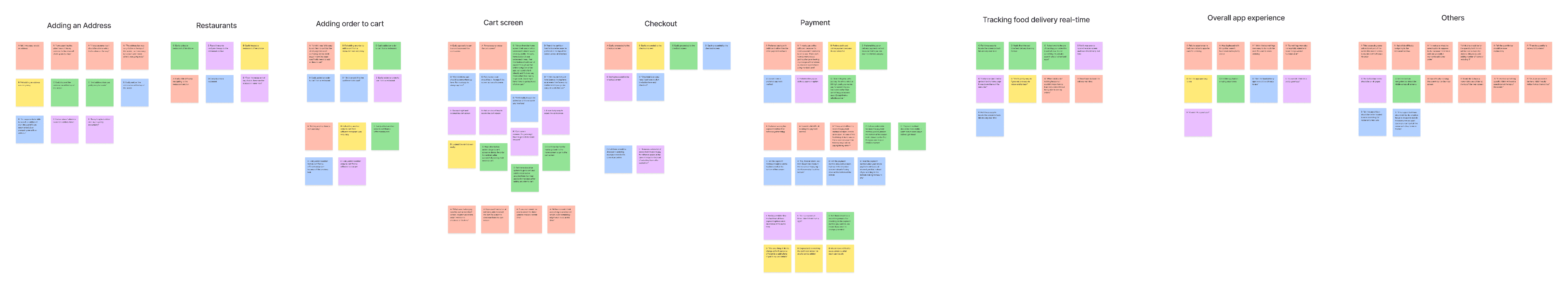
After prototyping the wireframe, I carried out a usability study on the low fidelity wireframes to test the functionality of the app, answer research questions, generate key performance indicators, and get users feedback. I created a research plan, and conducted the usability study on five participants from ages 20 - 60 years that order food from food delivery apps at least three times a month since they are my target audience. After the study was conducted, I created themes or patterns, and generated insights using an affinity diagram.


After usability test


The low fidelity usability study revealed frustrations with accessing the payment options on the checkout screen. Users wanted to see how they would pay for their items first, rather than scrolling to the bottom of the checkout screen. To solve this, I moved the payment option from the bottom to the top of the check out screen.

Before usability test

After usability test
Mockups
At this point I created a style guide or UI kit to ensure consistency across my high fidelity designs. My design was refined and improved to suit users needs and provide an easy navigation process for users.
Mockup screens


High fidelity prototype
After creating my mockups, I prototyped the frames. The high fidelity prototype is a simple representation of how the final product will look like. The final high-fidelity prototype presented cleaner user flows for ordering a meal. It also met user needs.
High fidelity test
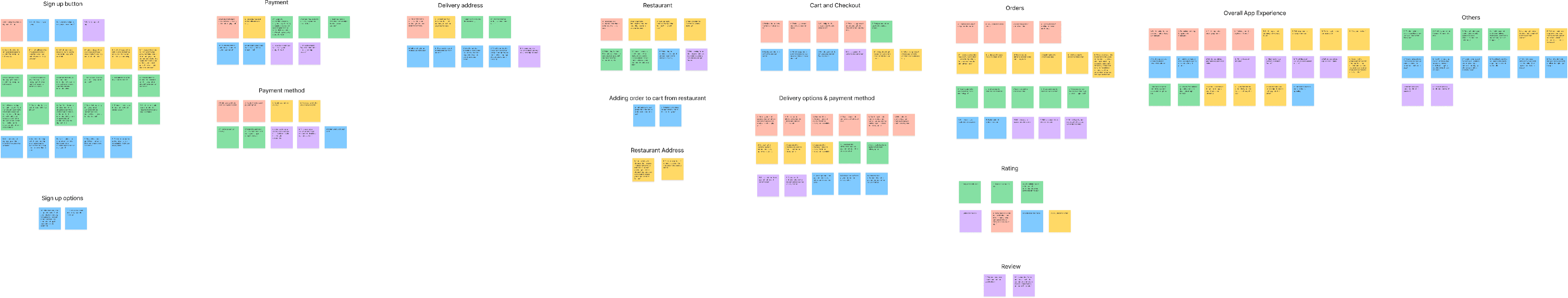
After prototyping my high fidelity designs, I carried out another round of usability study to test final screens and get users feedback. In order to do this, i created a research plan, and conducted the usability study on five participants from ages 20 - 60 years that order food from food delivery apps at least three times a month. After I conducted the usability study, I created themes or patterns, and generated insights using an affinity diagram.
Findings
Findings from the High fidelity prototype usability study helped me to understand where users might face some issues in the final product. Some findings were:
Users needed a way to know the sign up page was scrollable, so I added a scroll bar on the sign up screen to indicate continuation.
Users would like to have different sign-up options.
Users would like to be notified when an order has been successfully added to cart.
Users would like to re-confirm the address of the restaurants they are ordering from right before checking out.
Users would like to comment and give feedbacks on ordered food.
The high fidelity usability study revealed frustration with accessing different sign-up options. To solve this, I added different sign-up options such as Google, Facebook, and Apple.
The high fidelity usability study revealed frustration with users not being notified when an order has been added to cart. To solve this, I added a notification that pops-up upon adding an order to cart.
The high fidelity usability study revealed frustration with reconfirming the address of the restaurant being ordered from on the checkout screen. To solve this, I added the restaurant address to the checkout screen.

Before usability test

Before usability test
Before usability test
Before usability test

Before usability test

After usability test

After usability test

After usability test

After usability test

After usability test
BRAINSTORM
BRAINSTORM
Understand THE goal
Overview
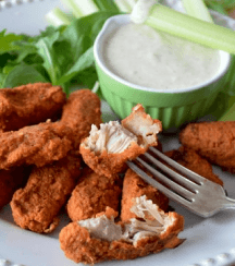
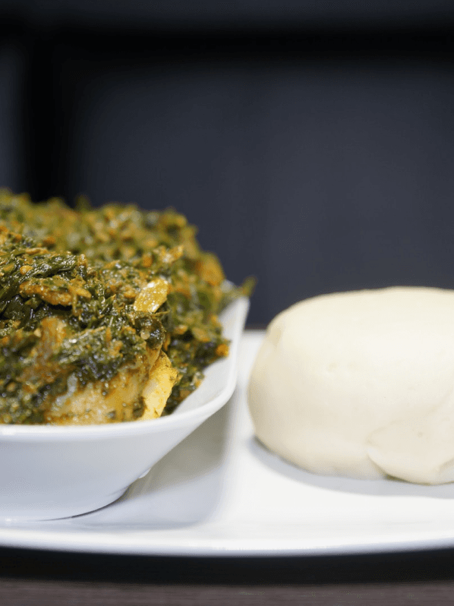
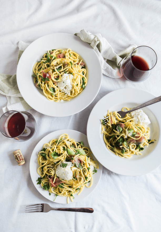
Retail food delivery is a courier service in which a restaurant, store, or independent food-delivery company delivers food to a customer. An order is typically made either through a restaurant or grocer's website or mobile app, or through a food ordering company.
The food industry has gone through a significant revolution over the recent past. Customers can now easily order food online and have it delivered to their homes within the shortest time possible. In fact, the growth rate for online food ordering and restaurant delivery has been over 20% over the last five years. Although the estimates differ across locations, online food delivery rates are expected to grow to more than $220 billion by 2025. This translates to about 40% of the total restaurant sales.
Background
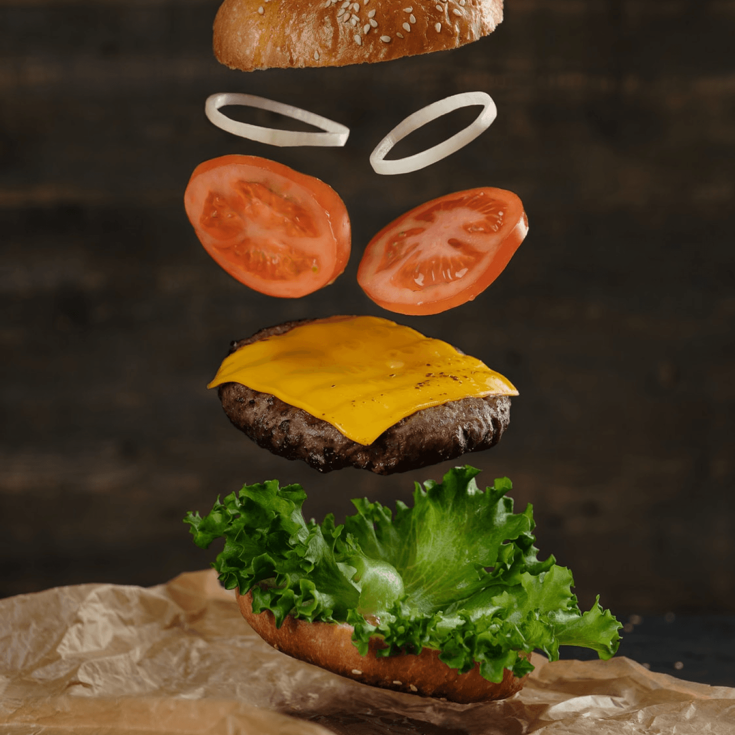
FastChaw is a food delivery app that aspire to deliver healthy meals from different restaurants of your choice within your environment. They offer a wide spectrum of competitive food prices. FastChaw targets customers like remote workers, office workers and people who generally don’t have time to prepare a meal or just want to get a bite of something tasty as soon as possible.
Challenge
With all the different activities one has to take part in each day, it’s challenging preparing meals at home. Busy workers lack the time necessary to prepare a meal and would like to have access to good and healthy meals to satisfy their hunger.
The goal
Design an app FastChaw that allows users to easily order healthy and tasty meals from their surrounding and favourite restaurants.
Responsibilities
Conducting interviews, paper and digital wireframing, low and high-fidelity prototyping, conducting usability studies, accounting for accessibility, and iterating on designs.
Key performance indicators
I generated key performance indicators to measure the success of the product at low fidelity. Examples of KPIs used were: Drop-off rates, Conversion rate, System usability scale (SUS).
Drop-off rates: 20% of participant didn’t make it to the end of the flow. This is 1 out of 5 participants.
Conversion rates: 80% of participant made it to the end of the flow. This is 4 out of 5 participants.
System usability scale (SUS): 79 score was the average mark for the SUS, which is a B grade indicating the product is good.
Findings
Findings from the Low fidelity prototype usability study helped guide the designs from wireframes to mockups.
Users need the cart screen to be more accessible.
Users want to see their payment options at the top of the checkout screen rather than scrolling to the bottom.
The low fidelity usability study revealed frustrations with accessing the cart screen. To solve this I added a “Go to cart” button that pops up immediately an order has been added to cart.
Key performance indicators
I also generated key performance indicators to measure the success of the product at high fidelity. Examples of KPIs used were: Drop-off rates, Conversion rate, System usability scale (SUS).
Drop-off rates: 0% of participant didn’t make it to the end of the flow. This is 0 out of 5 participants.
Conversion rates: 100% of participant made it to the end of the flow. This is 5 out of 5 participants.
System usability scale (SUS): 88 score was the average mark for the SUS, which is an A grade indicating the product is excellent.
Accessibility considerations
I followed the Web Content Accessibility Guildlines (WCAG), which explains how to make web content more accessible to people with disabilities. When designing this product, some accessibilty considerations I made were:
Adding ALT text to images.
Used colors that passed the Web Content Accessibility Guildlines luminosity ratio.
Used icons to help make navigation easier.
Used detailed imagery for different food types to help all users better understand the designs.
Impact & Takeaways
Positive User Reviews: Users praised the app's user-friendly design, intuitive interface, and comprehensive features in user testing.
Customer Satisfaction: User surveys indicated a 100% satisfaction rate with the FastChaw food delivery user experience, highlighting the success of the user-centered design approach.
One quote from peer feedback: “I really think this is the best food delivery app I have ever used. It’s really neat and user friendly. I love it”
What I learned
When designing the FastChaw app, I learned that the first ideas for the app is only the beginning of the process. Usability studies and peer feedback influenced each iteration of the app design.
Next steps
Conduct another round of usability studies to validate whether the pain points users experienced have been effectively addressed.
Conduct more user research to determine any new areas of need.
The high fidelity usability study revealed frustration with giving feedback after an order has been delivered. To solve this, I added a “write a review” button to the rating modal.


Affinity diagram
The high fidelity usability study revealed frustration with accessing the sign-up button. To solve this, I reduced the distance between the sign up button and the input labels. I also added a scrollbar to indicate the screen was scrollable.
Affinity diagram
Let’s create awesome products together, feel free to contact me to see how we can collaborate.
©2025