Role: Product designer
Year: 2022
Tools used: Figma, Adobe XD
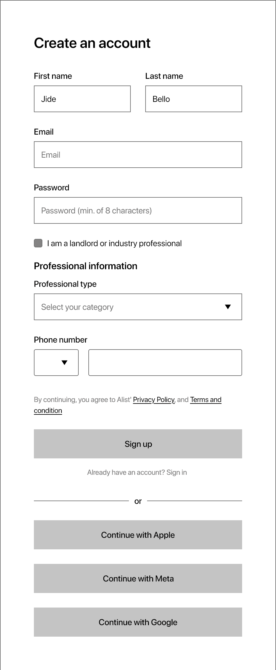
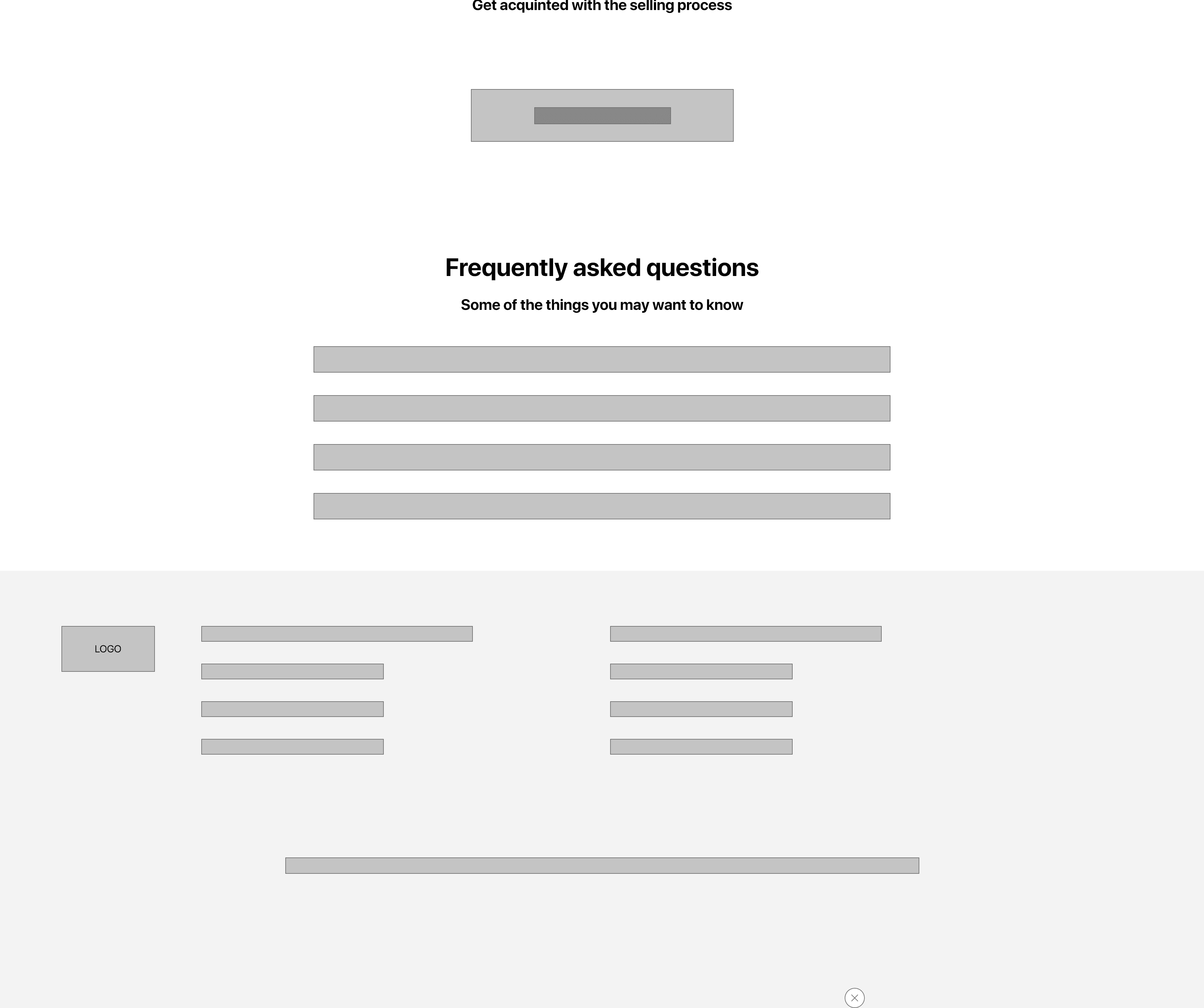
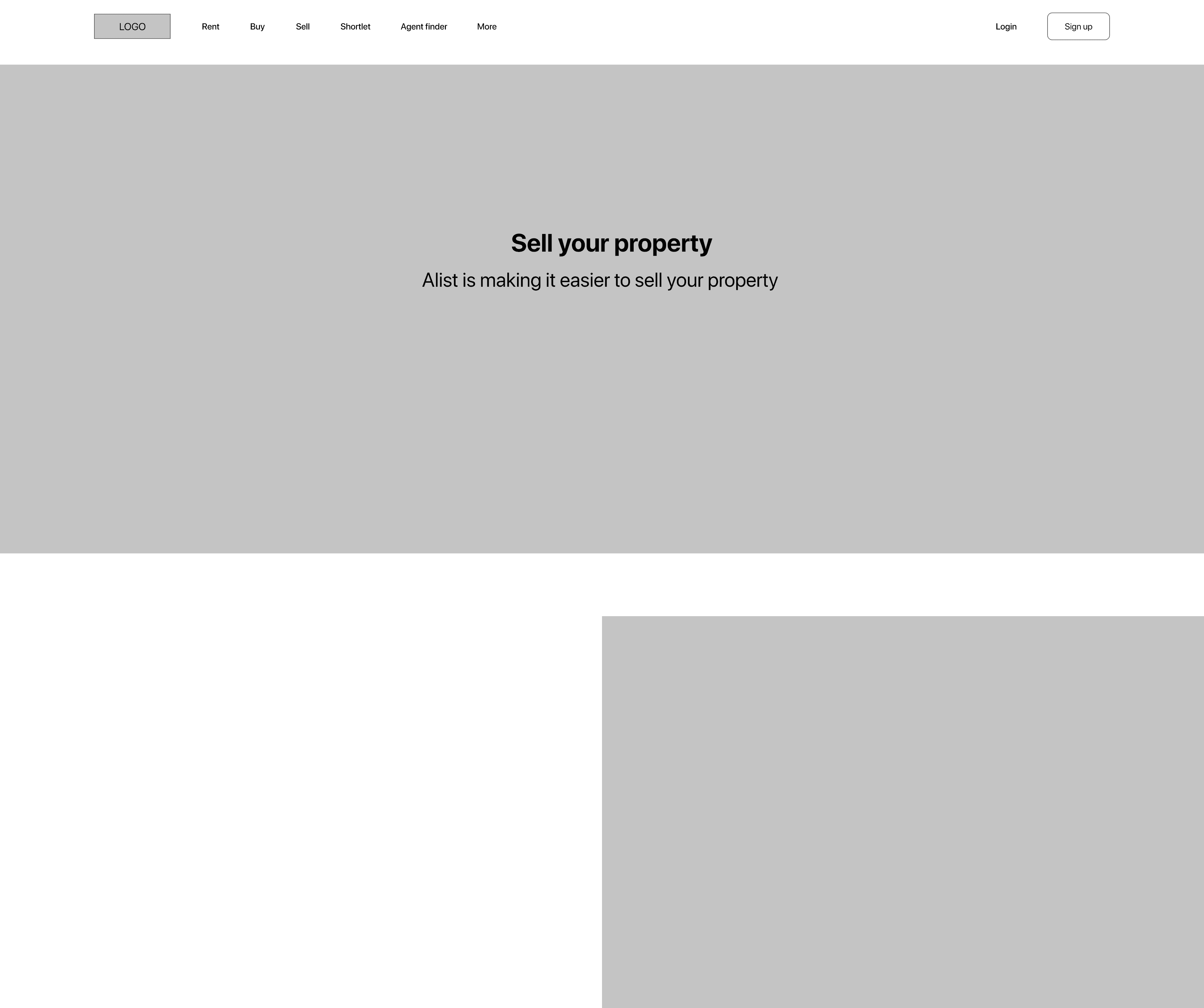
Alist: A Responsive Real Estate Website & Webapp
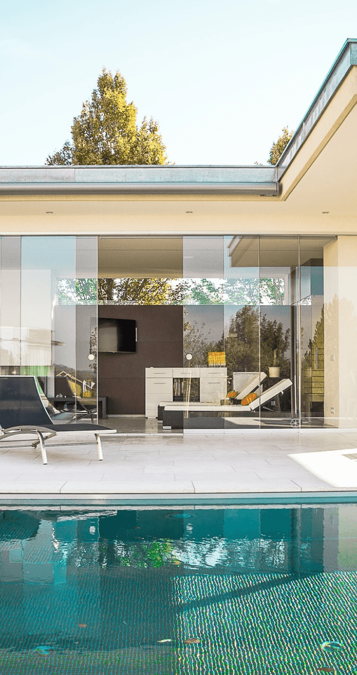
Brainstorm
Brainstorm
Overview
Real estate is equity (that consists of land or buildings) or a large variety of properties. A real estate business, therefore, is the system of buying, selling, or renting a property, building, home, or land.
In Nigeria, there is a constant demand for residential lodgings, office facilities, and commercial outlets. The search to either buy or rent buildings and structures of your preference could prove to be a Herculean task, and so sometimes, you would need the services of a real estate agent or expert.
Real estate investment in Nigeria is one of the major investments attracting both local and foreign investors from the commercial city of Lagos to the centre of power, Abuja, several individuals and companies engage in real estate investment.
In 2021, the GDP of the Nigerian real estate industry recorded a positive growth, a 2.3% increase from ₦3.96 trillion recorded in the previous year. Housing Development Advocacy Network (HDAN), predicts a growth rate of 2.9% for the country’s Real Estate sector in 2022.
Background
Alist is a real estate website that strives to deliver quality, affordable and detailed real estate properties in Nigeria. Alist offers a wide range of property types in various locations in Nigeria. Alist targets customers are people seeking to rent, buy, sell, or shortlet affordable properties. Alist goal is to make securing a real estate property fast and easy for all types of users.
Challenge
Securing a real estate property is very tedious and stressful in Nigeria because the available platforms for searching and securing properties either don’t exist, aren’t visually standard or appealing enough, or have unvetted real estate agents that tend to be fraudulent and don’t care about client satisfaction, which leads to little or no trust from the users trying to secure a property.
The goal
Design a real estate website that allows users to have easy access to detailed, visually appealing and vetted real estate properties that focuses on user satisfaction inorder to improve trust and also to provide real estate agents that care about clients satisfaction.
Responsibilities
Conducting interviews, paper and digital wireframing, low and high-fidelity prototyping, conducting usability studies, accounting for accessibility, iterating on designs and responsive design.
Understand your goal
Define the audience
The audience
The real estate website is aimed at users that want to acquire or lease real estate properties for different purposes.
Giving that there will be various types of people who have significantly different motivation for using this product, i’m grouping them into two different groups:
Regular people: These are high-level audiences that want to rent properties, buy properties, sell their own properties, and shortlet properties on the website.
Real estate agents: These are audiences that want to sell properties, rent properties out, and shortlet properties out on the website.
Empathize
Empathize
I started off by empathizing with users in order to fully understand the user needs and pain points, then I conducted user interviews of 5 adults between the ages of 20 - 55 that secured a property within the last two months. I created individual empathy maps for each user I interviewed in order to understand the users I am designing for, then I created an aggregated empathy map, took down user pain points, created personas, created user story, and user journey map.
Research also revealed that users felt real estate websites are not visually appealing.
Pain points
Pain points identified in the research phase were:
Navigation
Experience
Cost
My design process
My design process
Brainstorm
Empathize
Ideate
Prototype
Test
Define
1
Navigation
Wants better navigation and filter options such as location, price range, and type of apartment.
2
Experience
Wants accurate pictures and details of properties on the website to increase trust.
Wants website to be visually appealing.
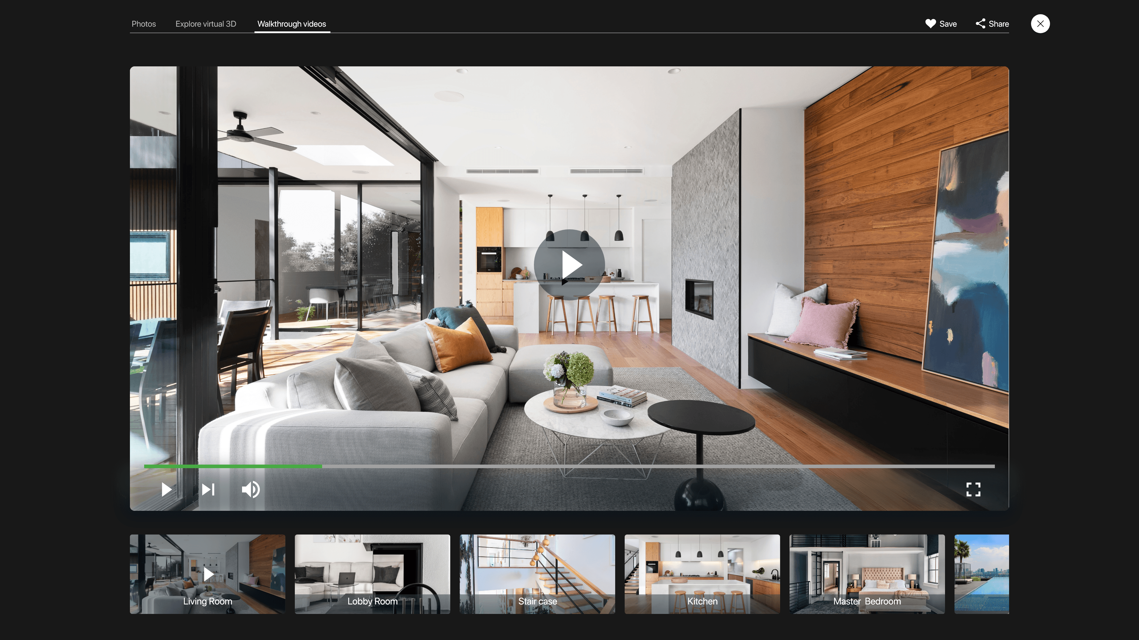
Wants access to map views of property location, 3d views, and walkthrough videos.
Wants access to professional real estate agents.
3
Cost
Wants to know the cost of properties to help quicken decision making.
Persona
After creating an aggregated empathy map and identifying painpoints, I created a persona whose goals and characteristics represented the needs of the larger group of users which is the regular people.

Shola brown
Age: 28
Education: Banking & Finance Degree
Hometown: Ikeja, Lagos
Family: Single, Lives alone
Occupation: Banker
Quote
“Securing a real estate property is very tedious”
Frustrations
“Real estate agents are expensive and always ask for money before taking you anywhere”.
“I want to be able to filter my search based on location, price range and type of apartment”.
“Property owners place priority on displaying expensive properties, they make it more detailed and organized”.
“Pictures they put online are not accurate and ugly”.
“False or improper documentation of most properties on the website”.
“I would like to see a google map view of the surroundings and also walkthrough videos of how the apartment looks like”.
“I would like a total of all cost at once so it can help me make my decisions faster”.
“I would like to see accurate details of the properties on the website such as number of toilets, baths, dimensions e.t.c”.
Goals
Wants more professional real estate agents that are less expensive.
Wants better filter options based on location, price range and type of apartment.
Wants accurate details of property displayed on the website, irrespective of cost.
Wants better and accurate picture quality of properties.
Wants accurate documentation of properties on the website to increase trust.
Wants access to map views of property location and walkthrough videos of the property.
Wants total cost of property to help quicken decision making.
Shola is a 28-year-old banker who lives alone and recently moved to lagos for a job offer in a big banking firm. He finds searching and securing a property for rent, very tedious and frustrating. He is frustrated with the functionality, features and aesthetics of real estate websites and also doesn’t trust the site. He is also frustrated with the agents in charge of managing properties on the website because they are expensive and don’t care about client satisfaction.
User story
So far, my research has uncovered key areas of opportunities, but now I decided to give the persona a story told from the persona point of view to inspire and inform design decisions.
As a busy banker, I want to be able to easily access detailed real estate properties online, So that I can comfortably secure a place to rent and stay.
User journey map
I created a user journey map to show the series of experience a user has while achieving a goal. It shows Shola’s experience using a real estate website to secure a property and also helps identify possible pain points and improvement opportunities.
Goal: Find a real estate website and secure a place to rent and stay.
Choose online real estate website
Browse the catalogue of properties
Choose a property
Confirm if property is available
Acquire and move into property
A. Call agents number on property to confirm availability.
B. Property not available so agent search for property for you.
C. Pay agency fees to the agent.
D. Pay agents transportation fees and follow agent to inspect other properties.
A. Secure a property after tedious searching.
B. Pay 1 year rent fee with other charges.
C. Move into property.
A. Select a property.
A. Apply filter options if available.
B. Search for a property.
C. Scroll through pages of property.
A. Search for real estate websites.
B. Choose a website.
Let website show properties that are available at the moment.
Let website show clear agent details and company profile.
Let website show walkthrough videos of properties.
Let website show location of properties on the map, and clear recent images of properties.
Create a website that has good readable fonts, good luminosity ratio, detailed imagery of different properties.
Include search filter based on location, price range, and type of apartment.
Improve information architecture.
Include proper documentation of properties on the website.
Include total price of properties and other charges on website.
Inquisitive.
Stressed.
Disappointed.
Frustrated.
Satisfied.
Relieved.
Eager.
Felt excluded (no accessibility option).
Excited.
Optimistic.
Optimistic.
Action
Task list
Feelings adjective
Improvement opportunities
Define
Define
I created a problem statement that is a clear description of the users needs that should be addressed.
Problem statement
Shola is a busy banker who needs easy access to detailed real estate properties because he wants to comfortably secure a place to rent and stay.
Ideate
Ideate
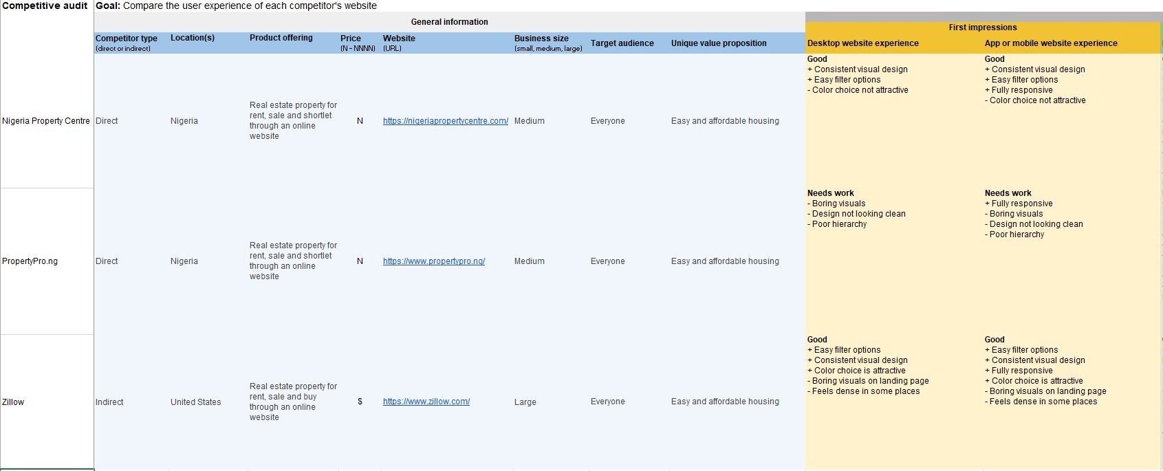
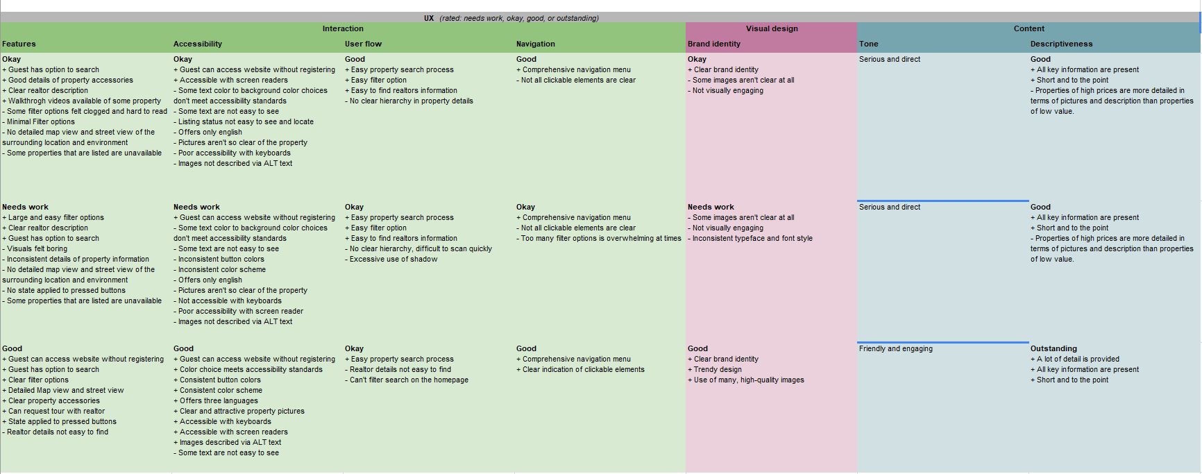
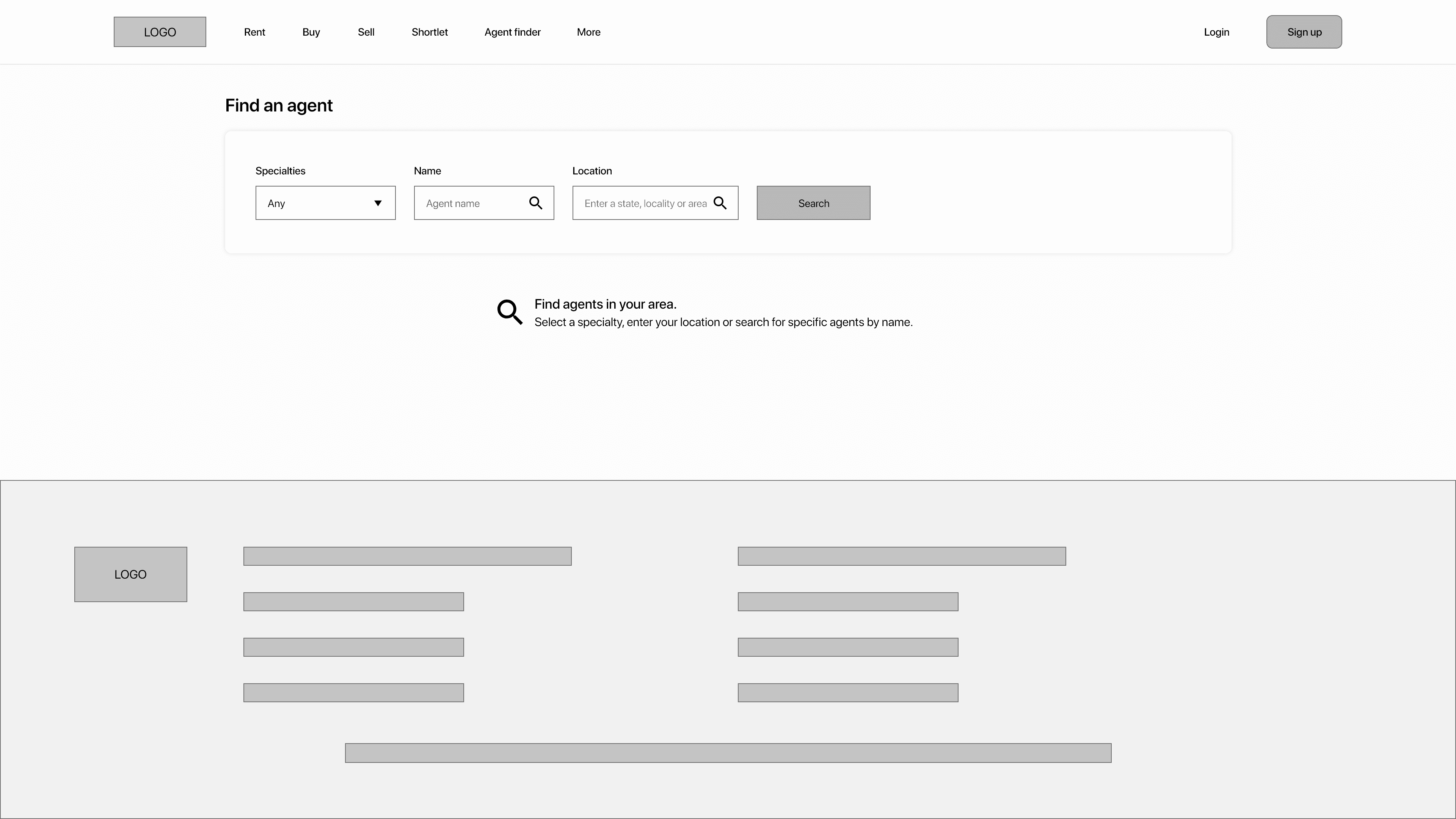
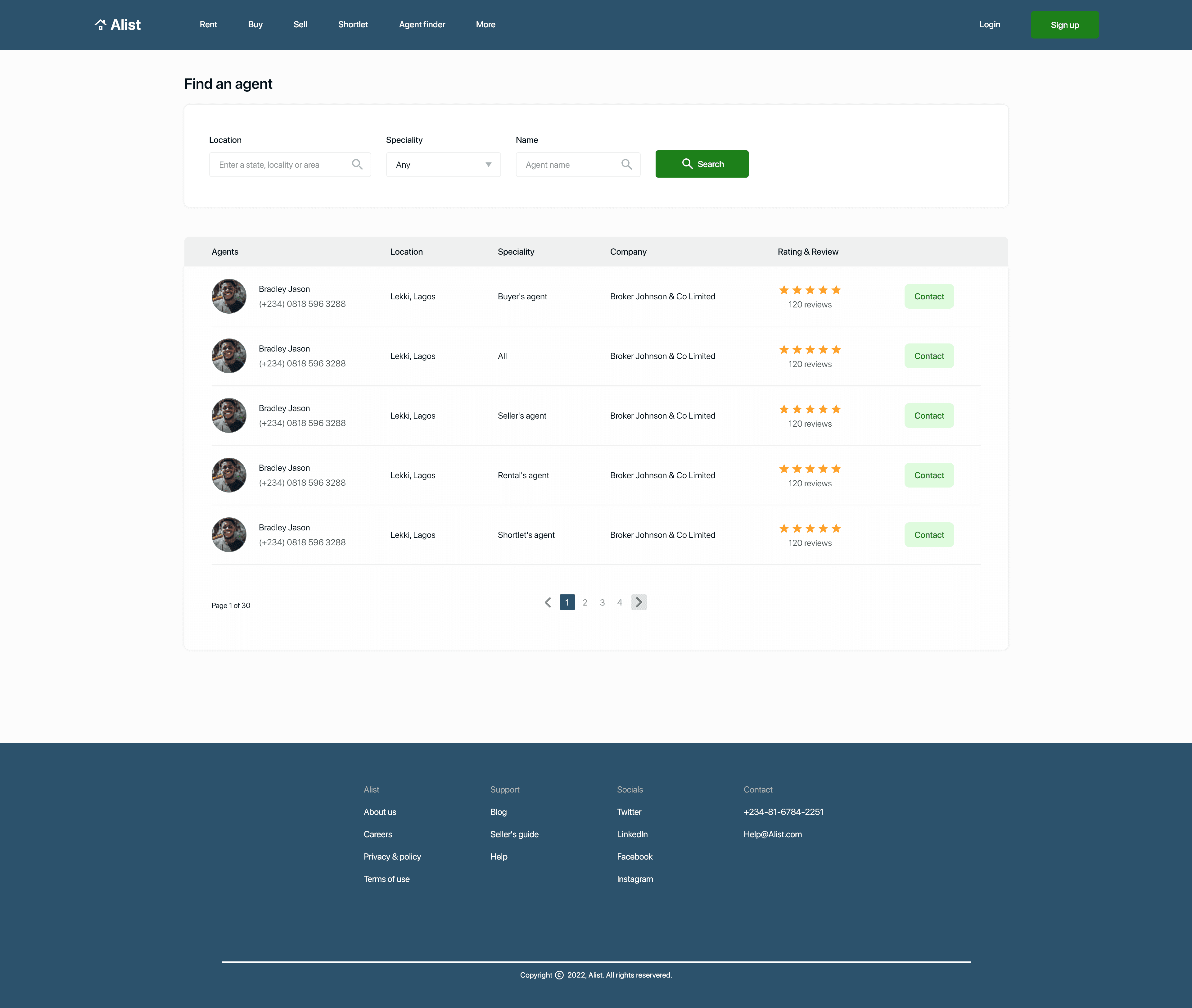
During the ideation stage I carried out competitive audit of my direct and indirect competitors to know their strenghts, weaknesses, how they place themselves in the market, gaps and opportunities. This gave me an idea of how the products available are. I compared two direct competitors (Nigeria Property Centre and PropertyPro.ng) and one indirect competitor (Zillow)
Competitive audit
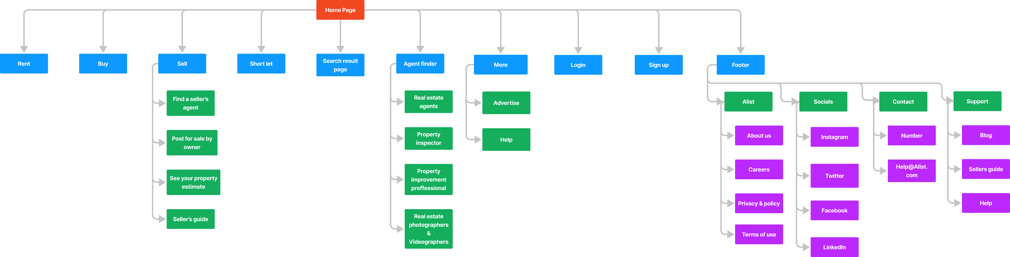
Information architecture
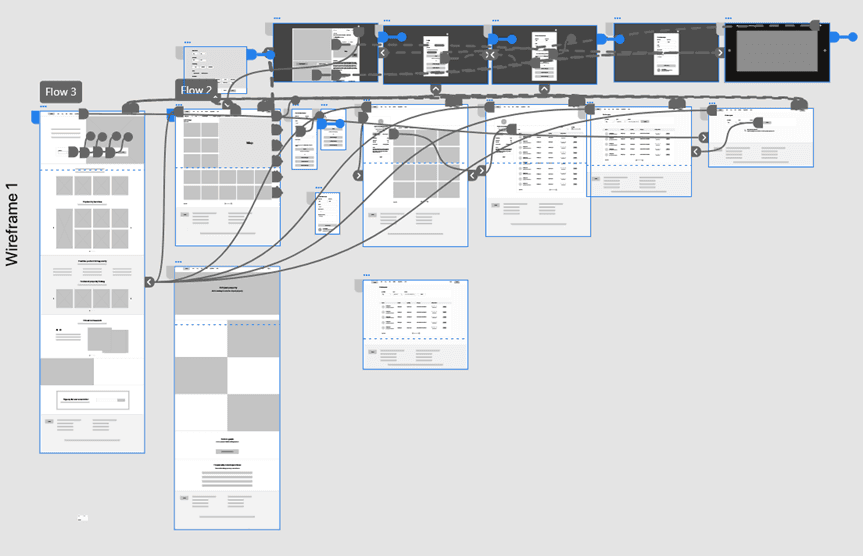
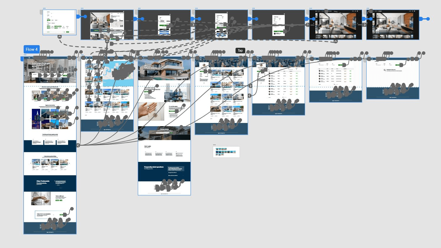
The information architecture shows how content are organized on the website. I created a sitemap and userflow. I used the hierarchical website structure when createing my sitemap to show how pages are prioritized, linked, and labelled. My goal here was to make strategic information architecture decisions that would create an easy overall website navigation.
Sitemap
User flow
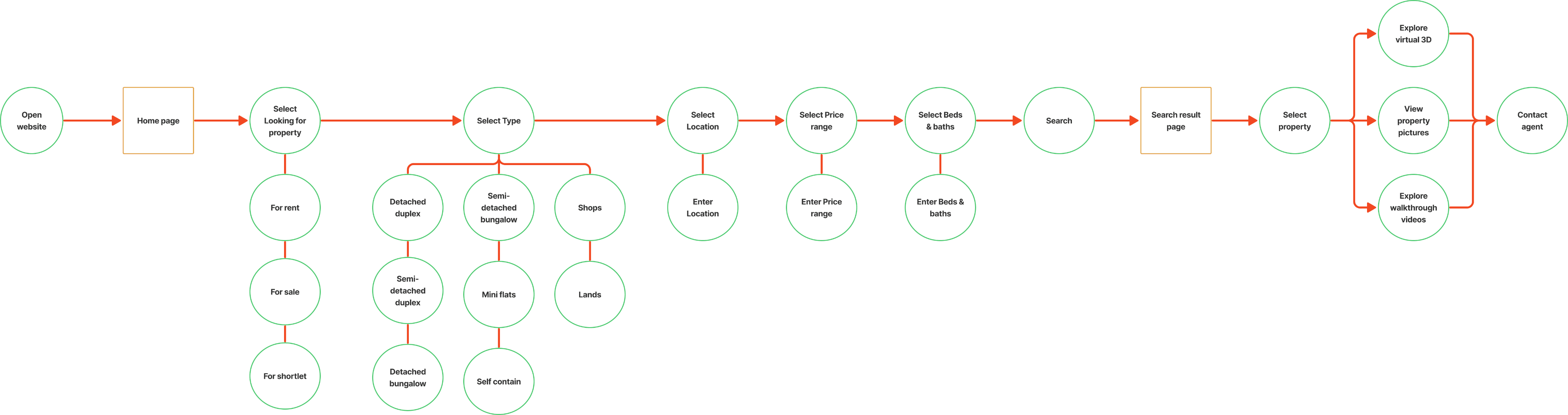
User Task: Use the Alist website to search for a property for rent and contact the agent in charge
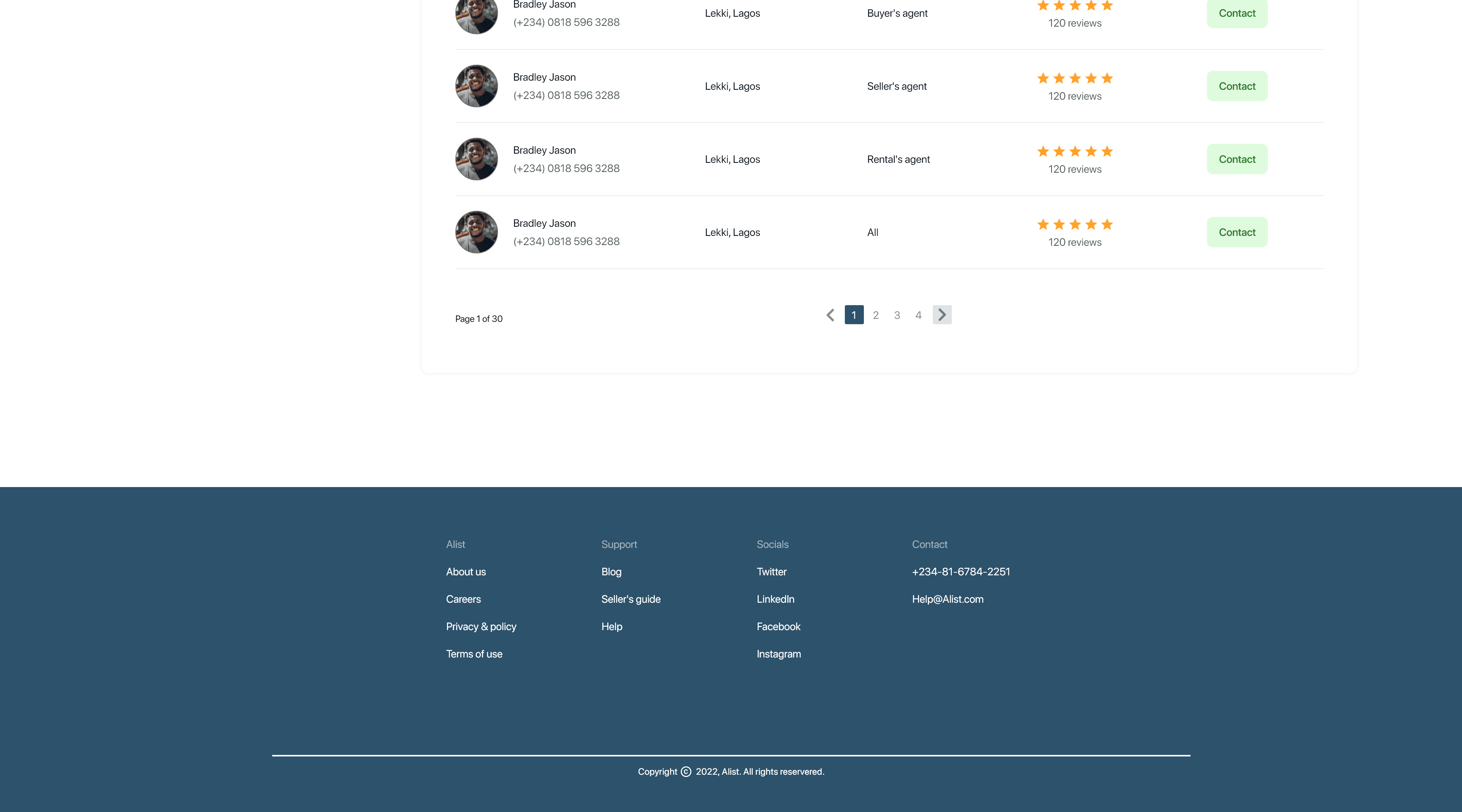
Wireframes
Next, I created paper wirefarmes, and digital wireframes.
Paper wireframes
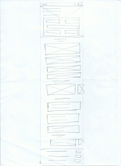
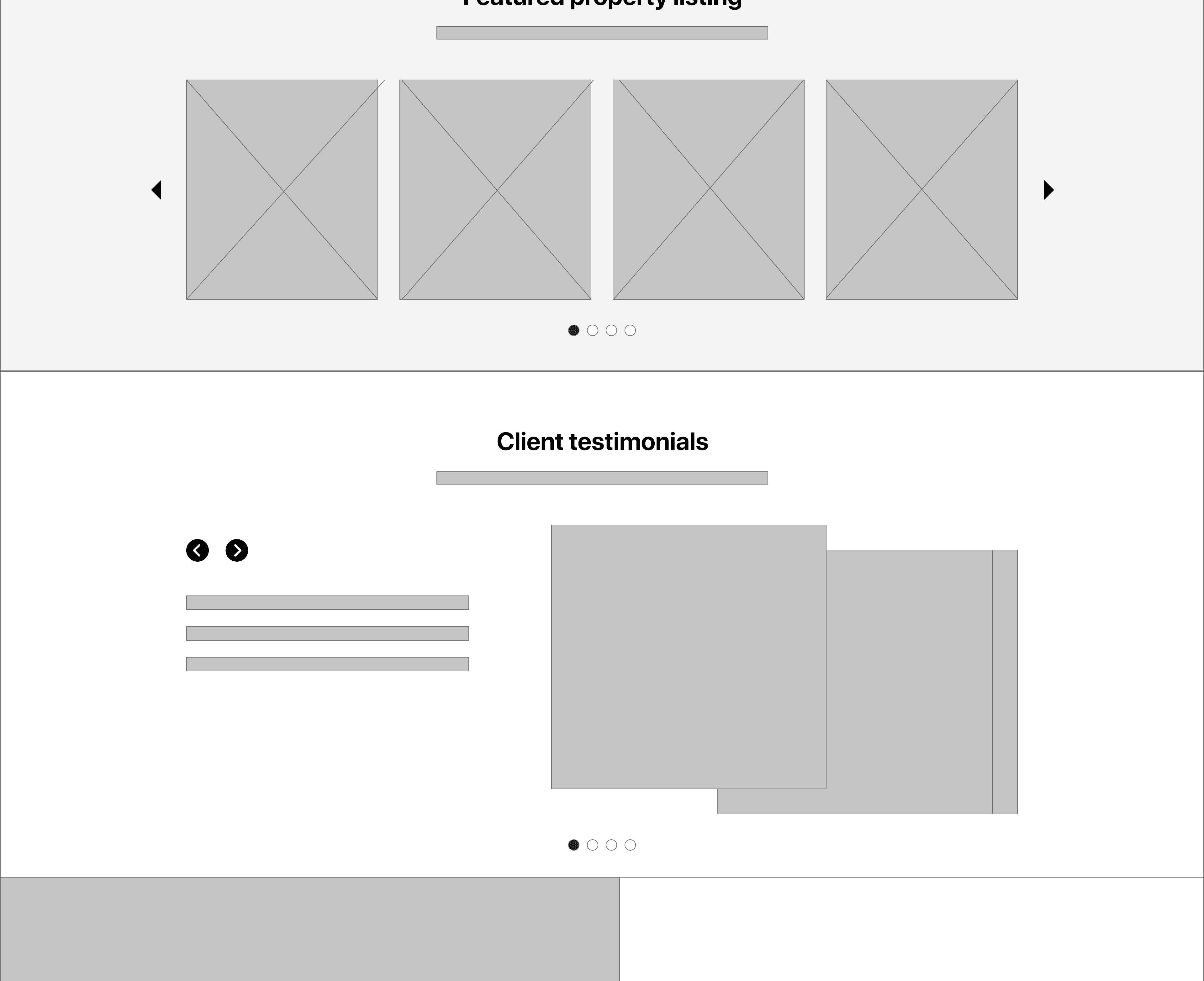
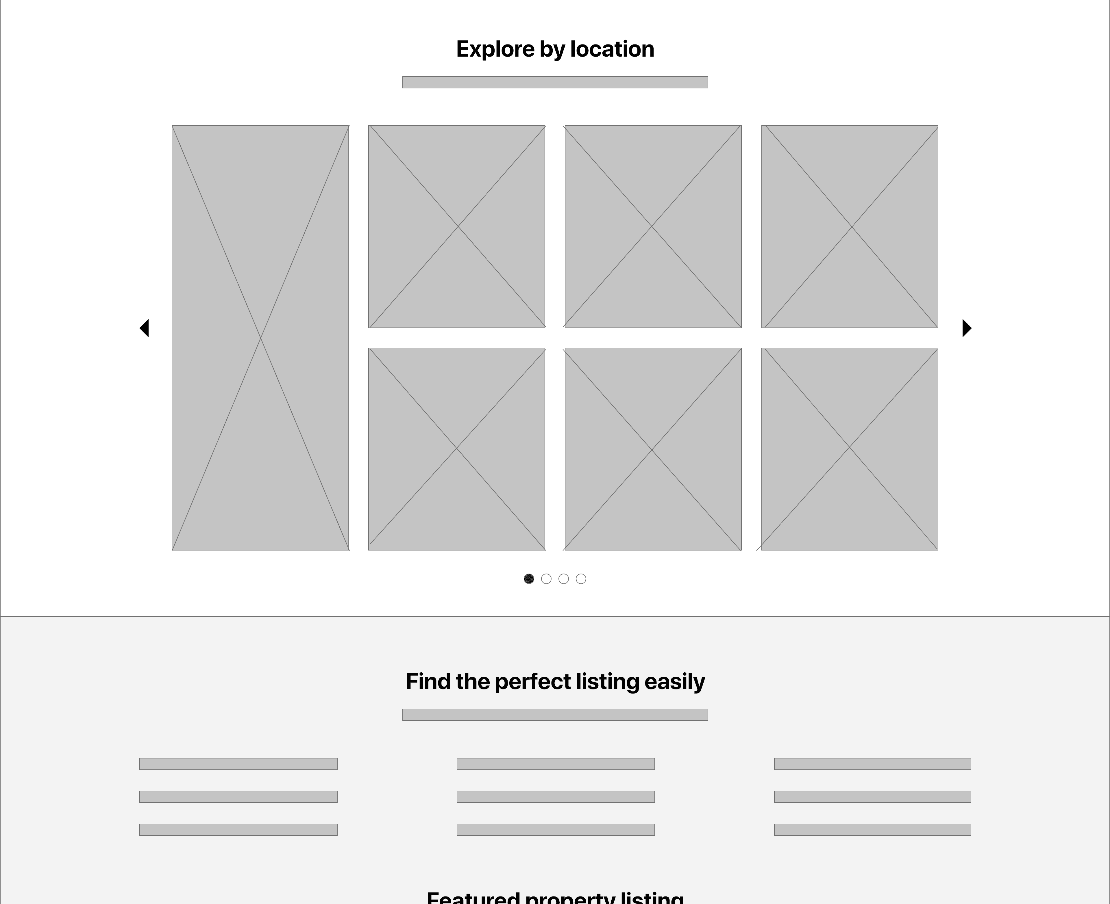
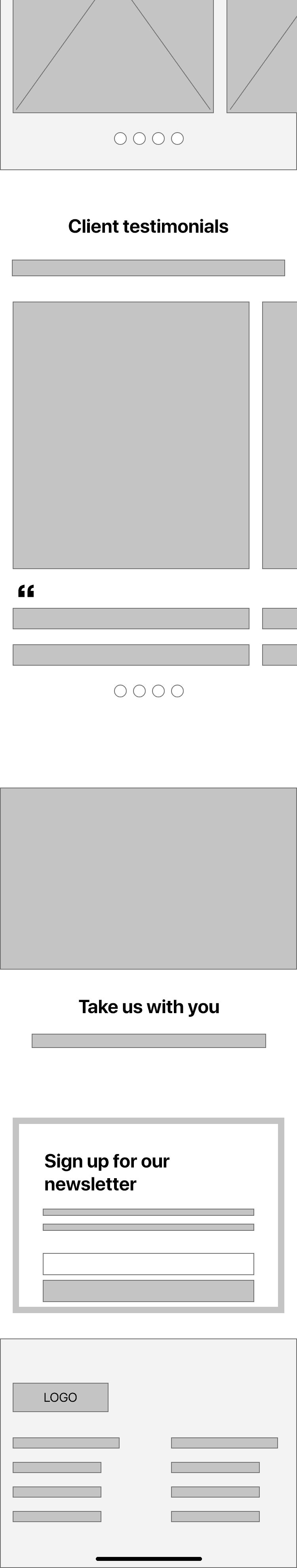
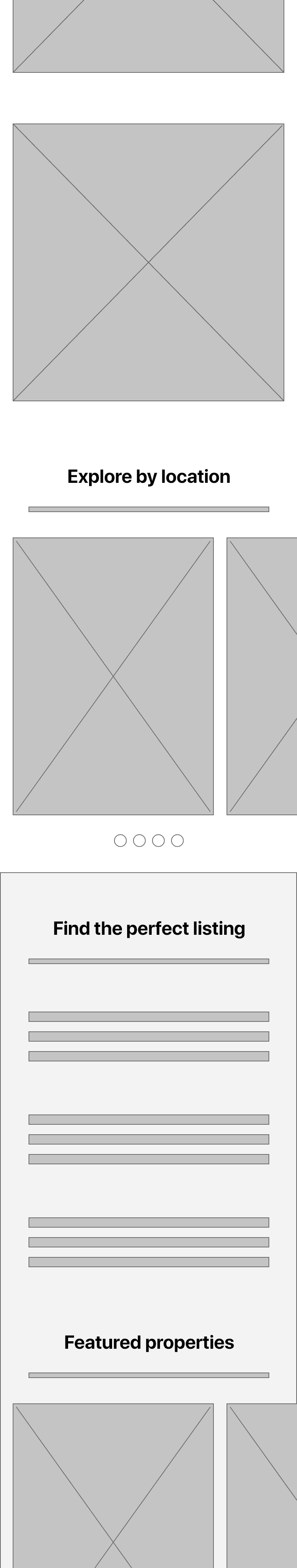
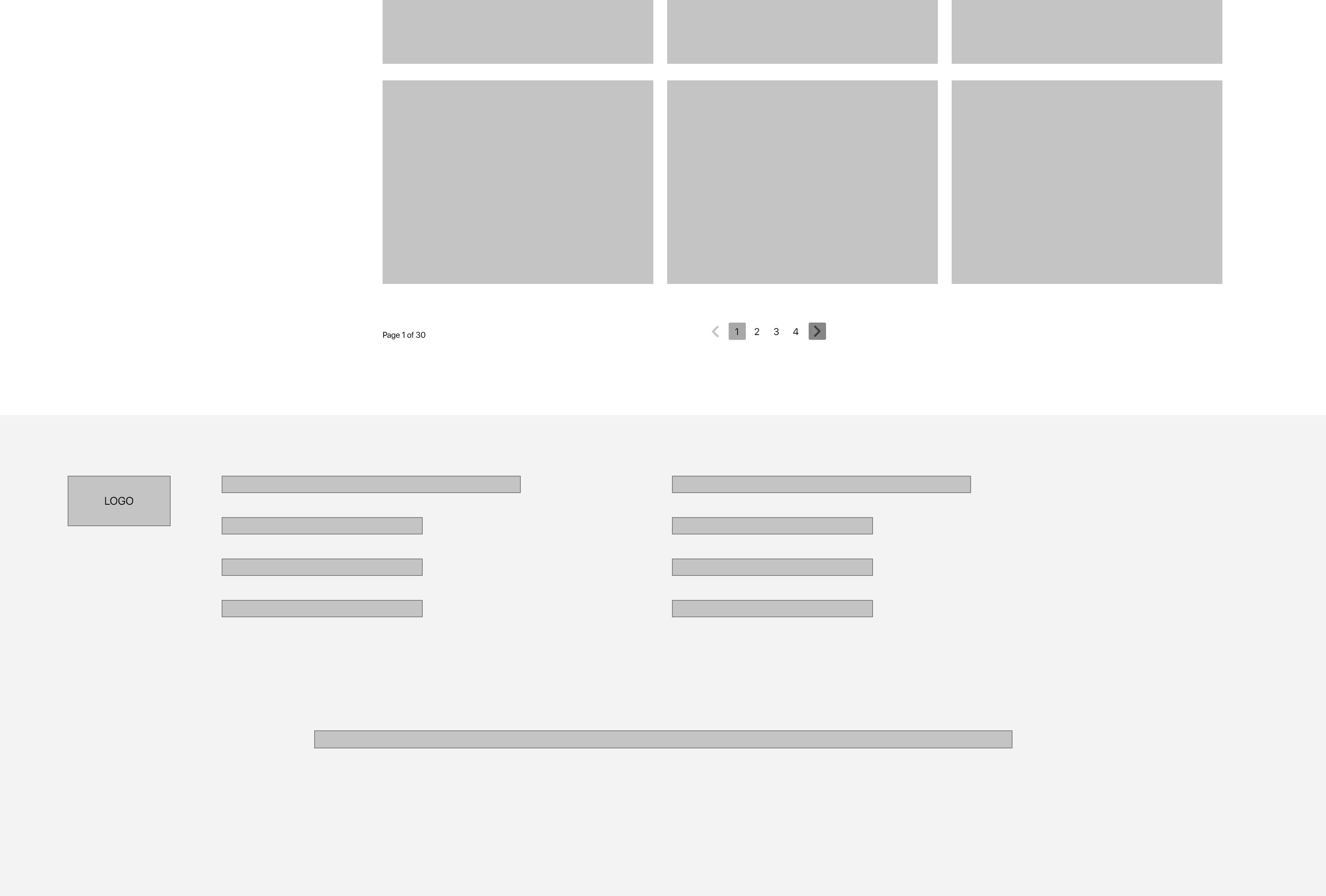
I sketched out paper wireframes for each screen on my website, keeping the users pain points in mind. The home screen paper wireframe focuses on optimizing browsing experience for the users and Alist users will have access to the site on a variety of different devices. Because users would access the site on a variety of different devices, I started to work on designs for additional screen sizes to make sure the site would be fully responsive.
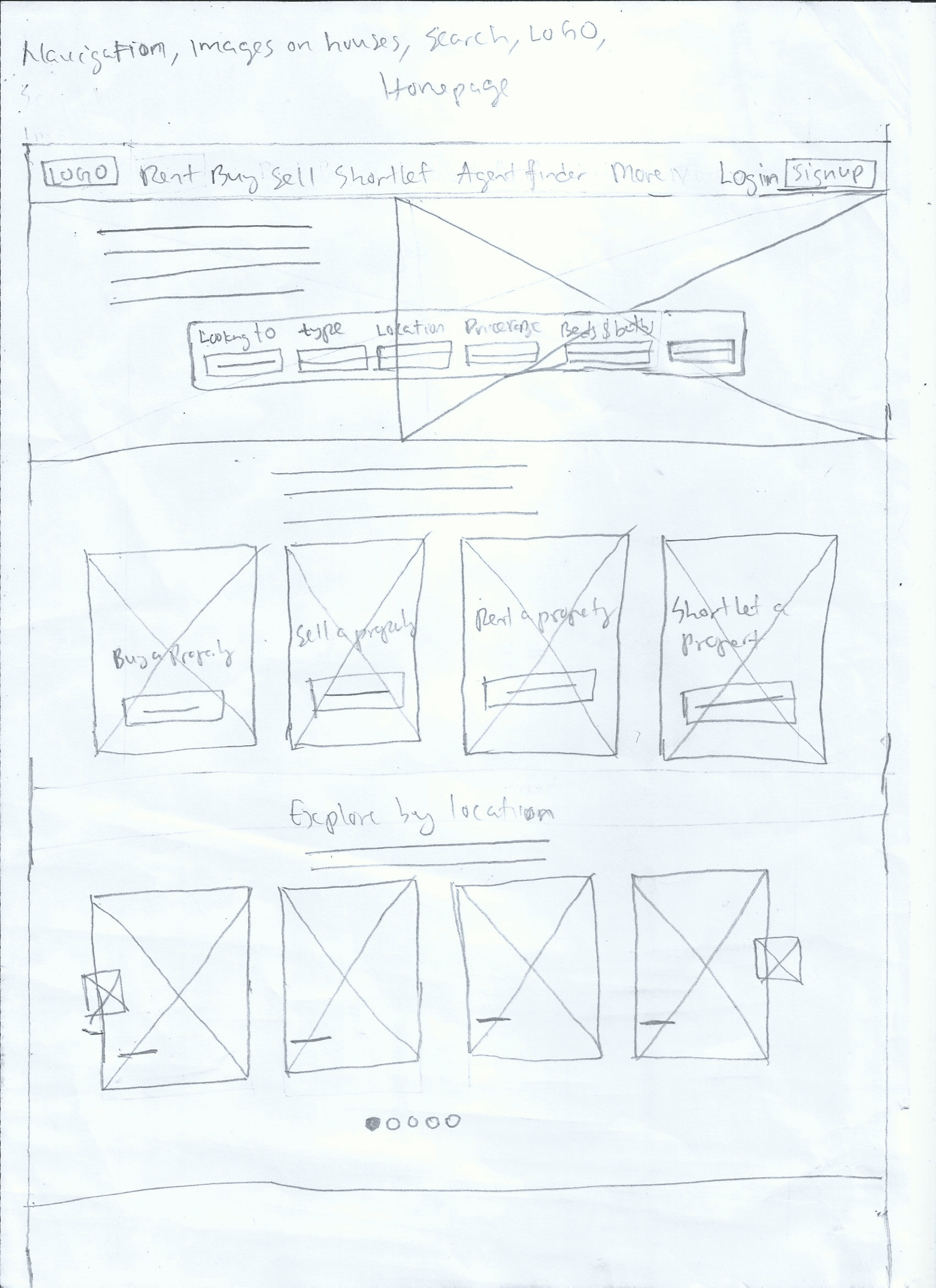
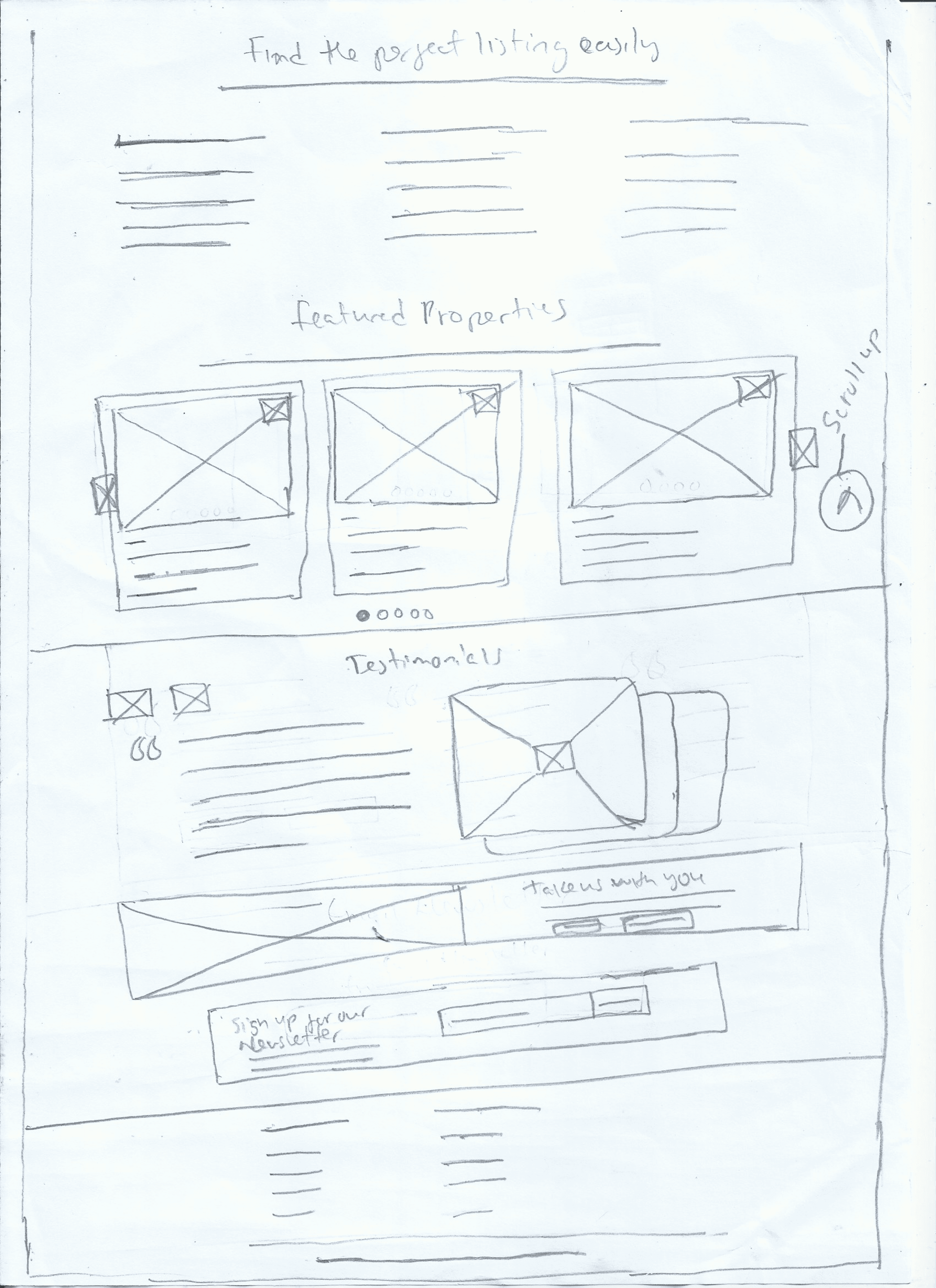
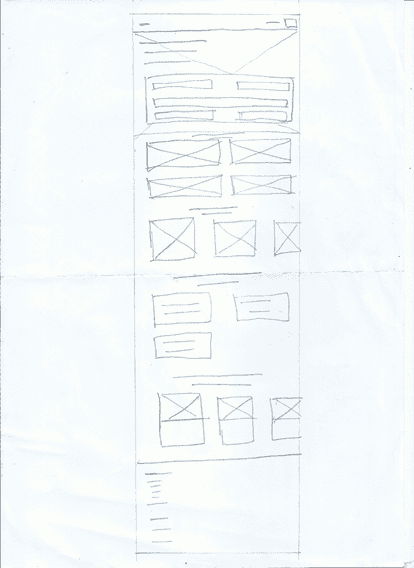
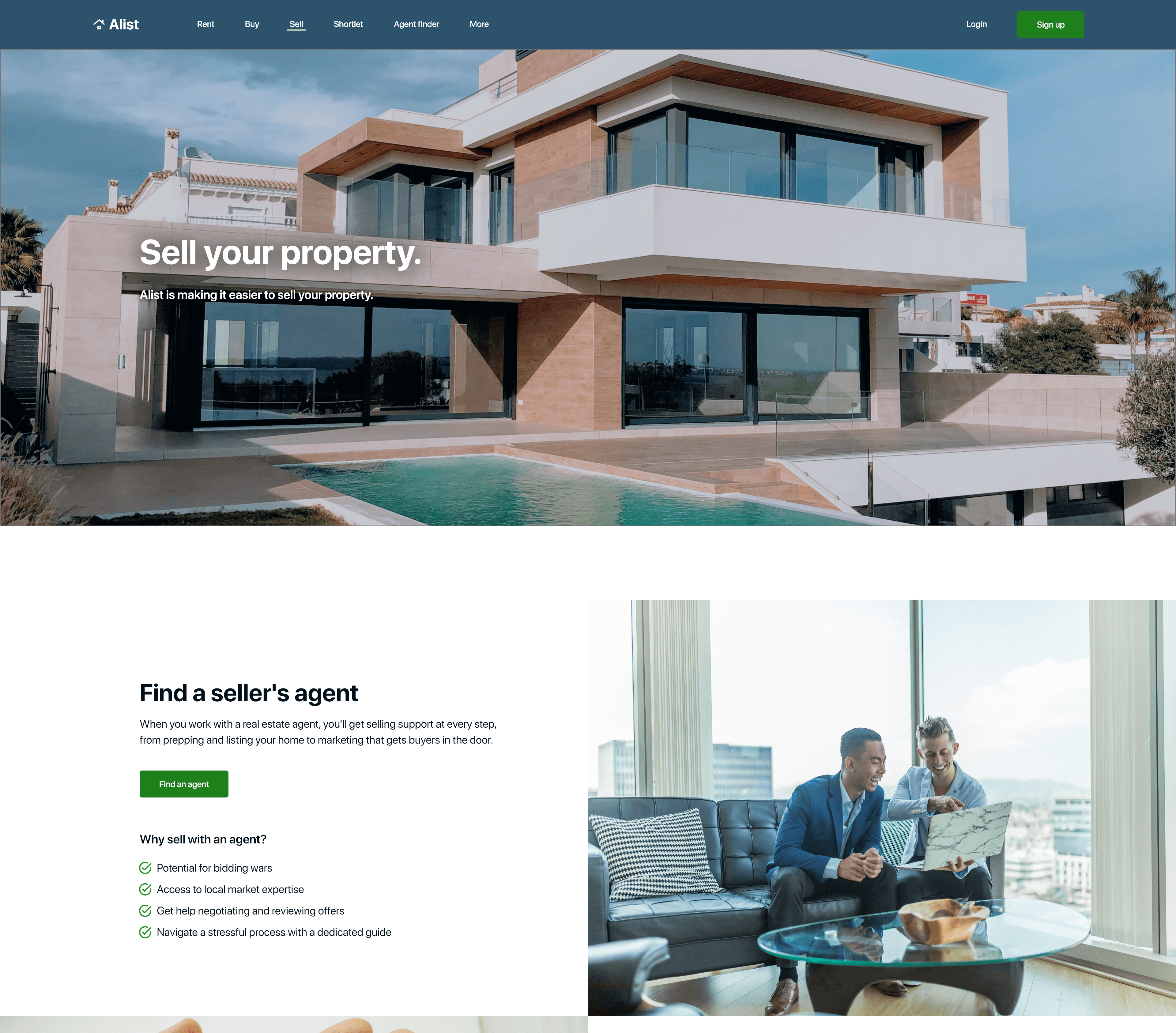
Home page
Desktop version
Tablet version
Mobile version
Digital wireframes
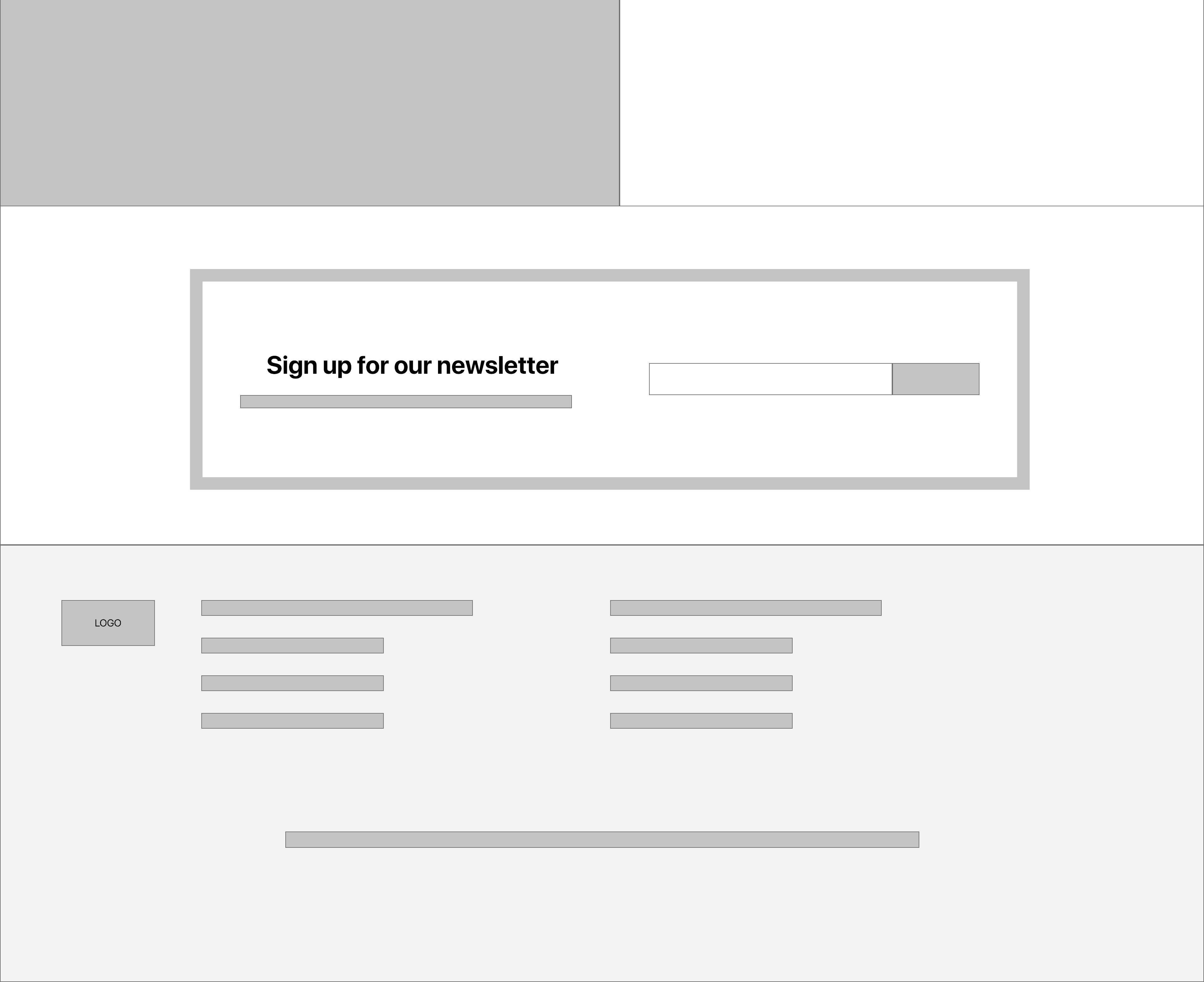
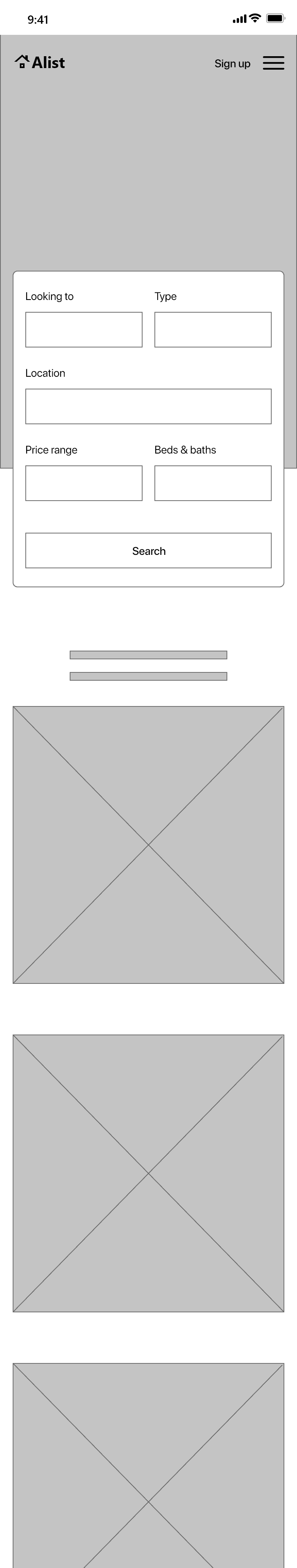
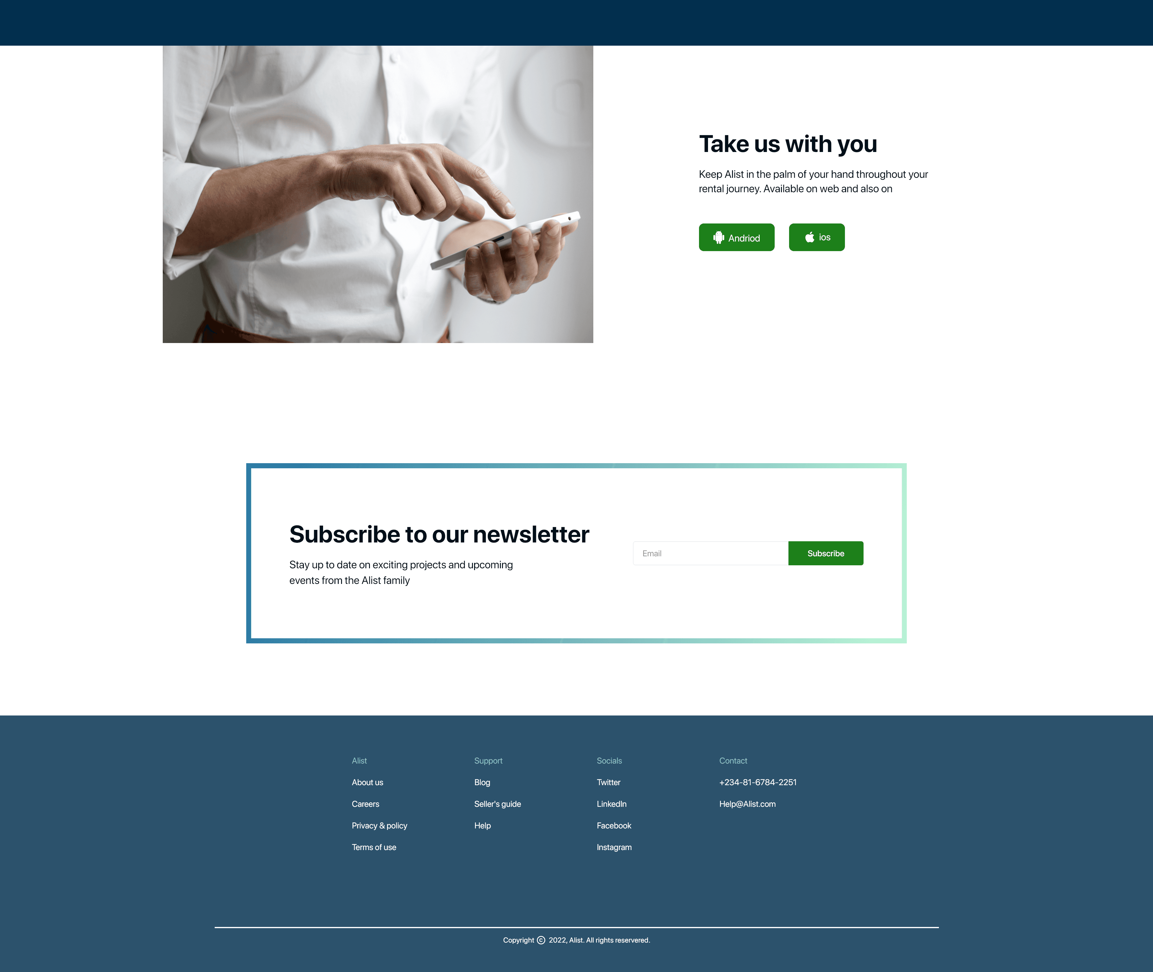
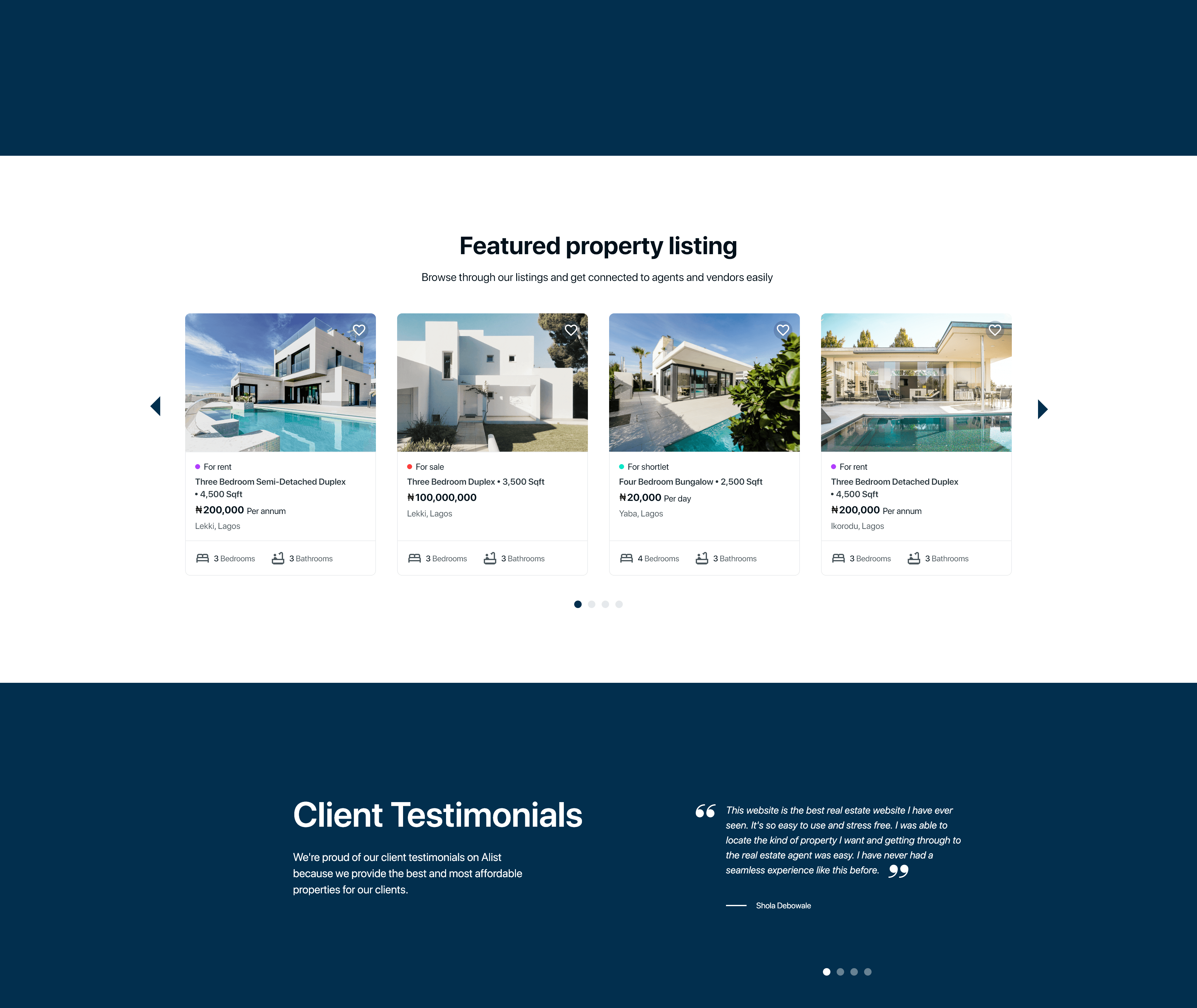
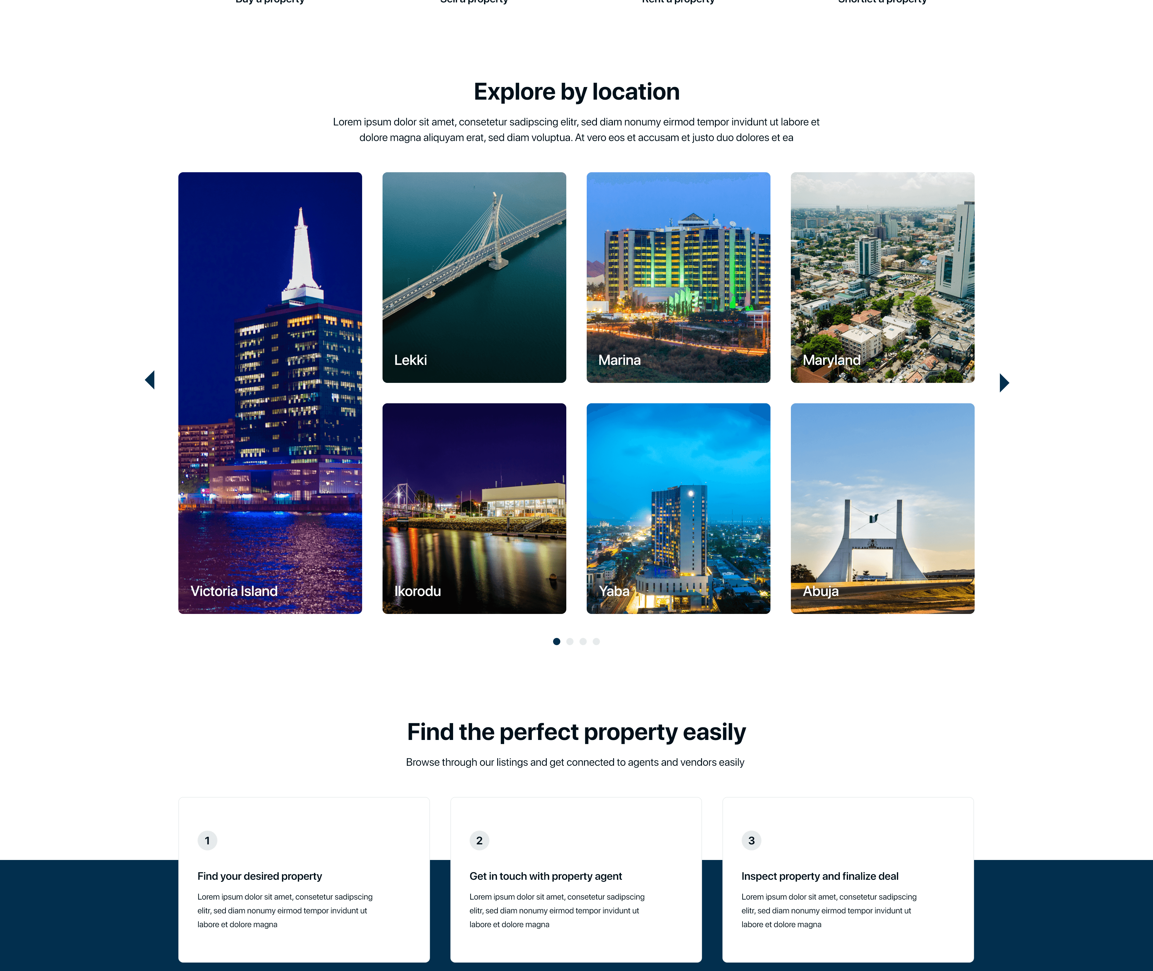
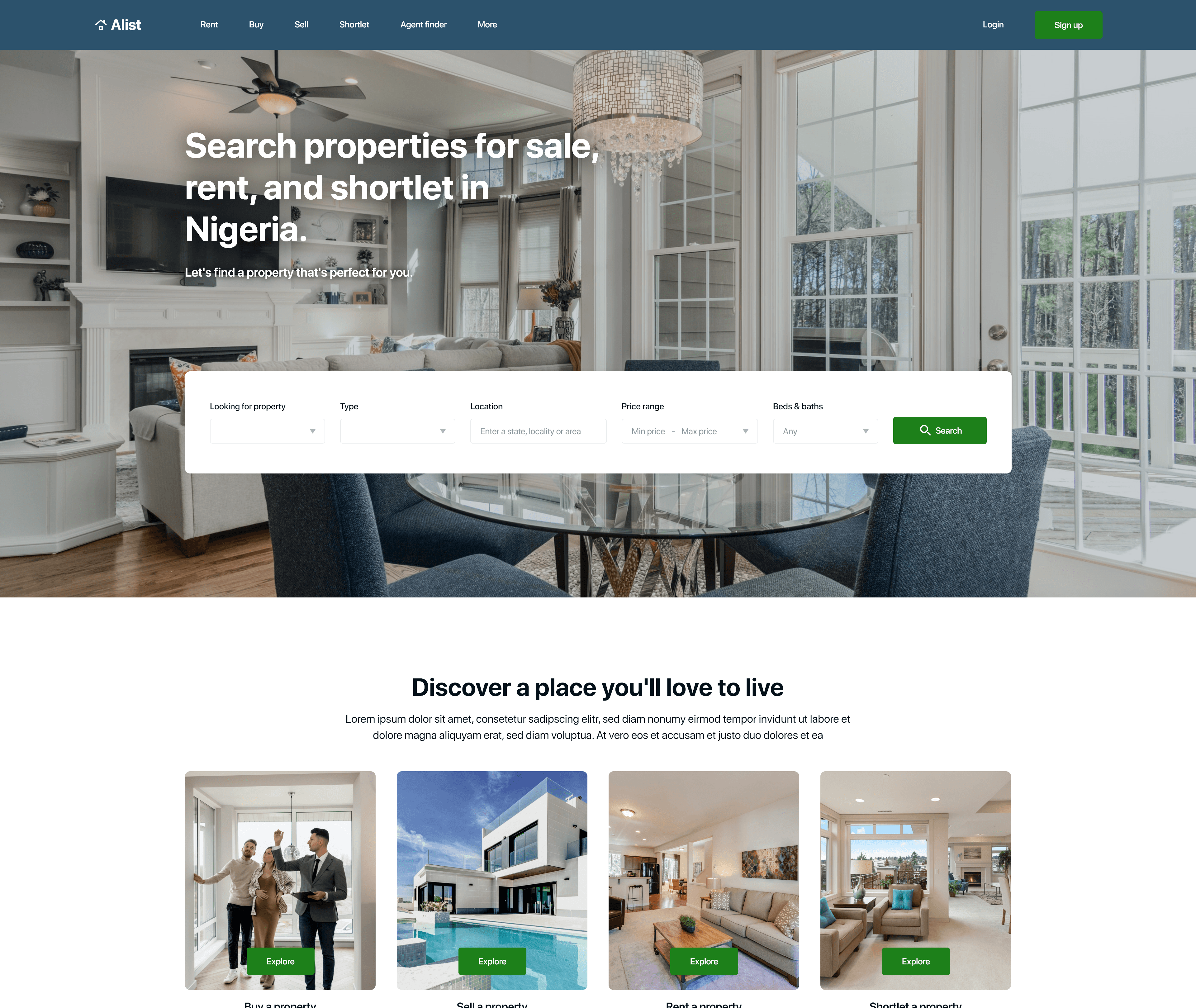
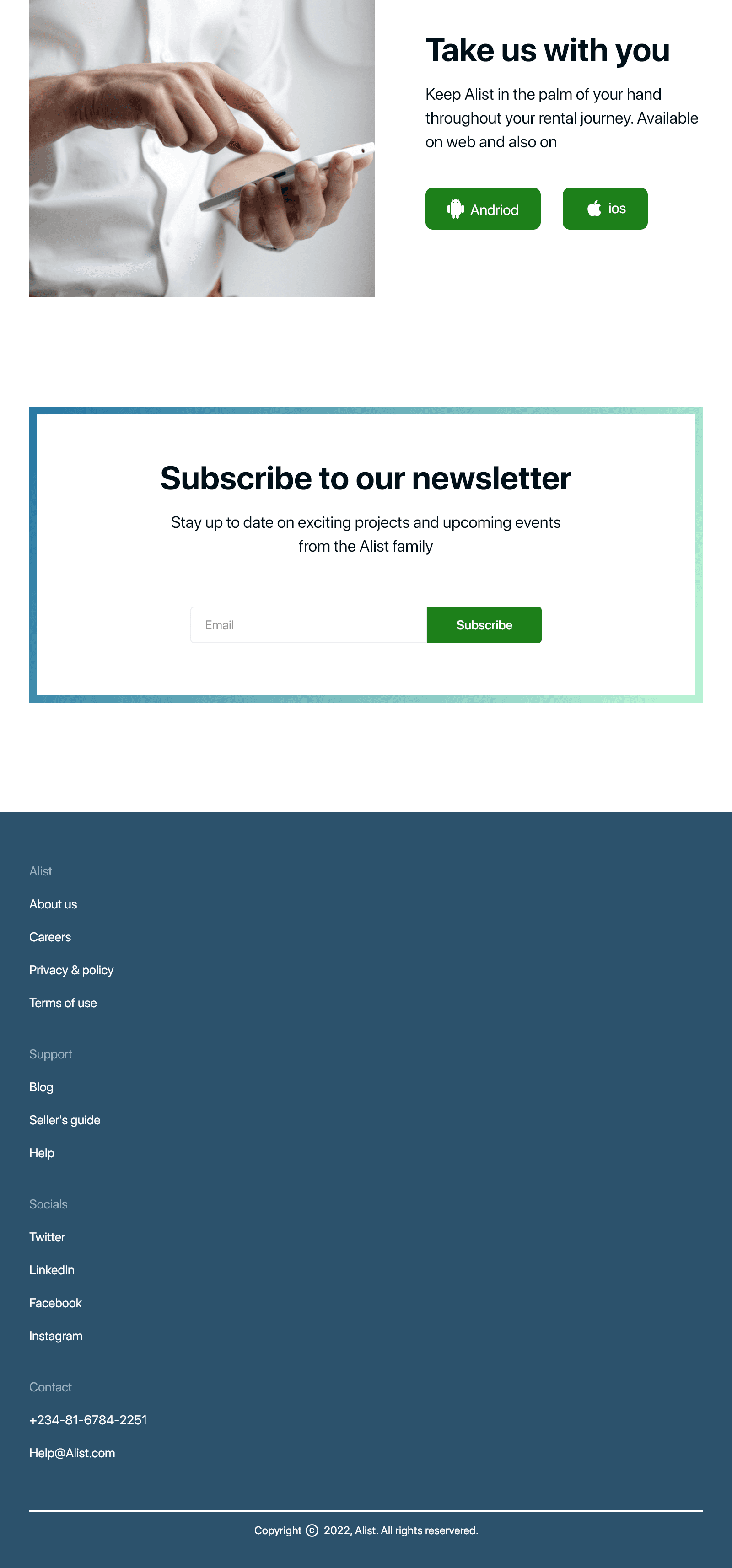
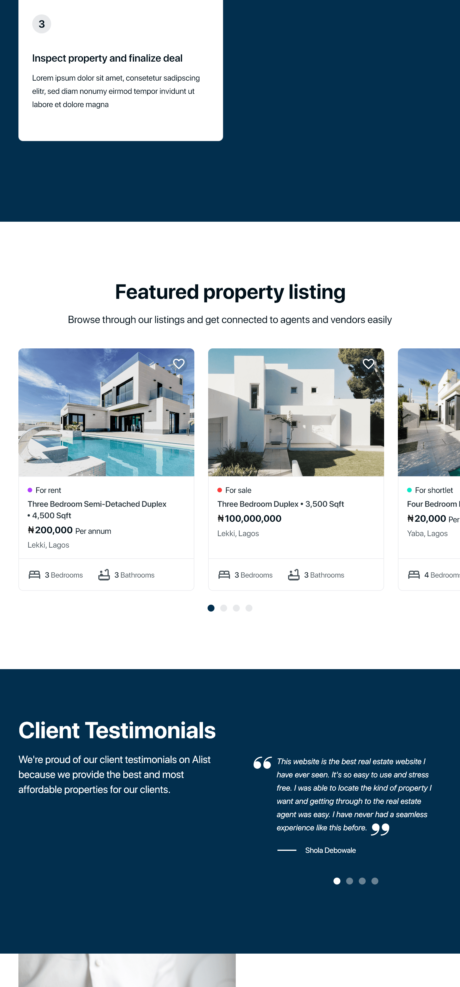
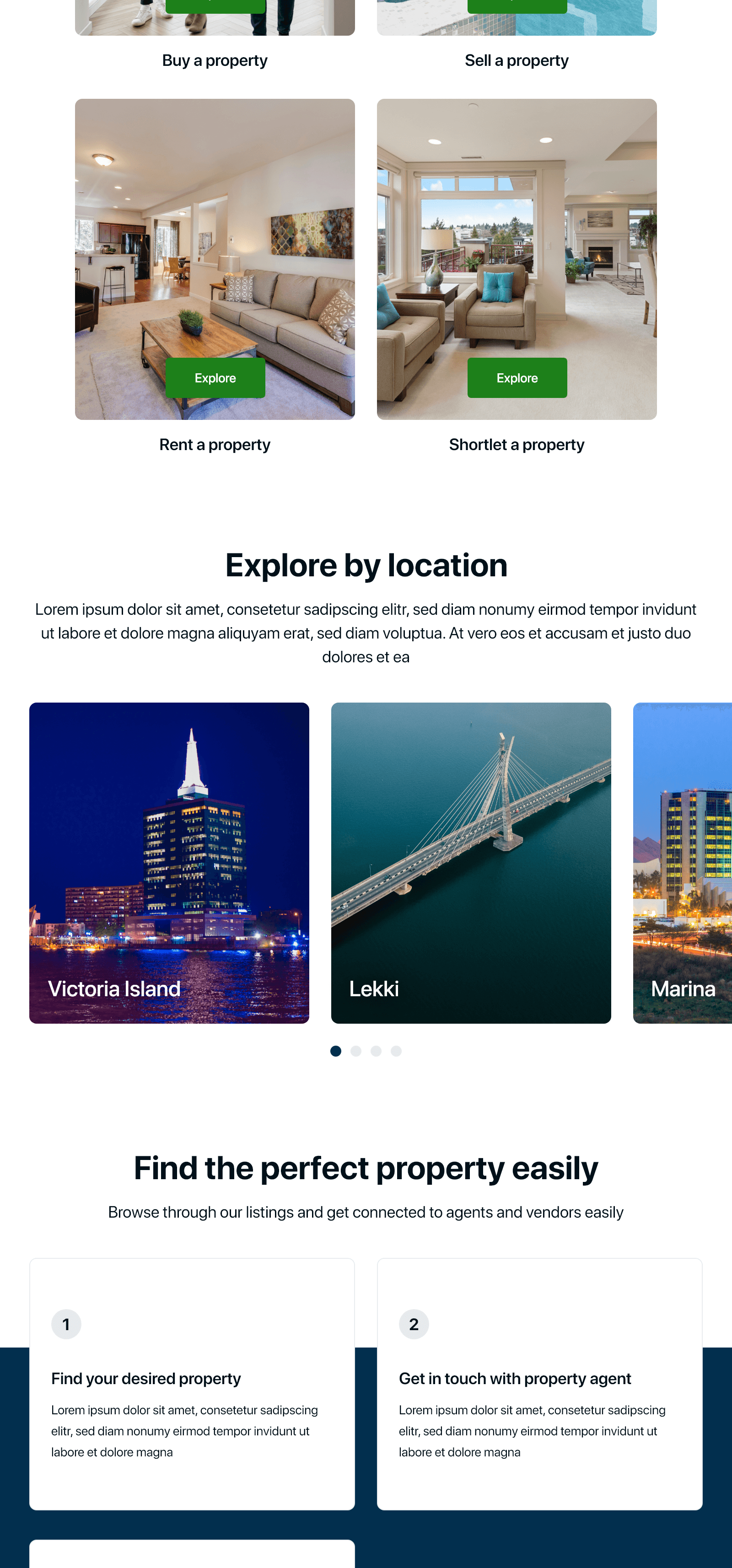
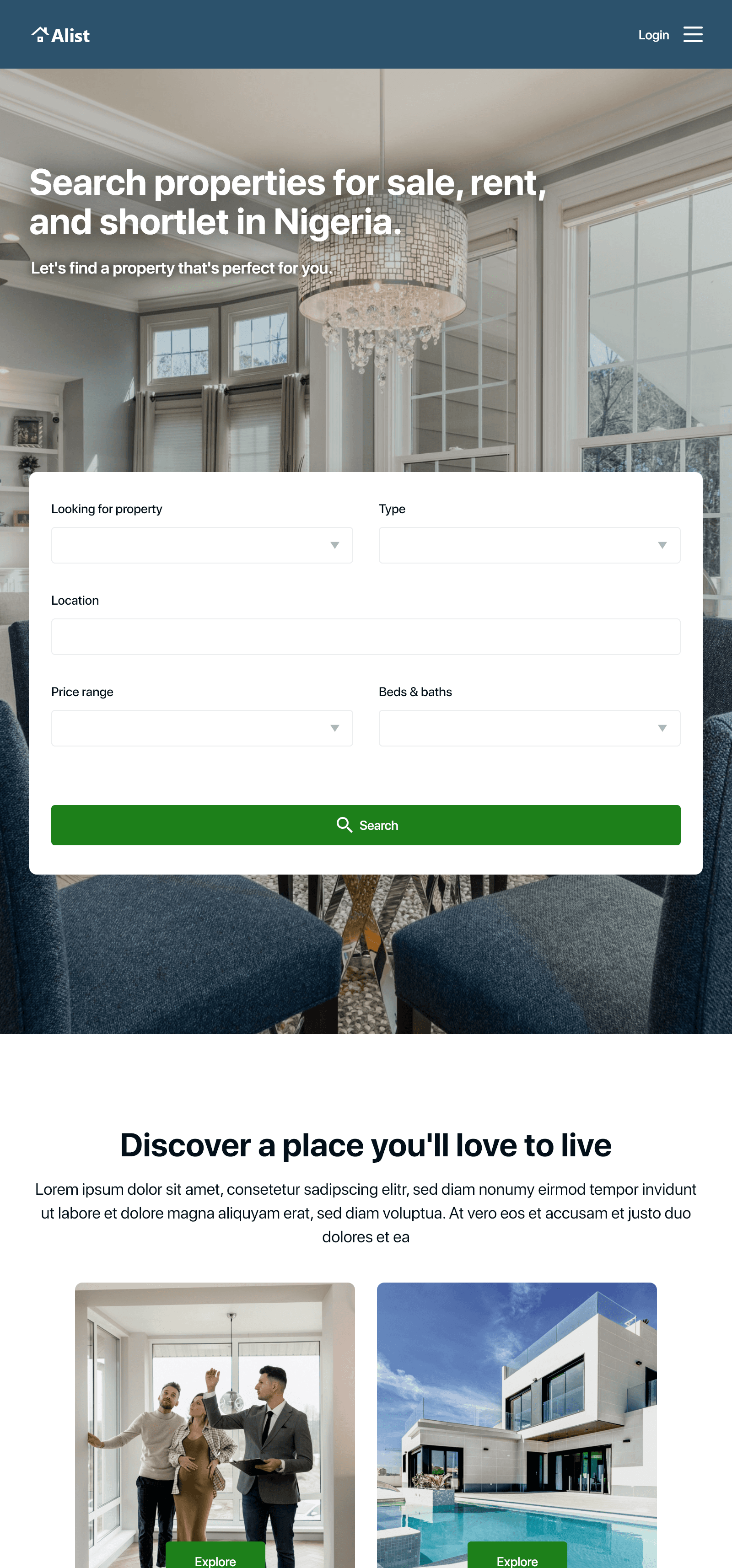
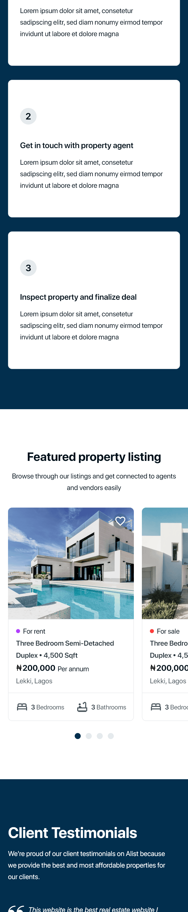
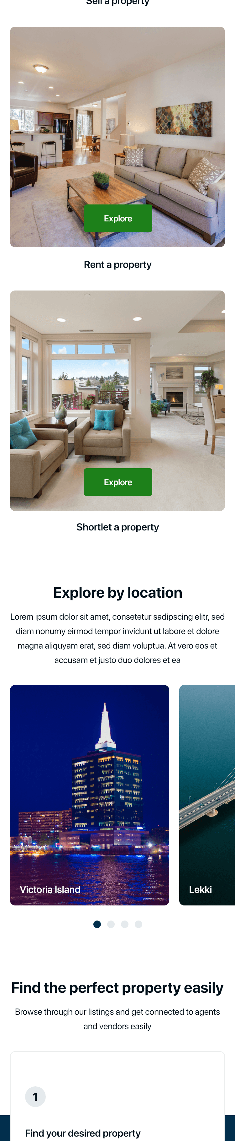
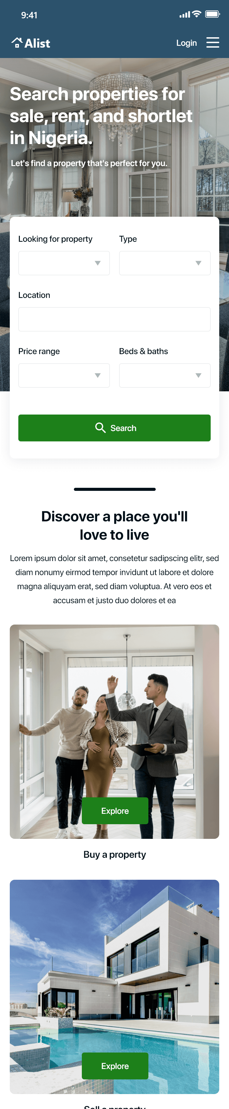
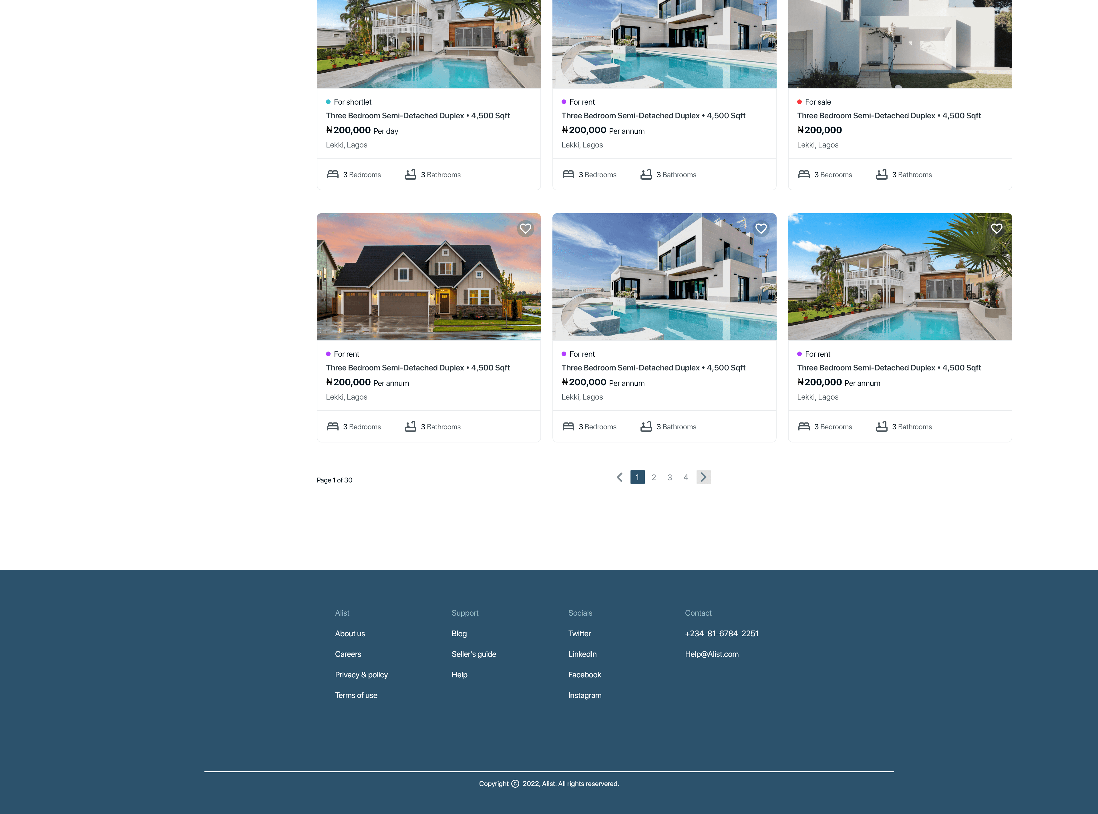
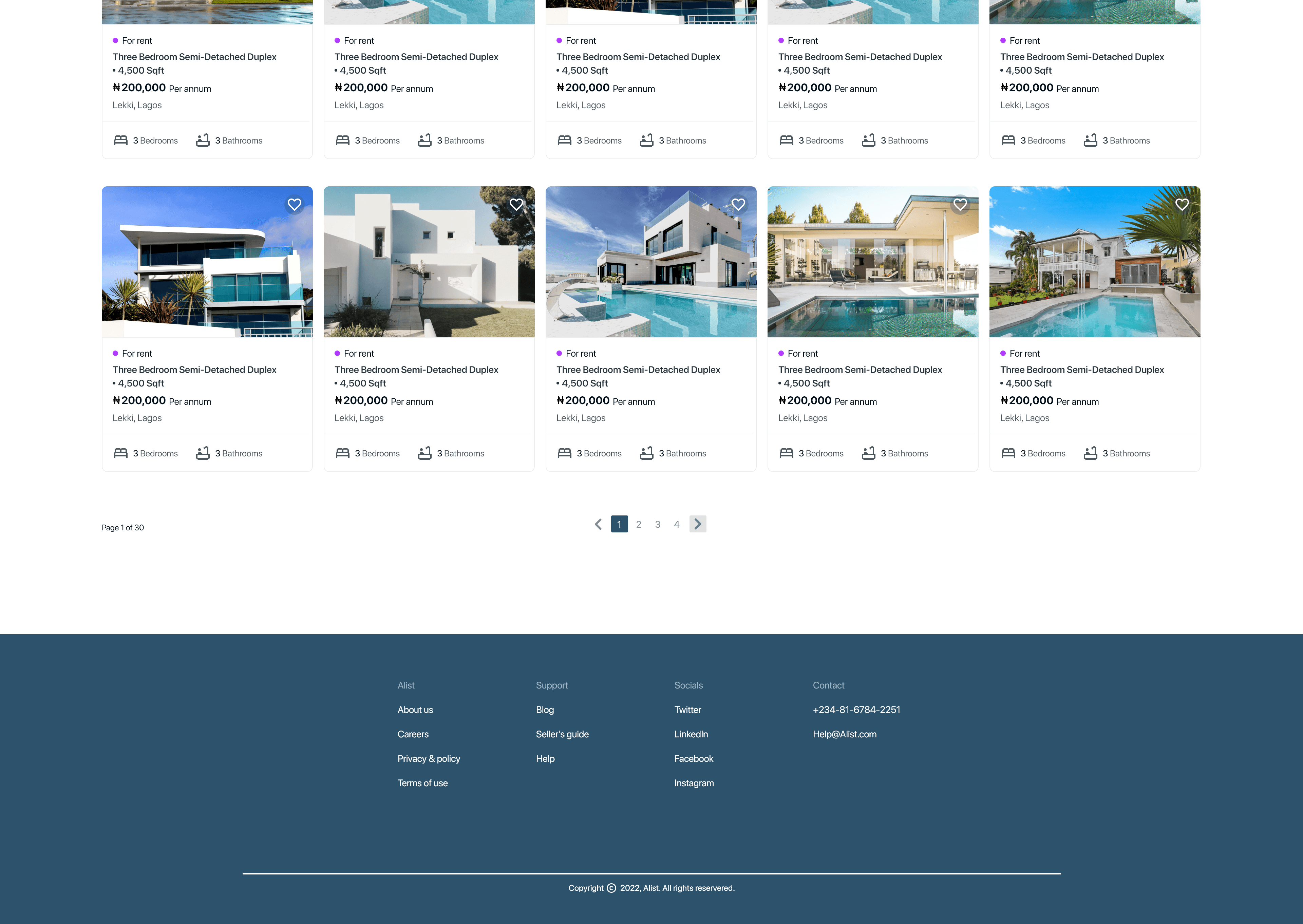
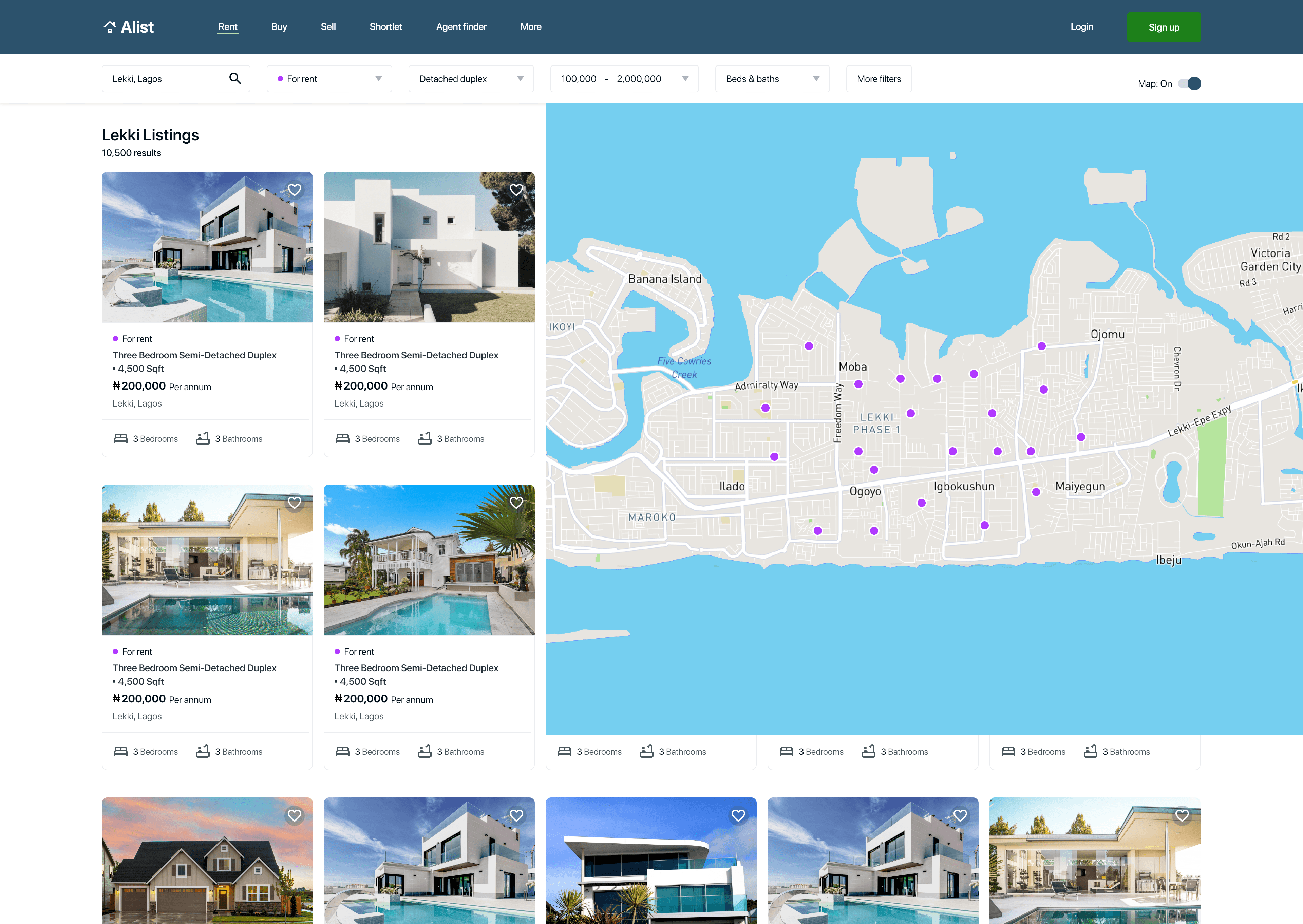
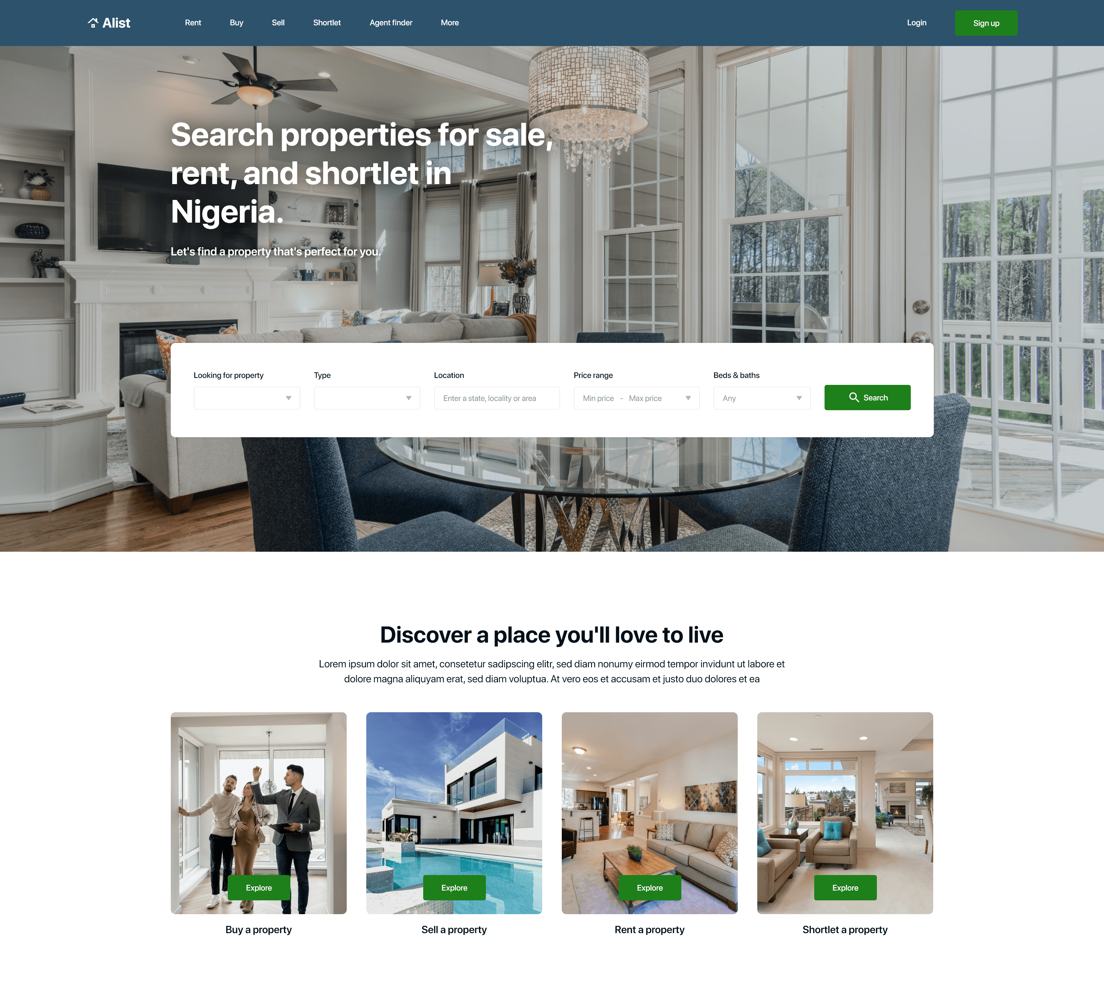
Moving from paper to digital wireframes made it easy to understand how the design could help address user pain points and create a great user experience. For the home page I prioritized giving users better filter options based on location, price range and type of property. I also created an easy website navigation bar. The picture below shows the home page section that’s above the fold.
Home page
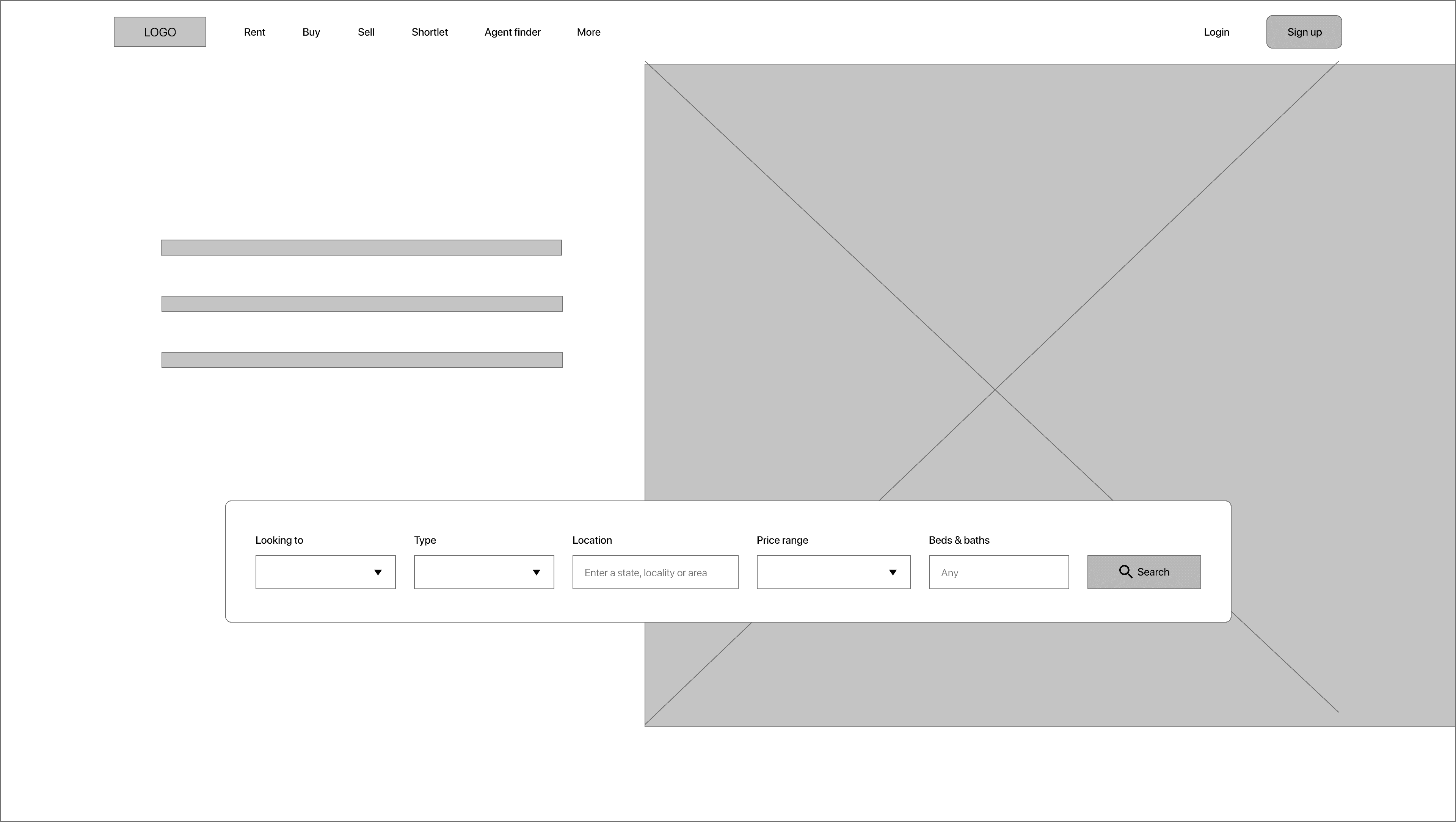
This is the website navigation bar.
This is the filter panel that helps users filter their search based on location, price range, and type of property.
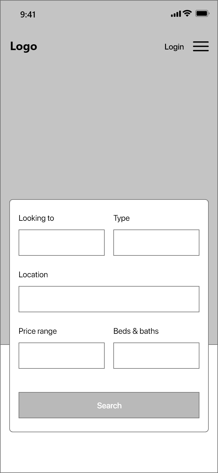
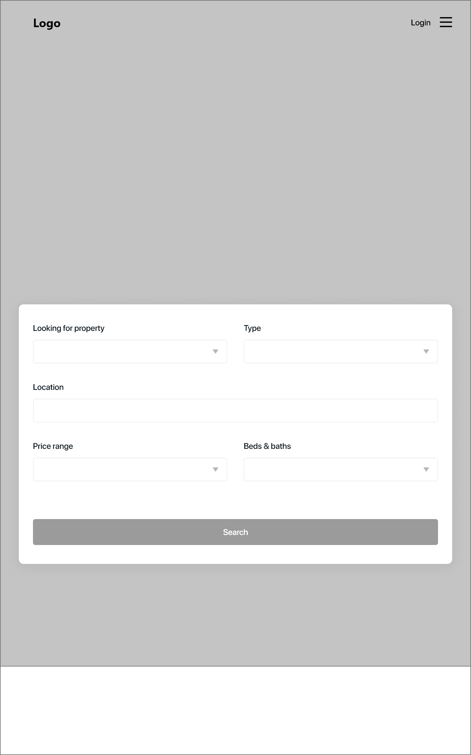
Home page other screen sizes above the fold
Tablet version
Mobile version
Low fidelity prototype
To create a low-fidelity prototype, I connected all of the screens involved in the primary user flow of searching for a property and contacting the agent involved.
Low fidelity test
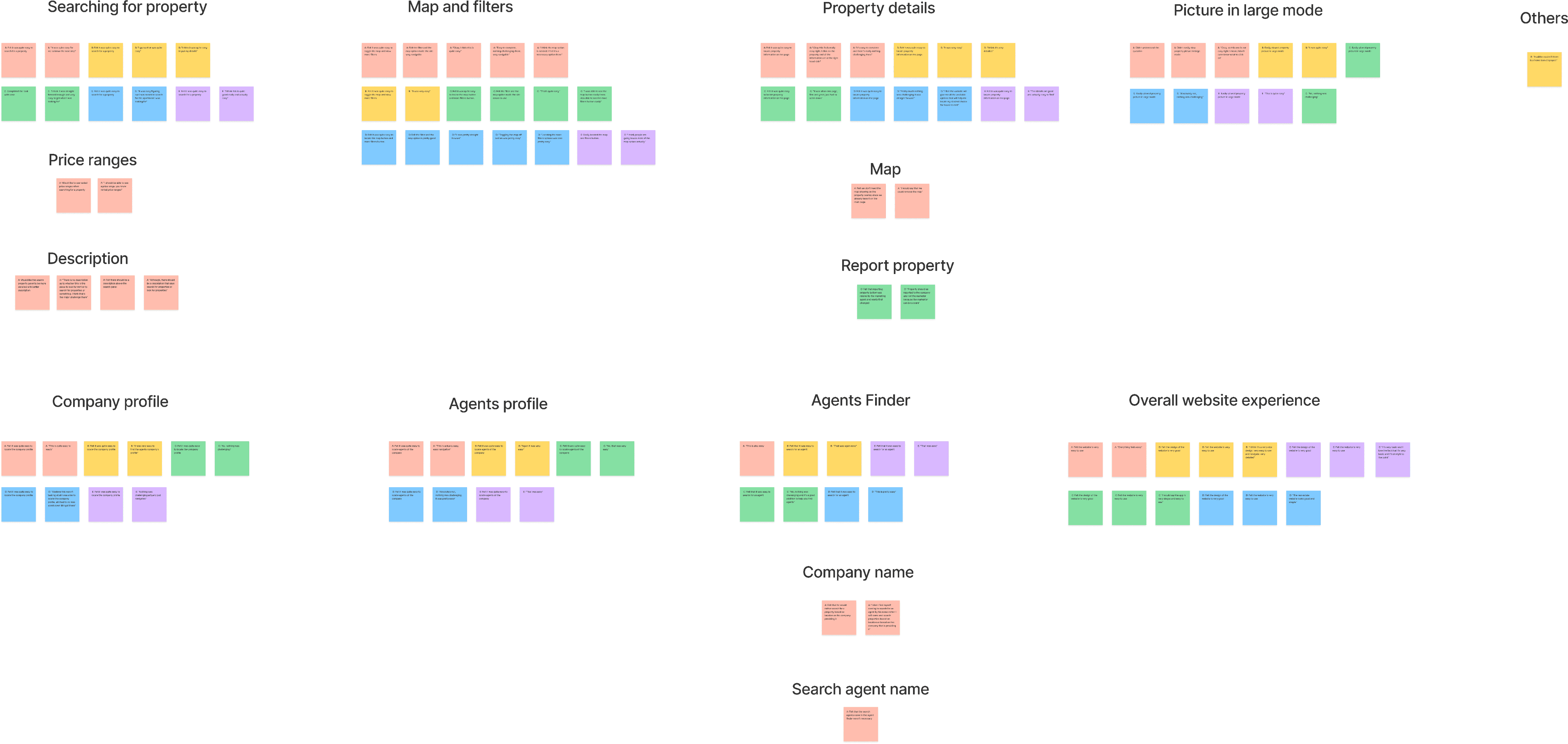
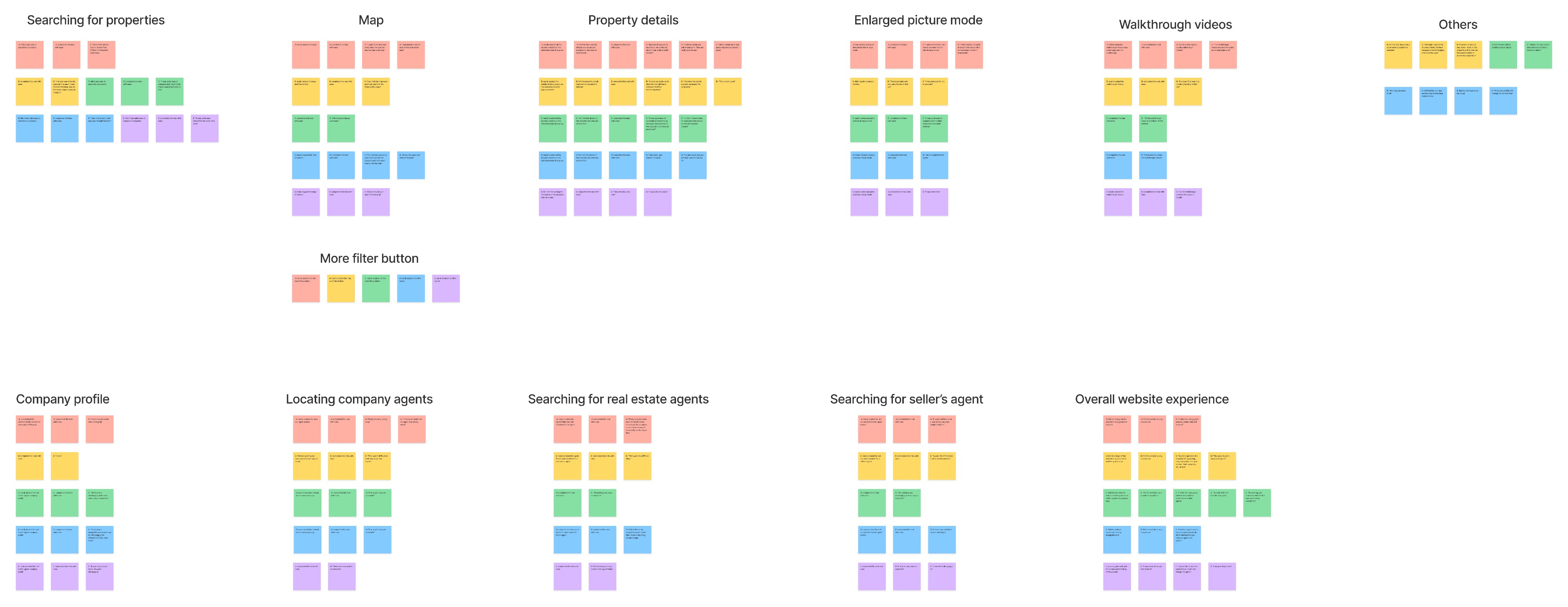
As soon as i was done prototyping the wireframes, I conducted a usability study on the low fidelity designs testing out the functionality of the website. I also created KPIs to measure the success of the product. I conducted the usability study on five participants from ages 20 - 55 years that recently acquired a property within the last 2 months since they are my target audience.
After the study was conducted, I created themes or patterns , and generated insights using an affinity diagram.
Key performance indicators
I generated key performance indicators to measure the success of the product at low fidelity. Examples of KPIs used were: Drop-off rates, Conversion rate, System usability scale (SUS).
Drop-off rates: 0% of participant didn’t make it to the end of the flow. This is 0 out of 5 participants.
Conversion rates: 100% of participant made it to the end of the flow. This is 5 out of 5 participants.
System usability scale (SUS): 84.5 score was the average mark for the SUS, which is an A grade indicating the product is excellent.
Findings
Findings from the Low fidelity prototype usability study helped guide the designs from wireframes to mockups.
Users had no usability issues with the website. They completed all the research study questions task with ease.
Affinity diagram
Style guide


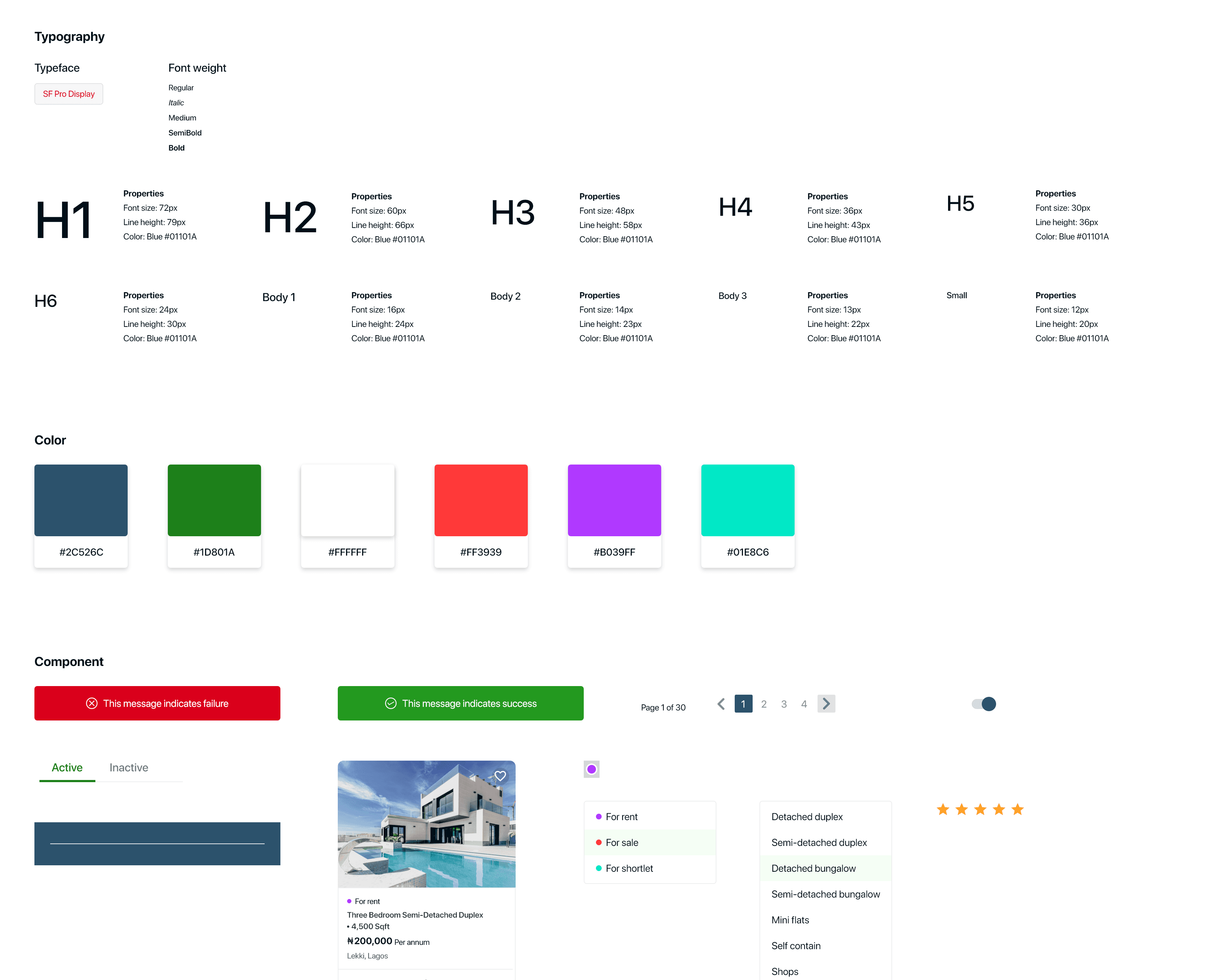
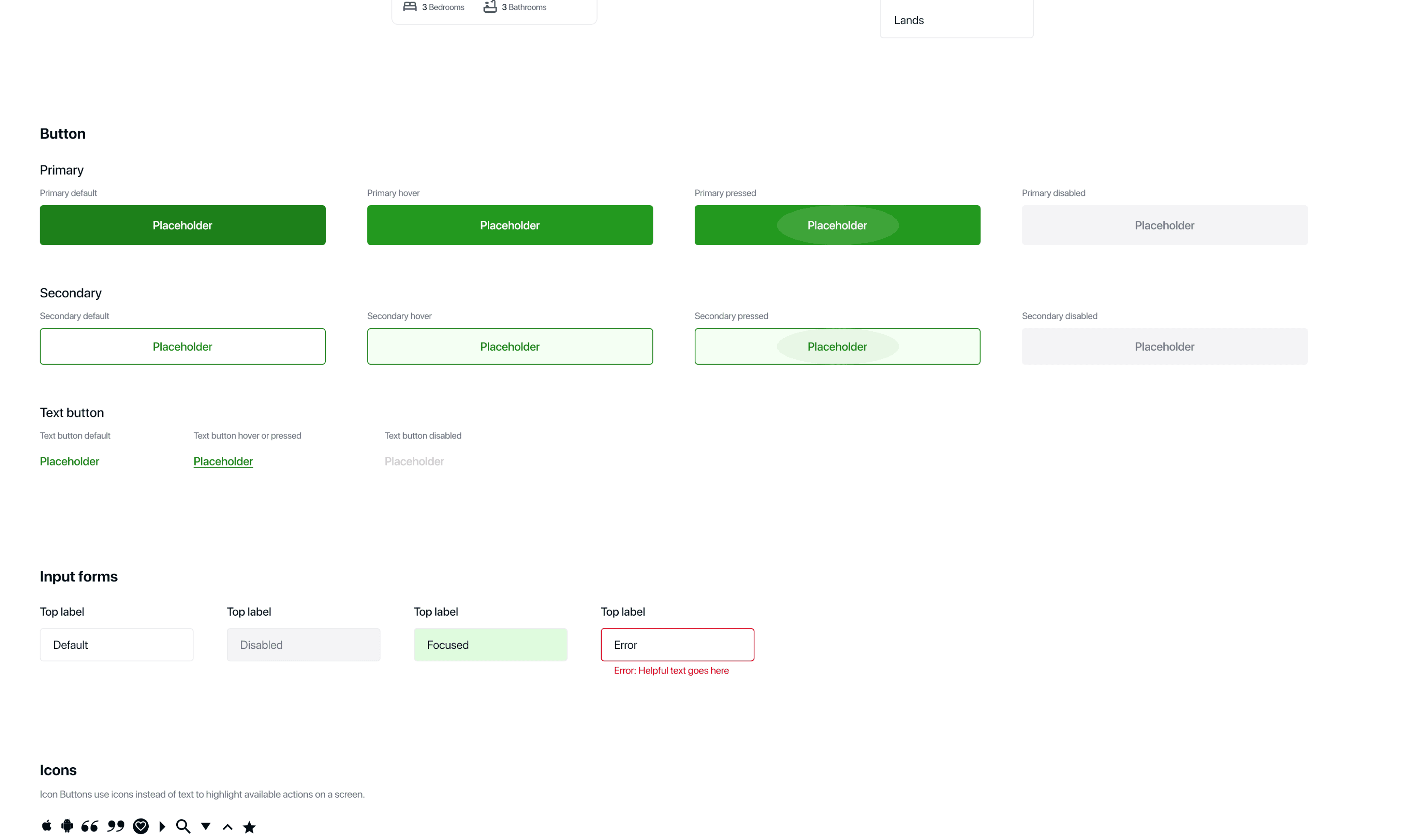

Desktop version
Mobile version

More digital wireframes


Desktop
Tablet
Mobile
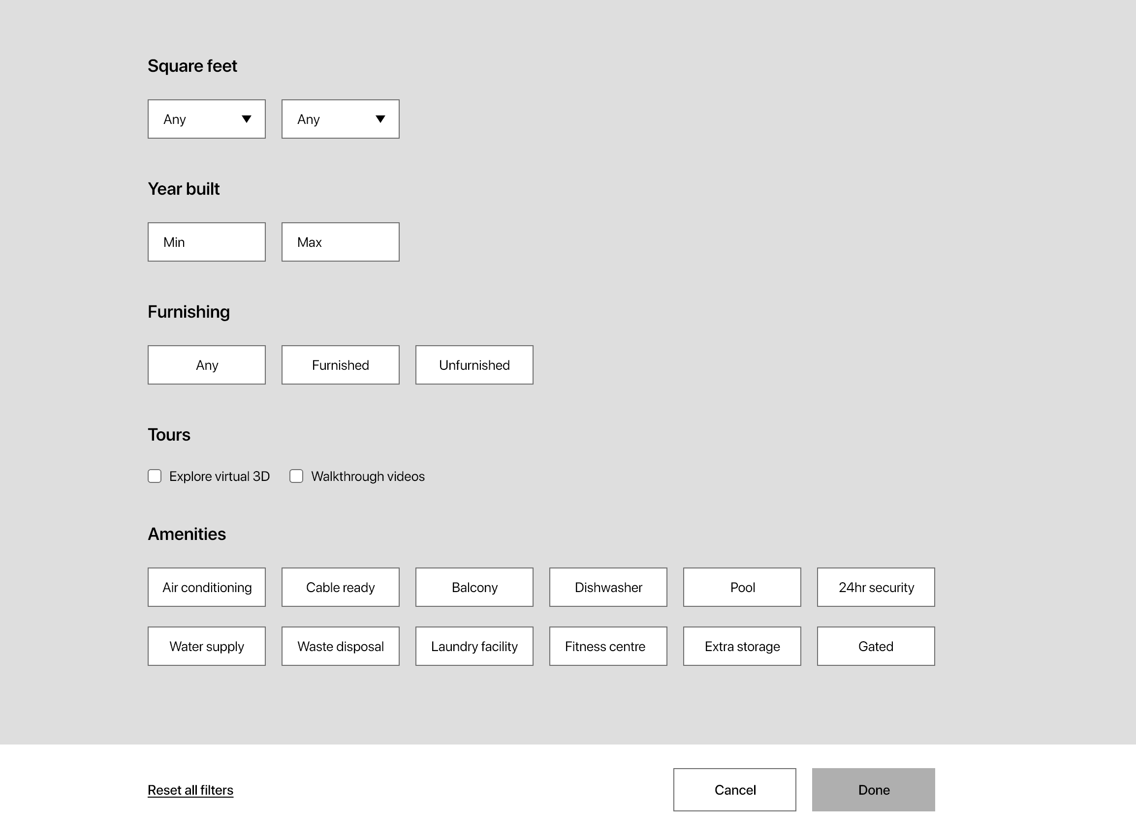
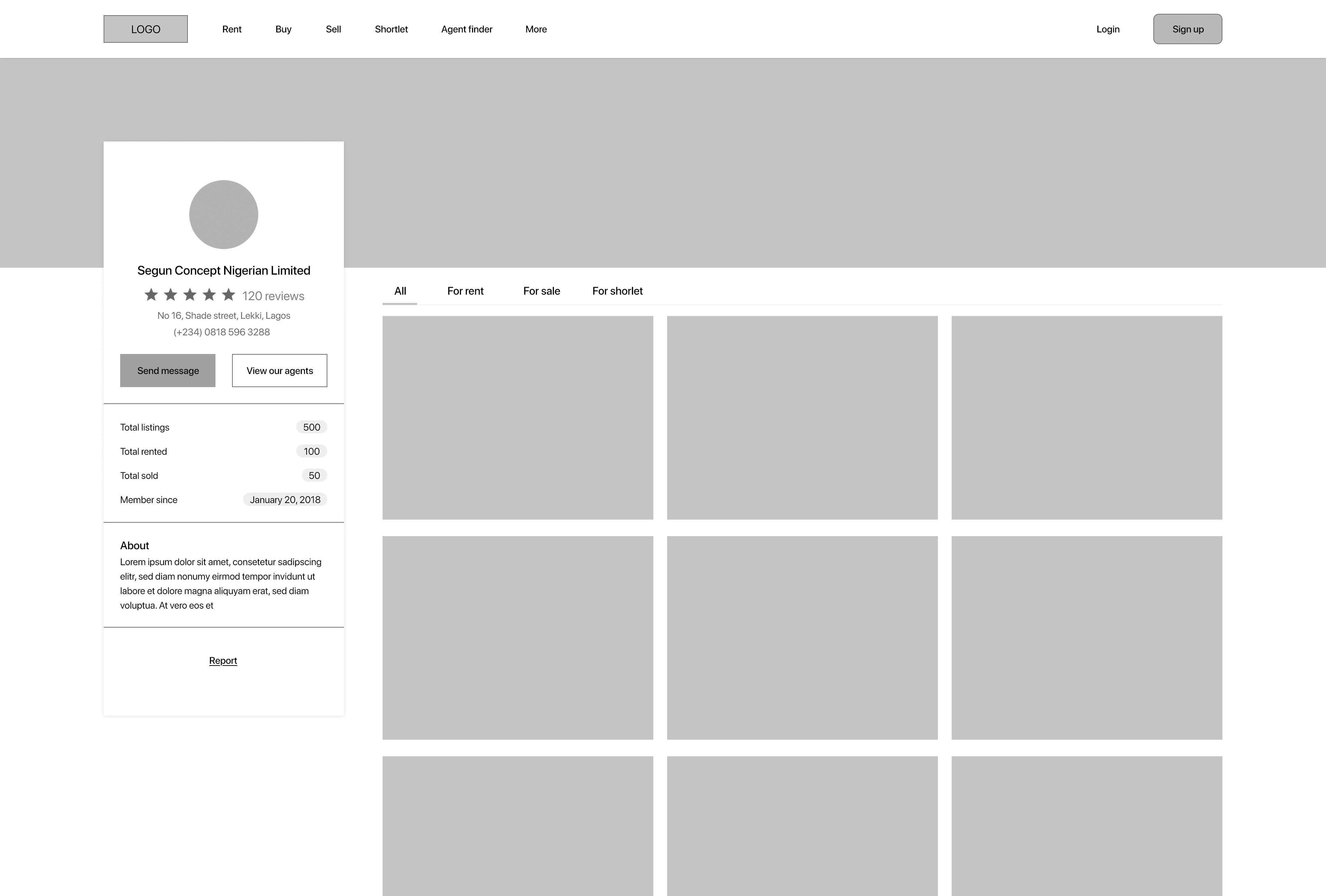
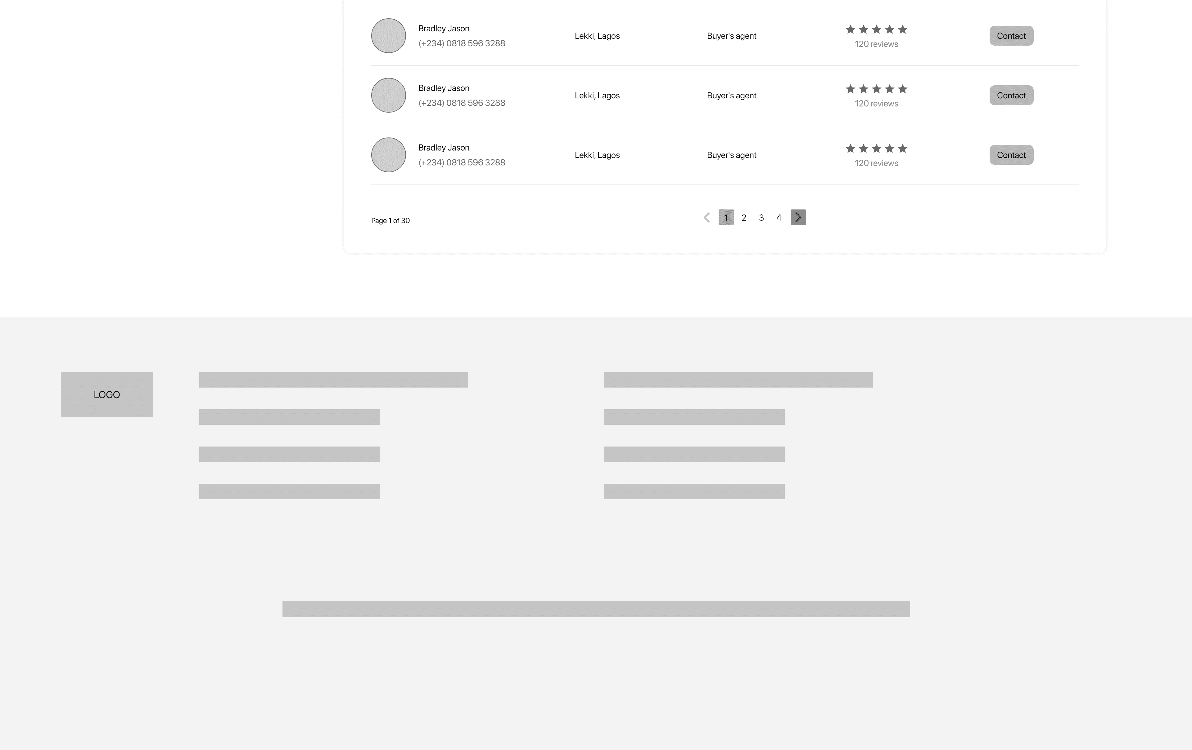
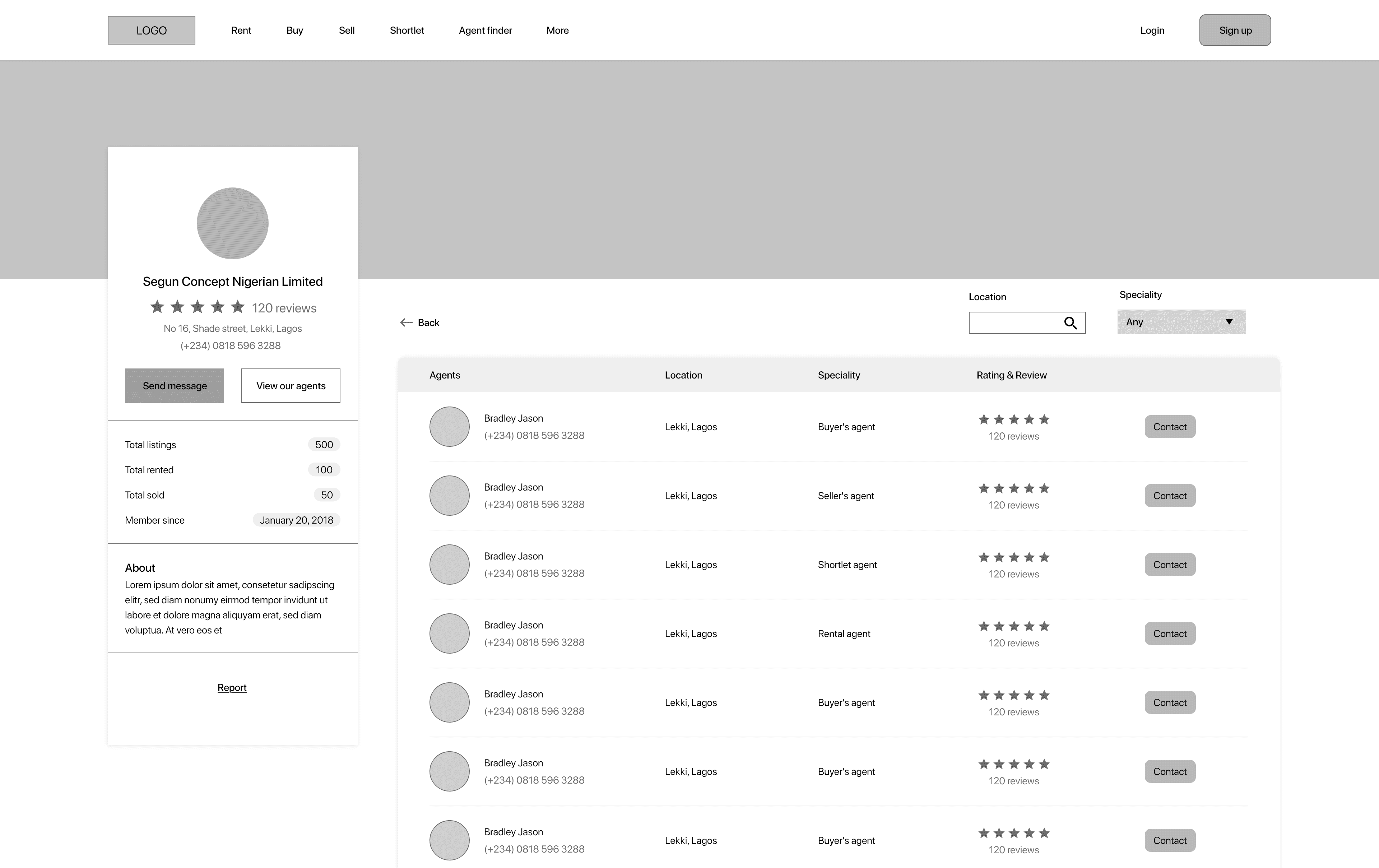
Mockups
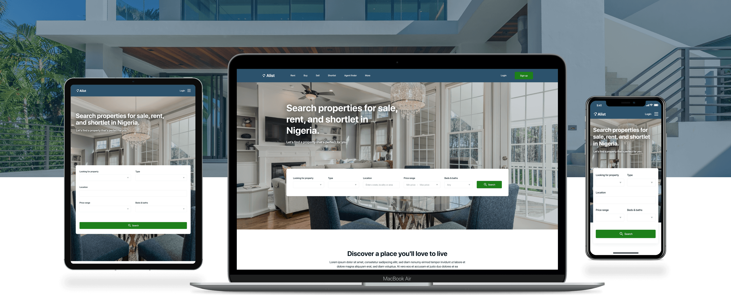
I included considerations for additional screen sizes in my mockups based on my earlier wireframes because users go through websites from a variety of devices, I felt it was important to optimize the browsing experience for a range of device sizes, such as mobile and tablet so users have the smoothest experience possible.
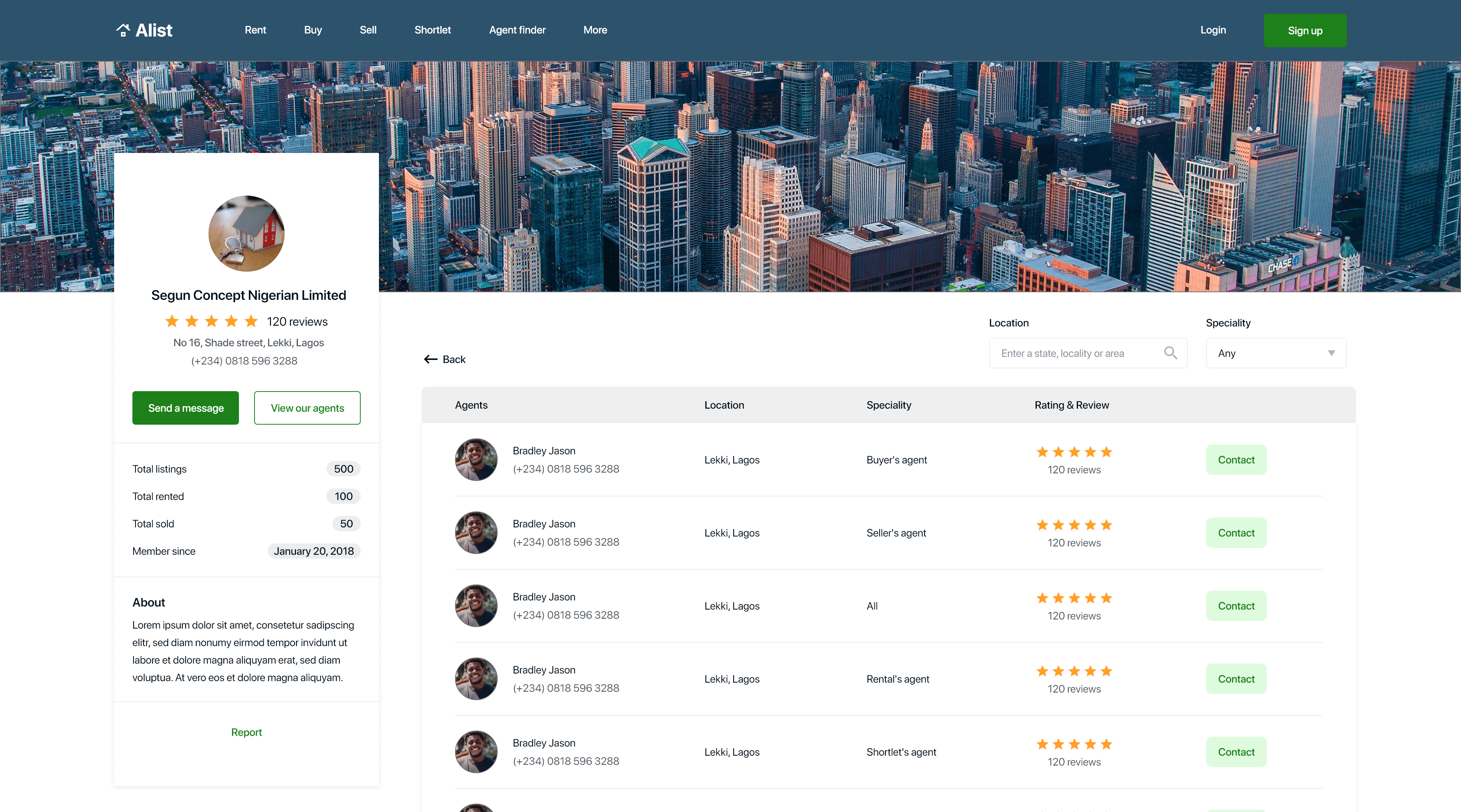

High fidelity prototype
To create a high-fidelity prototype, I connected all of the screens involved in the primary userflow of searching for a property and contacting the agent involved. It followed the same userflow as the low fidelity prototype.
High fidelity test
As soon as I was done prototyping my high fidelity designs, I conducted a second usability study on the high fidelity designs to improve my designs and get a lot of feedback, I also created KPIs to measure the success of the product. I conducted the usability study on five participants from ages 20 - 55 years that recently acquired a property within the last 2 months since they are my target audience.
After the study was conducted, I created themes or patterns and generated insights using an affinity diagram.
Key performance indicators
I generated key performance indicators to measure the success of the product at high fidelity. Examples of KPIs used were: Drop-off rates, Conversion rate, System usability scale (SUS).
Drop-off rates: 0% of participant didn’t make it to the end of the flow. This is 0 out of 5 participants.
Conversion rates: 100% of participant made it to the end of the flow. This is 5 out of 5 participants.
System usability scale (SUS): 81 score was the average mark for the SUS, which is an A grade indicating the product is excellent.
Findings
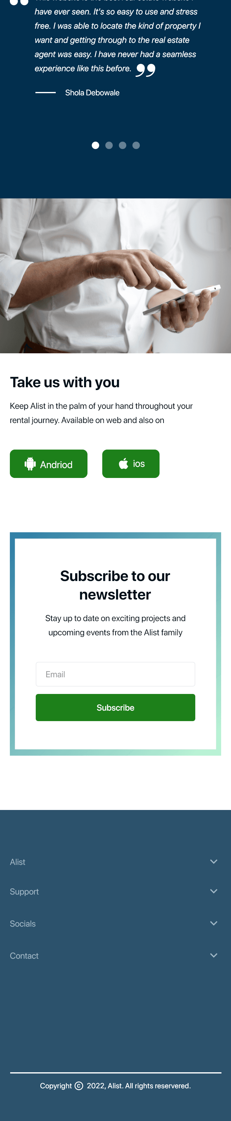
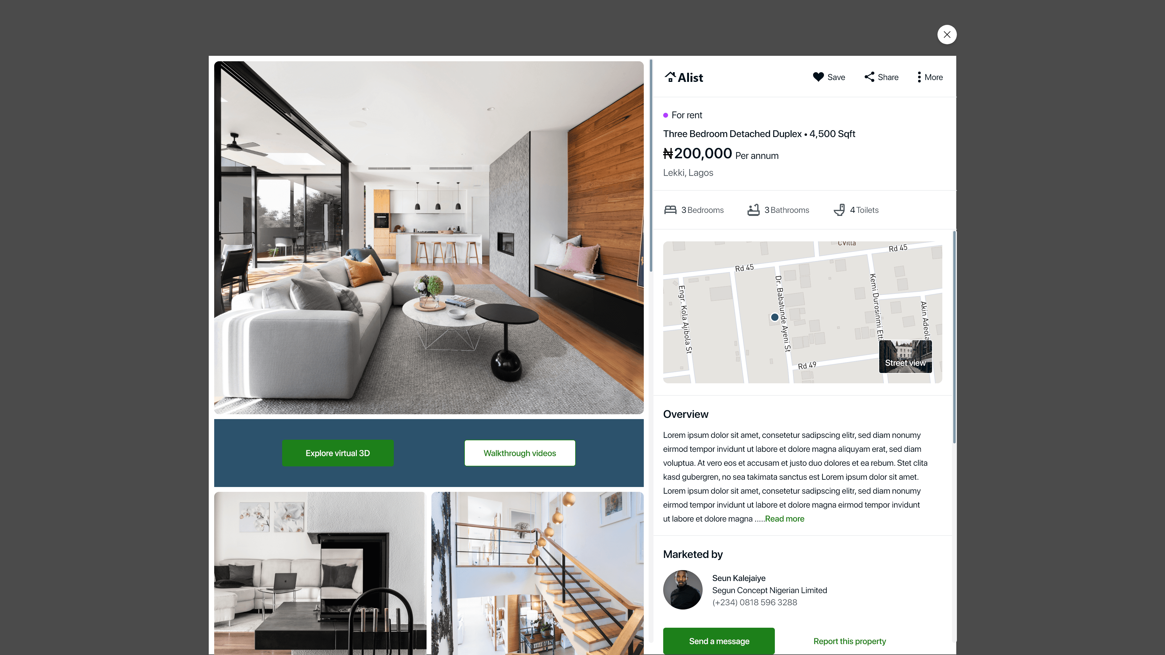
Users found the text on the pictures at the “discover a place you’ll love to live” section on the home page, hard to see.
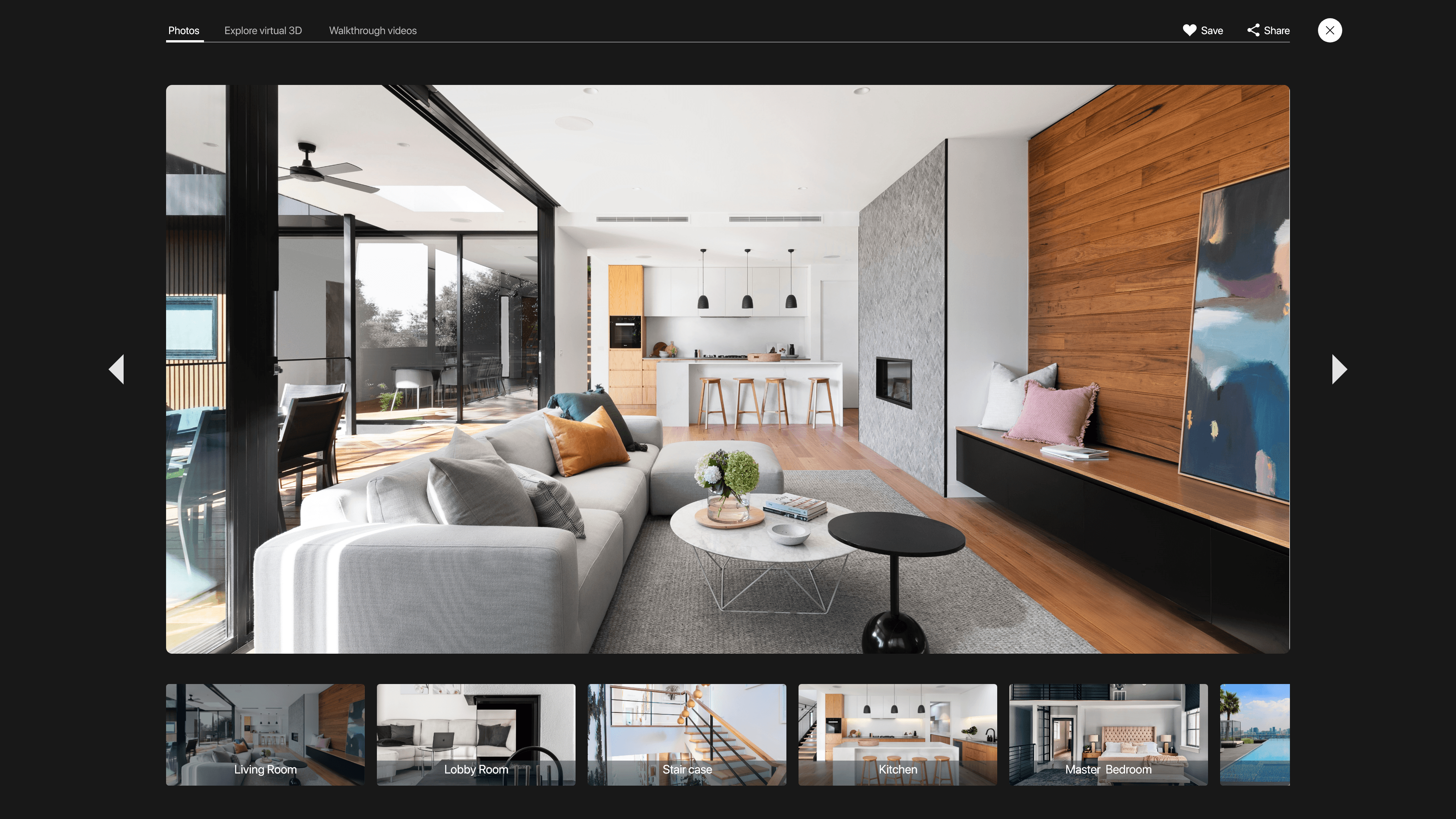
Users didn’t easily see the walkthrough videos and explore virtual 3d tabs on the property picture display in large mode.
Affinity diagram
The high fidelity usability study revealed frustration with seeing the text on the “discover a place you’ll love to live “section on the homepage. To solve this, I changed the location of the text from ontop of the picture to underneath the picture to increase visibility.
Before usability test

After usability test


The high fidelity usability study revealed frustrations in seeing the walkthrough videos and explore virtual 3d tabs on the property picture display in large mode. To solve this, I changed the color of the text to a brighter color to increase visibility.
Before usability test
After usability test


Accessibility considerations
When designing this product, some accessibilty considerations I made were:
I used headings with different sized text for clear visual hierarchy.
I used colors that passed the Web Content Accessibility Guidelines luminosity ratio.
Added ALT text to images.
Impact and Takeaways
Positive User Reviews: Users shared that the design was intuitive to navigate through, more engaging with the images, and demonstrated a clear visual hierarchy in user testing.
Enhanced Property Searching Experience : Users reported that Alist streamlined their property hunting process, provided accurate navigation and accurate details on each property on the platform.
One quote from peer feedback: "This is the solution to all my house hunting problems"
What I learned
I learned that even a small design change can have a huge impact on the user experience. The most important takeaway for me is to always focus on the real needs of the user when coming up with design ideas and solutions.
Next steps
Conduct another round of usability studies to validate whether the pain point users experienced have been effectively addressed.
Conduct more user research to determine any new areas of need and ideate on new features.
Let’s create awesome products together, feel free to contact me to see how we can collaborate.
©2025